Laura Child
Freelance Graphic Designer
ABOUT
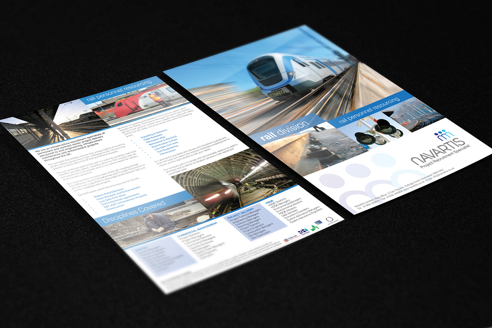
I was awarded first place in a branding competition for a recruitment company with three specialist divisions: rail, engineering, and construction. My concept centred around the human element at the heart of the business. I developed a custom typeface that incorporated the letter ‘n’ into iconography representing people, seamlessly linking the brand’s identity with its people-focused ethos.
The logo was well received and the company is now a global company.