Laura Child
Freelance Graphic Designer
ABOUT
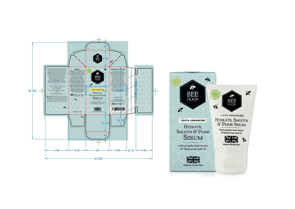
The brief was to design a packaging range for a skincare line rooted in the nourishing qualities of natural honey. The concept centred on purity, warmth, and the artisanal nature of the ingredients - combining the richness of honey with the simplicity of natural skincare. The visual identity needed to appeal to eco-conscious consumers while conveying a sense of gentle luxury.
I developed a packaging system using a soft, earthy colour palette with accents to evoke warmth and nature. Typography was carefully selected to balance elegance with approachability, and minimalist layouts allowed key product information and benefits to stand out. Hand-drawn botanical illustrations and a subtle honeycomb motif added layers of storytelling, nodding to the natural source of the hero ingredient. Sustainable packaging materials were considered throughout, aligning with the brand's eco credentials.
The final packaging elevated the brand’s shelf appeal and created a strong visual narrative that resonated with target customers. Feedback from initial product launches highlighted positive response to both design and perceived product quality. The range secured retail placement in several boutique stores and formed the basis for wider brand expansion into complementary lines such as lip care and body balms.
MADEIT CREDITS
-

Laura ChildFreelance Graphic Designer