Tom Malt
Head of Brand and Creative EMEA
ABOUT
BRAND ILLUSTRATIONS
PURPOSE
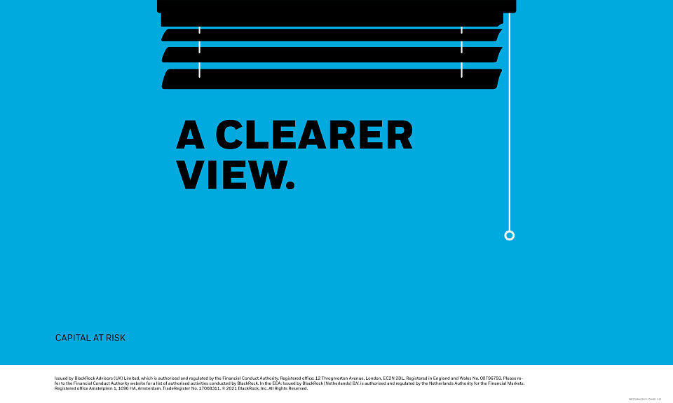
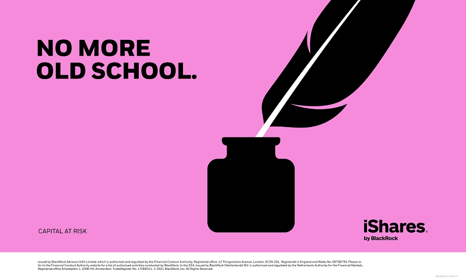
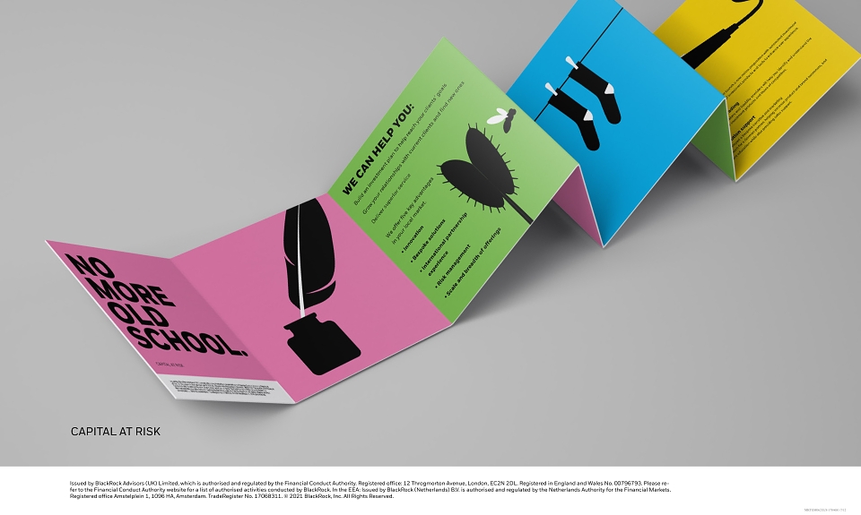
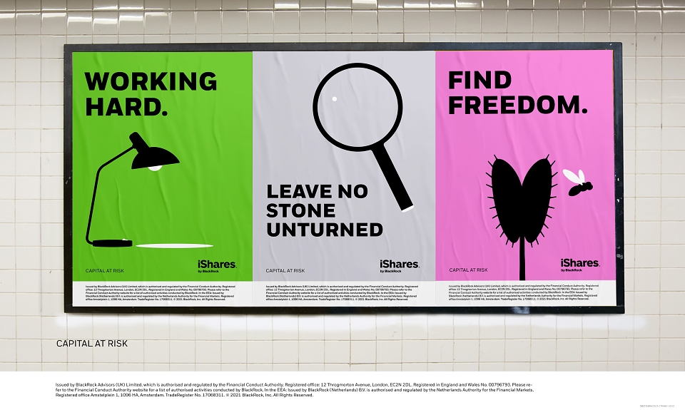
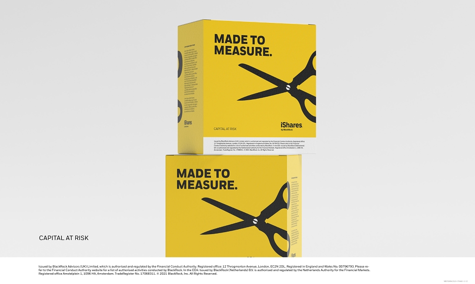
Our illustration style differentiates us in an otherwise bland category. It gives us visual equity. By tapping into the visual language of activism, we create illustrations that are bold, graphic and direct. It lets us communicate complex ideas simply.
PRINCIPLES
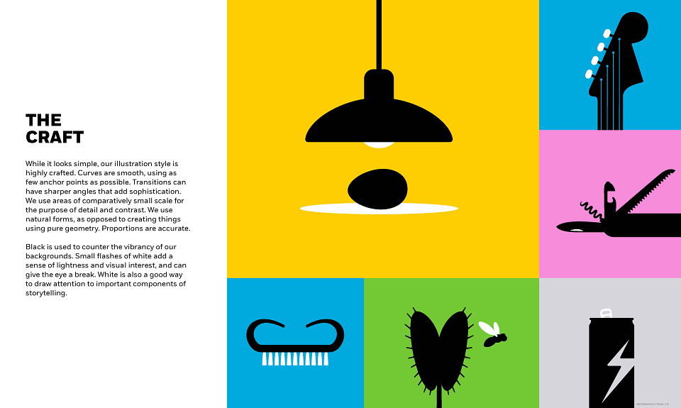
Our illustrations are simple, but include refined details. They are always black in
order to contrast with our vibrant floods of background color. A touch of white is added
to illustrations to bring freshness, a touch of clarity, and added meaning. Our illustrations are used as metaphors. They help communicate a range of complex topics in an engaging way. And it means we can inject wit through unexpected combinations of art and copy.
THE CRAFT
While it looks simple, our illustration style is highly crafted. Curves are smooth, using as few anchor points as possible. Transitions can have sharper angles that add sophistication. We use areas of comparatively small scale for the purpose of detail and contrast. We use natural forms, as opposed to creating things using pure geometry. Proportions are accurate. Black is used to counter the vibrancy of our backgrounds. Small flashes of white add a sense of lightness and visual interest, and can give the eye a break. White is also a good way to draw attention to important components of storytelling.
MADEIT CREDITS
-

Jim AndersonCopywriting -
Leena WaghmareContributors -

BLACKROCK -

Tom MaltHead of Global Creative -

Charlotte HopeContributors -

Carmen GarciaCreative Director -

Vipin PillaiAccount Manager -

Mike Diceyillustration -
Lisa AtkinsonBrand Director