Tobin Thomas
Creative Director and Team Lead
ABOUT
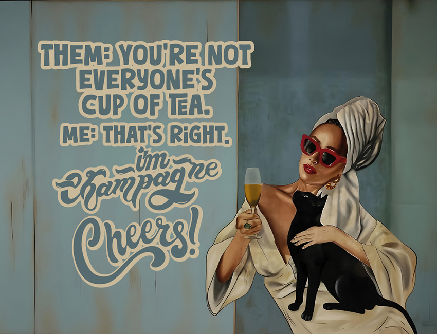
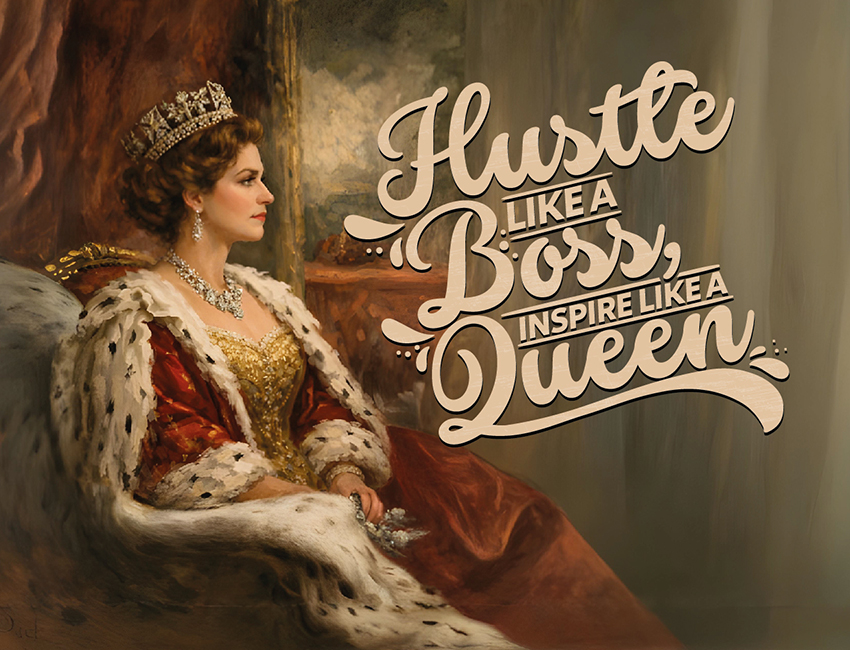
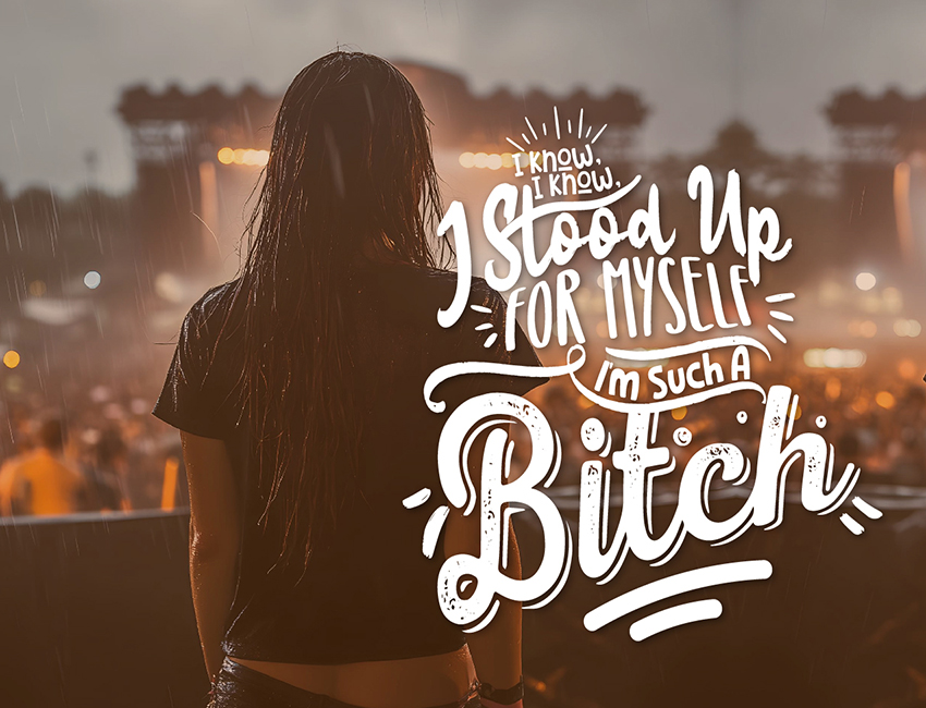
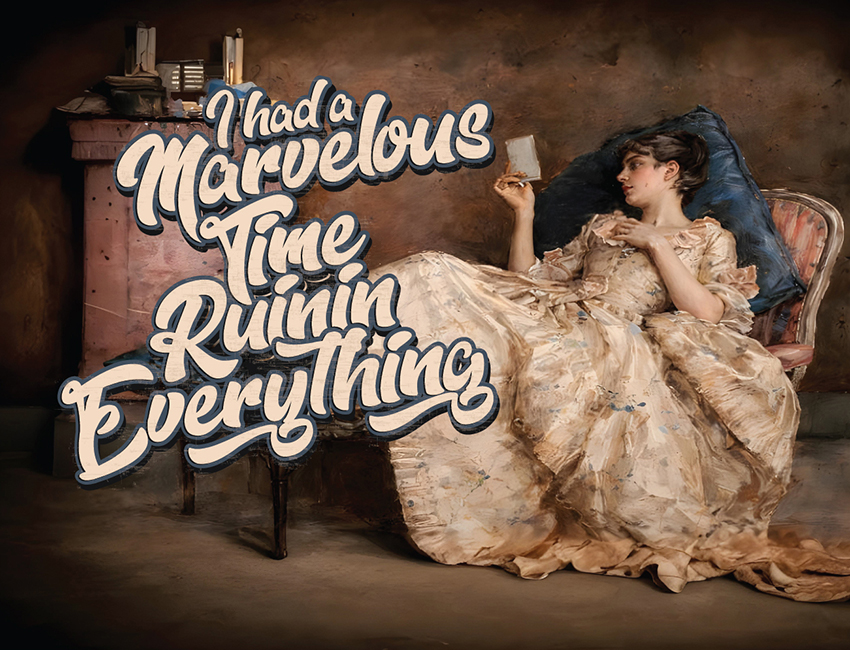
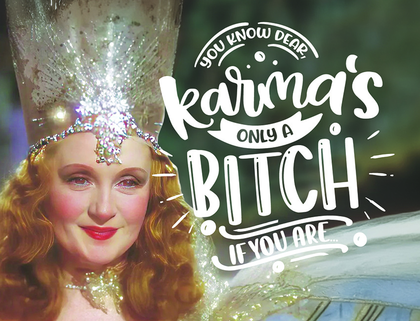
I love using the past to empower the present. In this recent series, I paired vintage art styles with bold, unapologetic messaging centered around strong women.
The real creative challenge wasn't just dropping text onto an image—it was integrating heavy, modern statements into old-world aesthetics without breaking the charm of the original eras. It required careful typographic calibration:
Classical painterly textures call for expressive, multi-weighted scripts and warm, robust serifs that anchor the message without overpowering the delicate brushwork.
Mid-century & pop illustrations demand punchy, high-contrast hand-lettering and dimensional outlines to deliver that graphic pop.
The takeaway: When vintage art meets contemporary copy, typography is the bridge. It’s never just about finding an attractive font—it’s about finding the era’s authentic typographic voice so the words live in the artwork, not just on top of it.
MADEIT CREDITS
-

Tobin ThomasCreative Director and Team Lead