Tobin Thomas
Creative Director and Team Lead
ABOUT
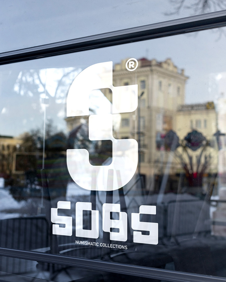
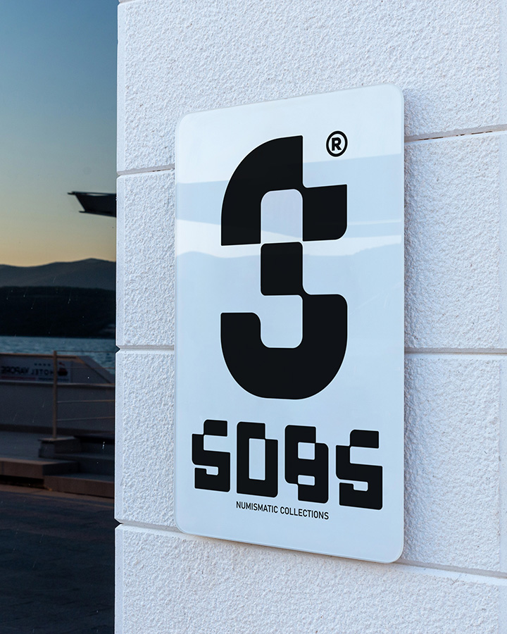
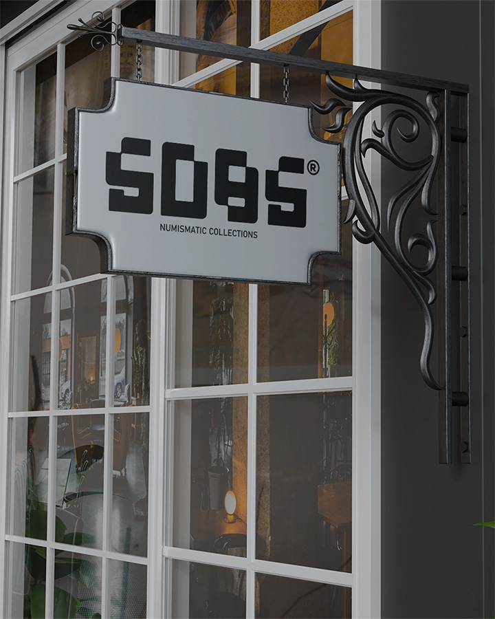
Another logo has been completed and approved by my client. This time, the new logo is for Numismatic Collections and exhibition purposes. I created three variations for this project: ✅ a primary logomark, ✅ an alternative logo mark, and ✅ a brand mark logo.
Quick breakdown‼️
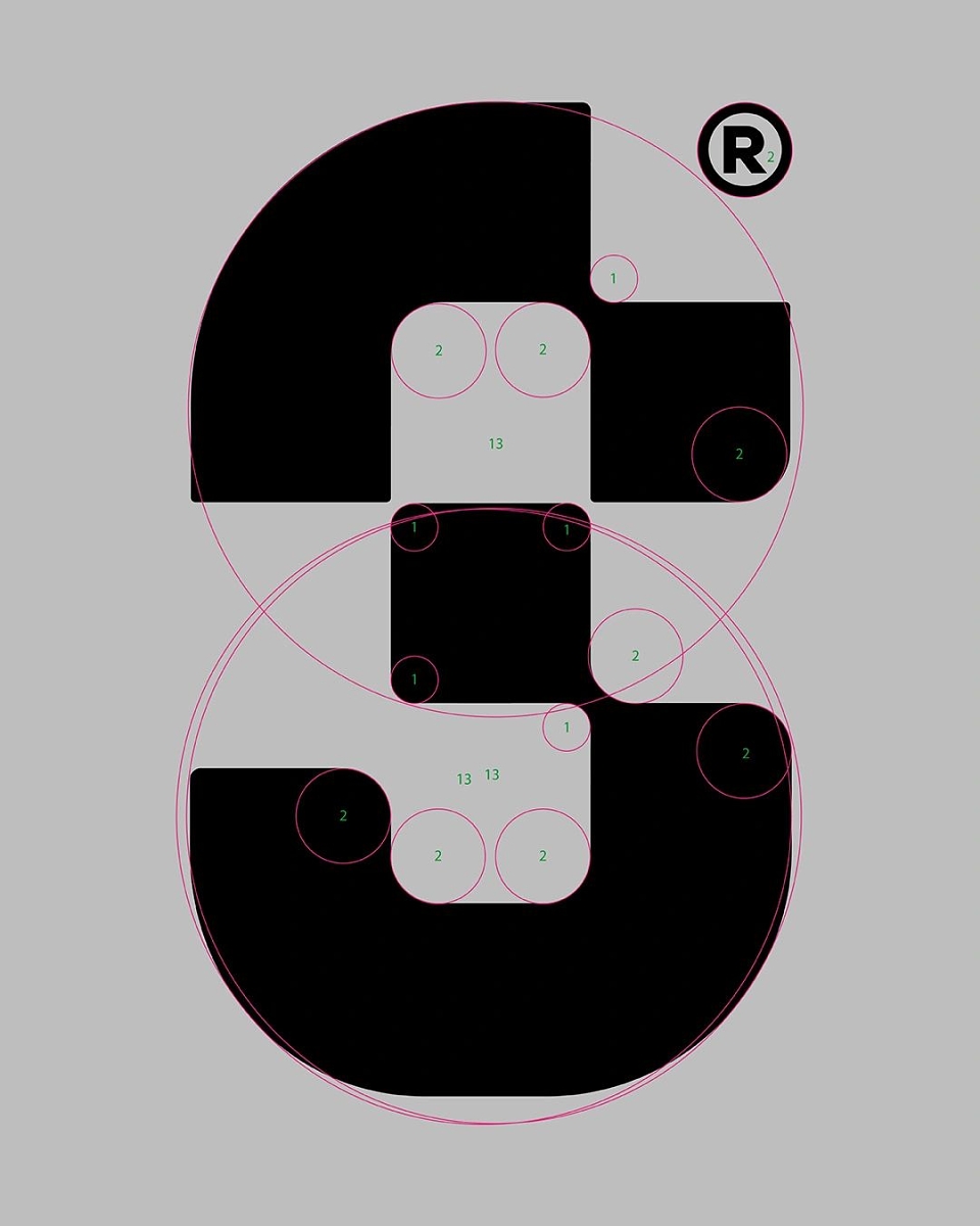
This logo, created for Numismatic Collections, skilfully merges historical elements from ancient Chinese and Roman coinage, renowned for their distinctive square-shaped coins, all crafted using the golden ratio. The vertical rectangular shape of the logo is inspired by Roman coinage, such as the aes signatum (circa 3rd century BCE), while the central square draws from iconic Chinese coins like the Ban Liang and Wu Zhu coins. The name "SOBS" is incorporated seamlessly into the rectangular design, enhancing its modern appeal.
What sets this logo apart is incorporates the golden ratio, a principle of classical design elegance used throughout history in architecture, art, and design. Revered for its naturally pleasing proportions (approximately 1.618:1), the golden ratio brings a harmonious balance to the logo, reflecting timeless beauty.
This blend of historical coinage and the golden ratio emphasizes the significance of numismatics and ensures the design remains visually balanced and aesthetically compelling. It symbolizes a deep respect for historical and mathematical design principles, making the logo stand out with its rich cultural and artistic composition.
MADEIT CREDITS
-

SOBS Numismatic CollectionsClient
-

Tobin ThomasCreative Director and Team Lead