Tobin Thomas
Creative Director and Team Lead
ABOUT
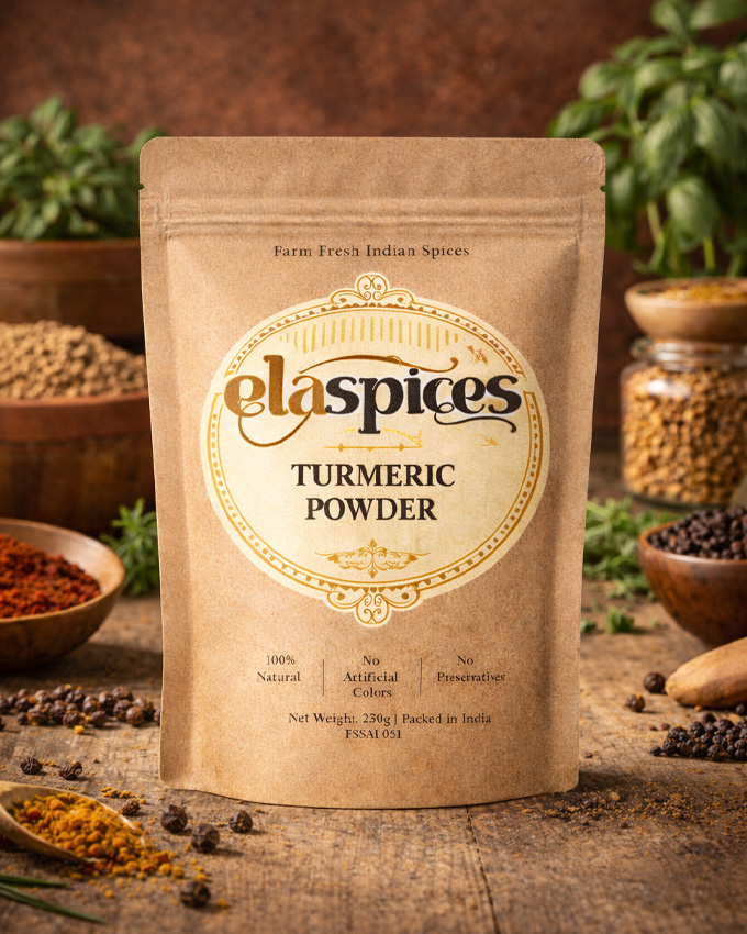
ElaSpices – Emblem Logo Concept & Story
Logo Type: Vintage Emblem Mark
The ElaSpices logo is designed as a vintage-inspired emblem, created to stand out in India’s competitive online spice market.
In a marketplace filled with ordinary wordmarks and minimal icons, this emblem approach gives the brand a strong, premium, and trustworthy presence.
Concept & Brand Story
ElaSpices represents:
. Heritage
. Authentic Indian flavor
. Purity
. Farm-fresh tradition
. Timeless quality
To reflect these values, the logo is crafted in a retro-classic badge format, inspired by traditional spice labels, old Indian trade seals, and heritage food packaging.
The circular emblem symbolizes:
. Completeness
. Authenticity
. Seal of quality
. Trust in trade
It visually feels like a quality stamp, reinforcing reliability for online buyers across India.
Typography Strategy – Custom Identity
The “elaspices” logotype is created using a custom-styled font treatment to ensure:
. Unique brand recognition
. Distinction from generic spice brands
. Strong shelf visibility (both online thumbnails & offline packaging)
. Premium handcrafted feel
The flowing curves and vintage letter styling reflect the richness and aroma of traditional Indian spices.
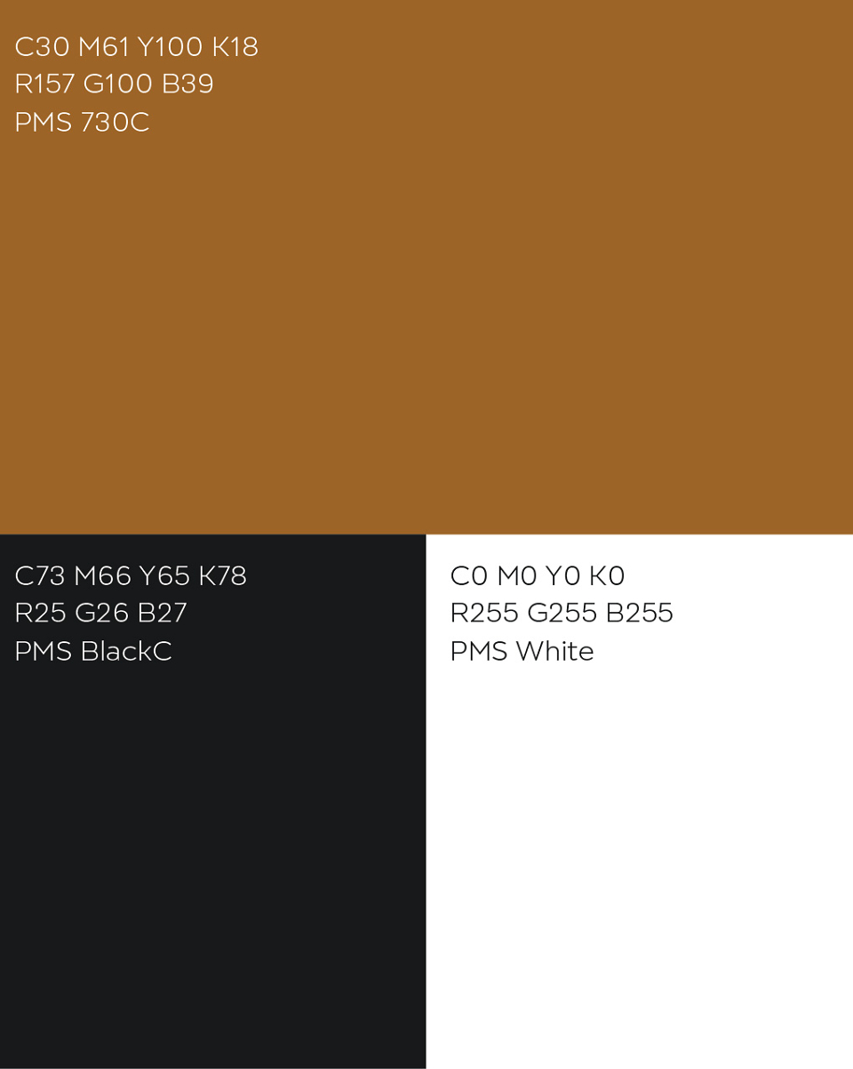
The three-color palette was strategically chosen:
Brown – Earth, organic origin, and authenticity
Black – Strength, bold flavor, and premium positioning
White/Cream – Purity and clean processing
Together, these elements create a classic yet powerful visual identity that reflects traditional Indian spice heritage while maintaining strong online visibility.