TJ Rees
CD
ABOUT
CONTEXT
When our client, Fedcom, secured the rights to Euro League Basketball,
it gave them a massive opportunity.
Name, design and launch a new sports broadcast brand – in just 8 weeks.
All to hit the first game of the season.
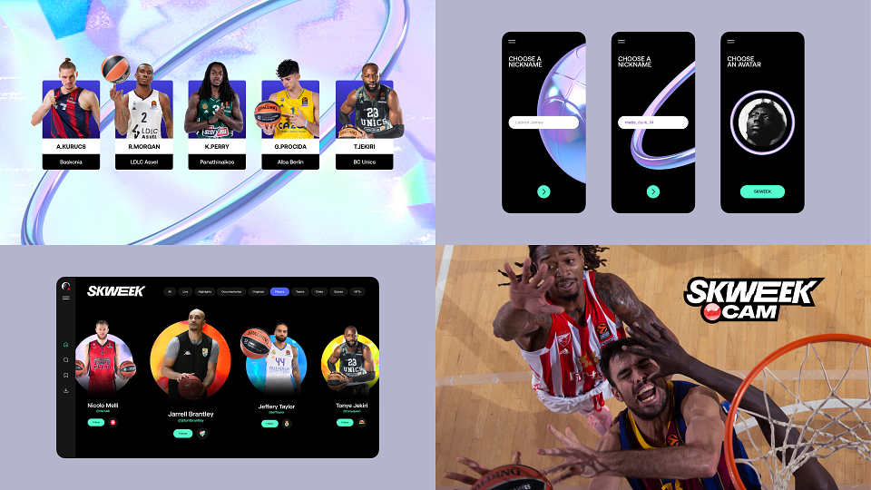
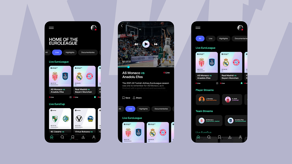
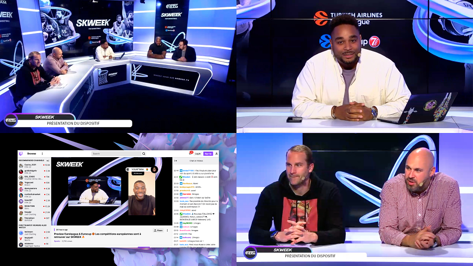
The brand was to serve as streaming platform, but also home to analysis,
news, and ‘all things basketball’ for European fans.
In terms of playing standard – European Basketball is close to the NBA.
But how it’s packaged and presented – is light-years behind.
The objective in short, was to change this.
To move away from the ‘official’ but sanitised way it’s been shown.
And create something that comes from the culture, lifestyle,
and game itself – rather than the federations that govern it.
Project to launch initially in France,
as part of phased approach across Europe.
Target audience – 16-25 y.o basketball fans
CREATIVE IDEA
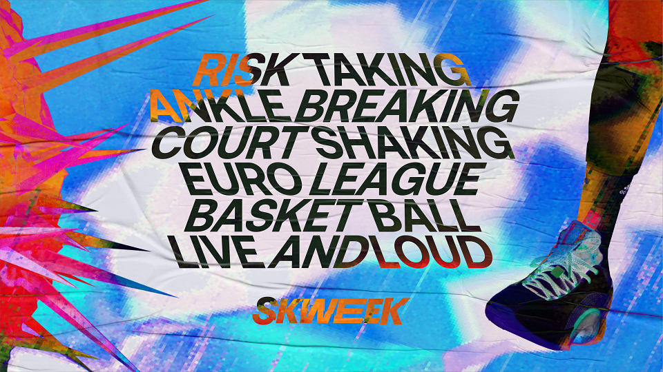
Our creative idea came from something any basketball fan will recognise instantly - the ‘squeak’ of sneakers on court.
On the face of it, it’s a tiny thing to fixate on.
But it stood out for us, because it doesn’t really make sense to anyone BUT basketball fans.
A ‘squeak’ is usually negative.
But if you love basketball – it’s the most beautiful sound in the world.
The more we looked at it –
the more it seemed a perfect metaphor for the feel and attitude of European basketball –
and of younger fans in particular.
The game is more physical, loud, aggressive -
and a ‘squeak’ is all of those things.
It’s all the energy and attitude of basketball – distilled down to a millisecond.
So everything we made, was inspired by that micro-moment.
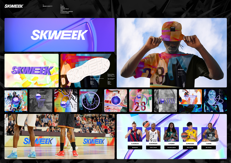
Name. Logo. Design. Sound. Motion.
We just kept asking – ‘Does it feel ‘Squeaky?’.
If it did, we kept it.
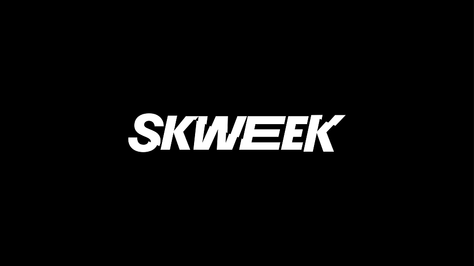
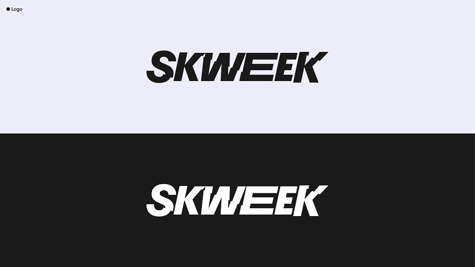
For the name, we took ‘Squeak’ - and made it more phonetic/
simpler for non-English speakers.
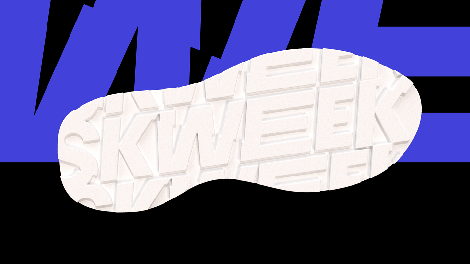
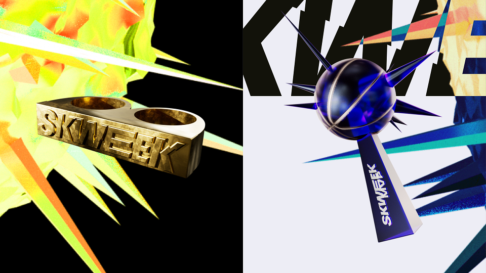
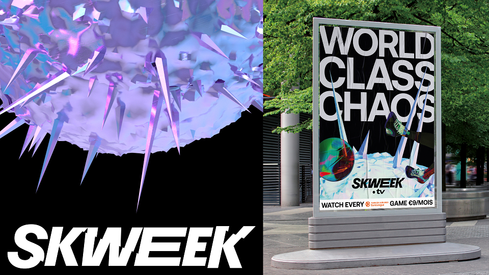
For our visuals, we looked at ‘squeaking’ sound waves -
spiky, sharp, high frequency.
For motion, we looked at the physics,
and found something called the ‘Stick-slip’ phenomenon.
And we explored the contrast between opposing forces,
fast/slow, loud/quiet.
That tension is across the brand,
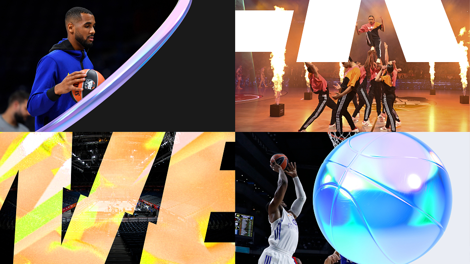
with premium, ‘high-finish’ elements, particularly in 3D -
disrupted by punchy, scratchy motion design.
‘In-your-face’ imagery – sat on calm, spacious backdrops.
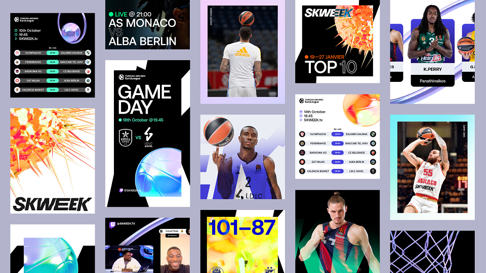
And attention-grabbing hero assets, complemented by simpler, functional elements,
in things like the type, backgrounds, or ‘in-game’ infographics.
The brand needs get our attention initially –
but once you’re watching the game – it gets out of the way.
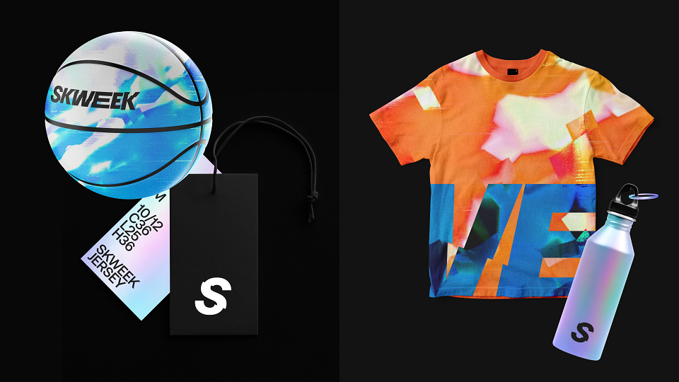
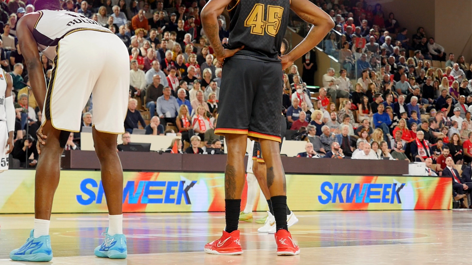
With so many touchpoints (broadcast, courtside, app, web, merchandise),
and so little time – we needed a brand that was conceptually, easy to get,
and technically, easy to work with.
RESULTS
Since the official launch of the brand on the 27th September 2022 momentum across social channels has been steadily building – growing both followers and engagement. The name SKWEEK has directly inspired a successful influencer marketing campaign – posting under #skweeksoundchallenge influencers are testing the squeak of their trainers to build awareness of the brand and recognition of the name. In the month since launch the platform has seen better than anticipated uptake in subscription and live audience viewing figures are rising with each game played.
MADEIT CREDITS
-

FedcomClient
-
Andy YoungDesigner -
Chris MooreDesign Director -
Ed AndrewsDesigner -
Julien PietriMotion Design -
Rosie WalkerClient Director -
Thomas MelsensMotion Design -

Murat KilicMotion Designer -
Richard PizeyMotion Lead -

Interbrand London -

Sam AshkenSenior Strategy Director -
TJ ReesCreative Director