Cristina Lisovoi
Graphic Designer
ABOUT
Concept
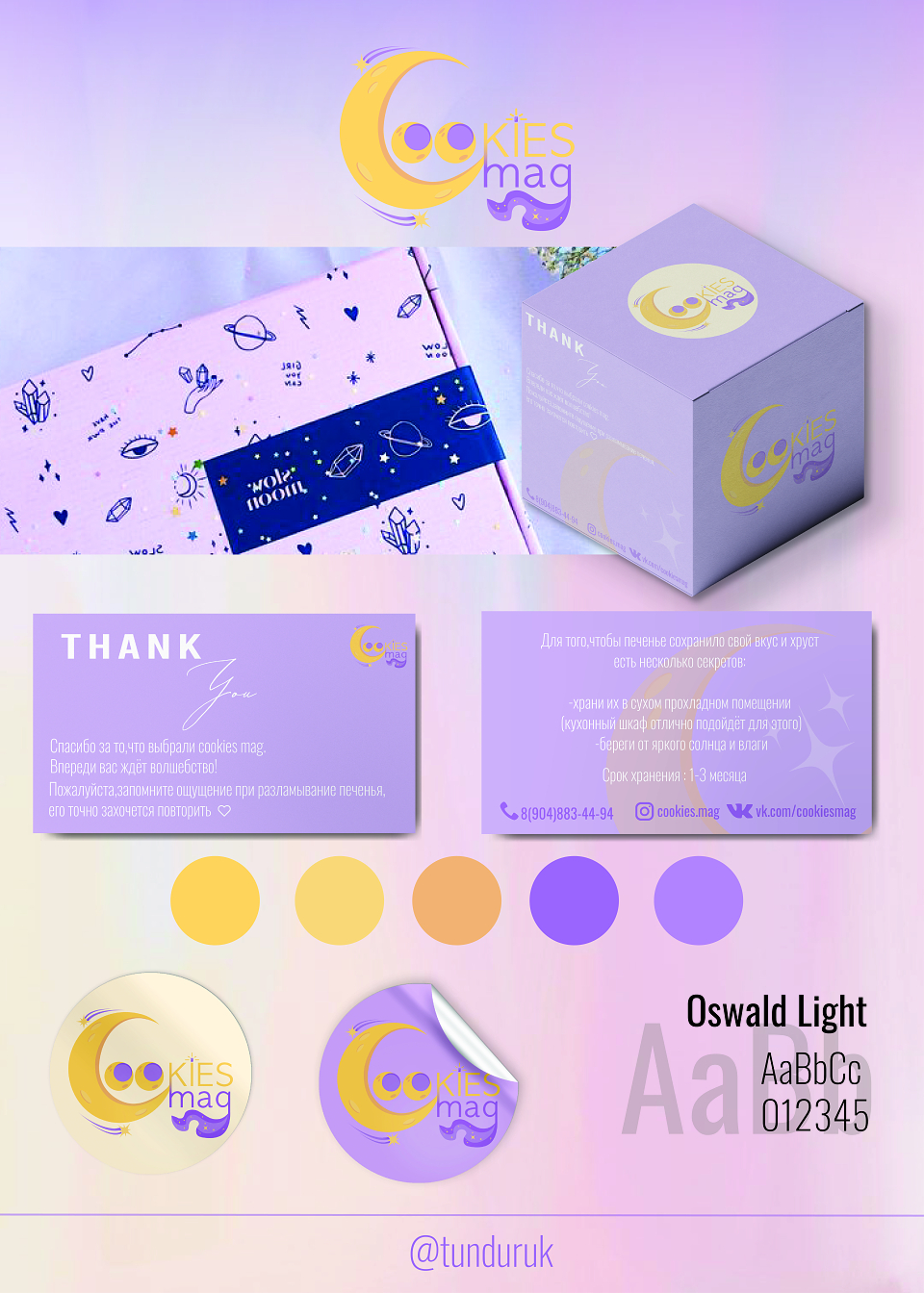
The branding project for "Cookies Mag" focuses on creating a magical and celestial theme, aligning with the brand's identity and values. The concept combines soft pastel colors with playful, space-inspired illustrations to evoke a sense of whimsy and delight for the customers.
Execution
Logo Design: A crescent moon is integrated with the brand name, emphasizing the celestial theme, with smooth, modern typography ("Oswald Light") for a contemporary look.
Packaging: The design features custom illustrations of stars, planets, and crystals, reinforcing the magical concept. The combination of lilac, yellow, and pale lavender tones ensures a cohesive and visually appealing presentation.
Supporting Materials: Stickers, thank-you cards, and storage instructions are included, reflecting the brand's attention to detail and customer care.
Typography and Palette: The clean and readable "Oswald Light" font complements the brand's magical aesthetic. The pastel palette provides warmth and approachability while staying visually balanced.
Results
The cohesive branding successfully establishes "Cookies Mag" as a fun and enchanting cookie brand. The packaging and supporting elements create a memorable unboxing experience, encouraging customer loyalty and repeat purchases. The visual identity communicates quality, whimsy, and care, aligning perfectly with the target audience's expectations.
MADEIT CREDITS
-

Cristina LisovoiGraphic Designer