Tom
Senior Graphic Designer
ABOUT
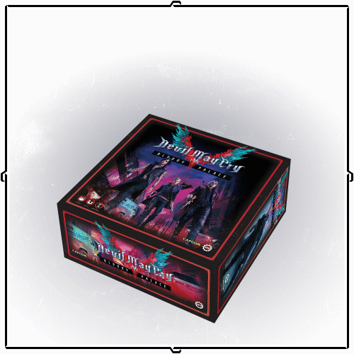
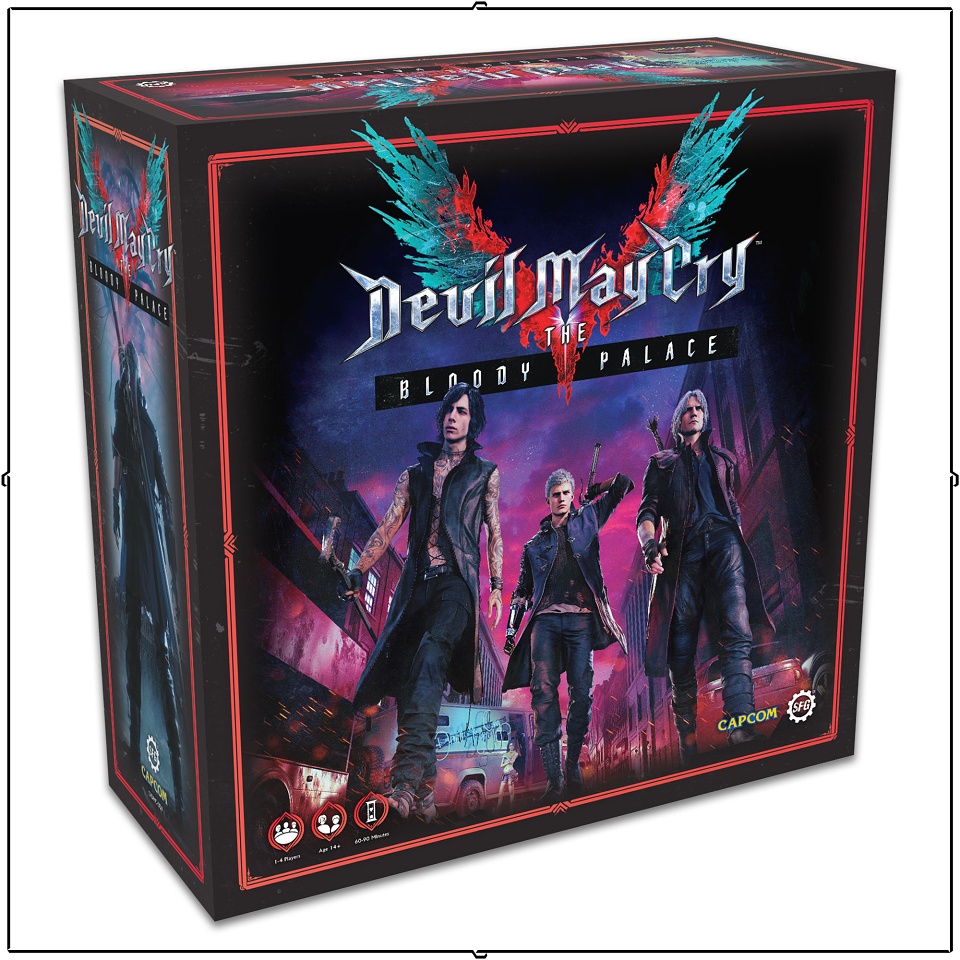
My key goal when working on Devil May Cry was to make sure the game looked as bombastic and over the top as possible - the video game series is not exactly known for its subtlety and I wanted to capture the demonic-soap-opera/death-metal-video feeling in every aspect of it.
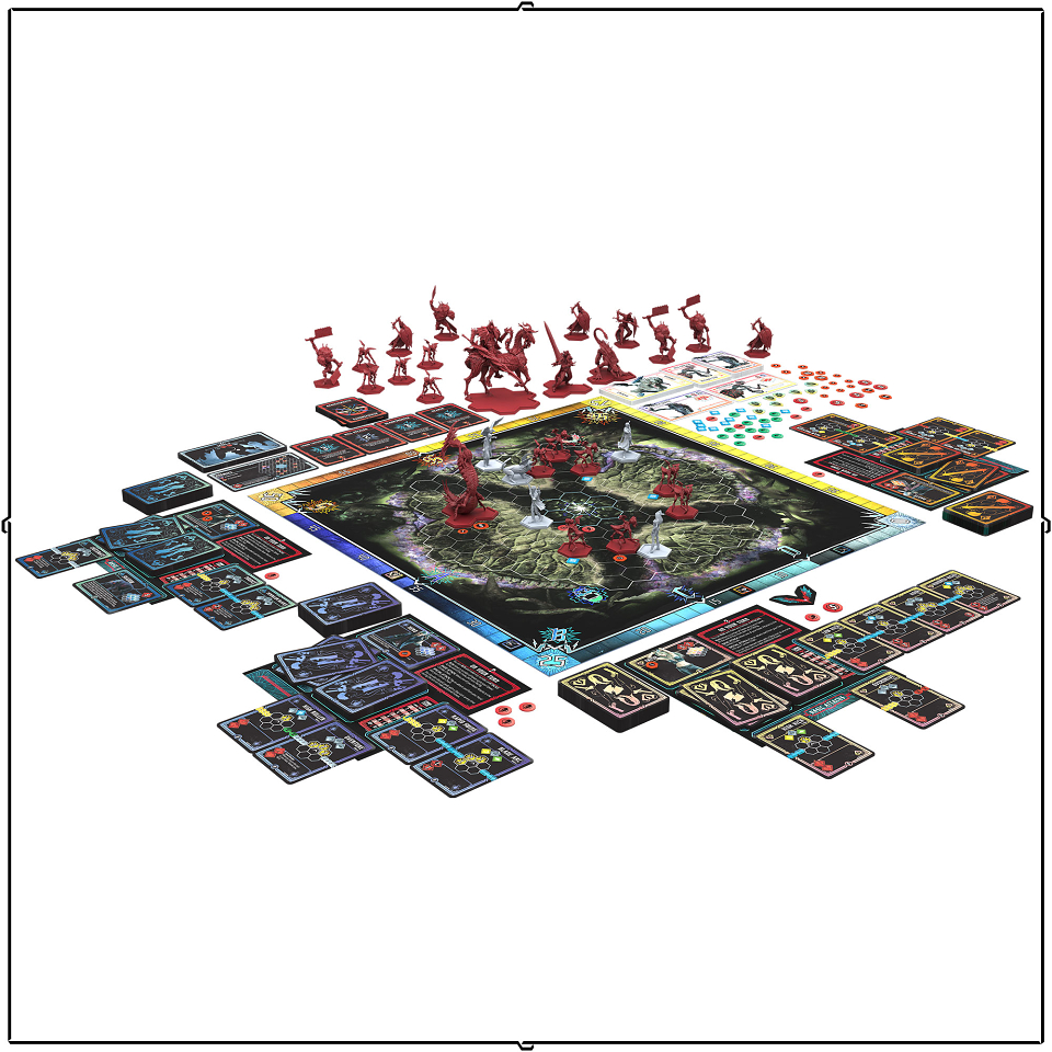
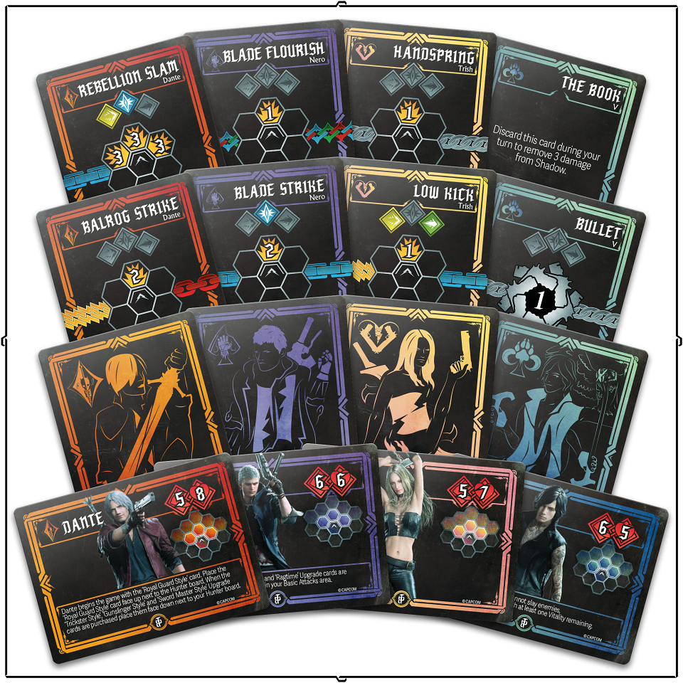
The vibrant neons were given a little more structure by adding a ‘playing card’ structure to the whole game. The player characters are each represented by an icon inspired by a suit (diamonds, spades, hearts and clubs) and a pair of colours, one of which matches the traditional suit colours (red and blue/black respectively). This gives each player’s unique decks of cards a distinct look that is easy to sort through and find for setup or break down, while maintaining a level of consistency across the game as a whole.
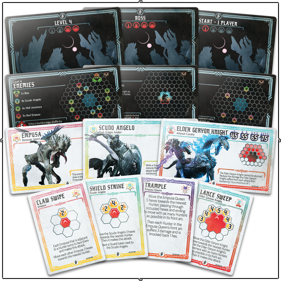
The board-controlled enemies, on the other hand, are treated as chess pieces, with icons calling back to pawns, knights, rooks and so forth. Their colouring is again codified, with each ‘size’ of enemy having a consistent colour, so you can see at a glance roughly how dangerous each foe is.