Thobias
Graphic Designer
ABOUT
Sushi is the most known japanese dish and it is getting more and more appreciation in Sweden but we wanted to speed up that process with a package that would give an impression of freshness and would get the consumers interest.
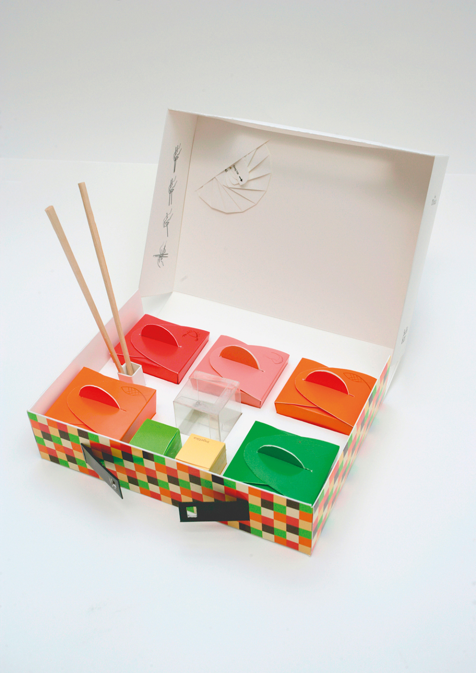
The packaging of sushi today in the swedish are really dull and they all look the same, a black bottom with the sushi divided by small "walls" and a plastic cover over the package. This would be a fun task to try go against this trend in sushi-packaging and go the opposite way we thought. Our package contains 6 pieces of nigiri and 6 pieces of maki.
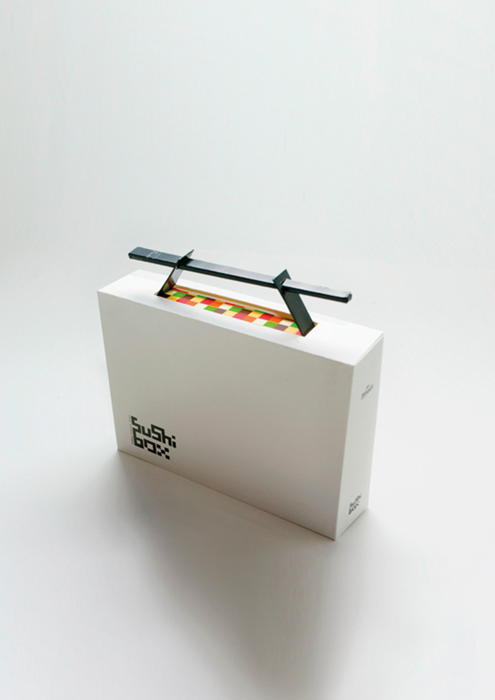
The wasabi and ginger container got the same "tear-of" function. When it comes to the graphic design of the package we wanted to keep it clean and stylish. We chose a white color to the big box to represent freshness and the color helps it to stand out on the shelf in the store. Not to much graphic either on it, just a logo we designed for the product and some text on the backside.
The sushi containers we wanted to have bright, popping colors taken from the food itself. It makes a interesting and fun contrast to the white of the rest of the box. The rest of the small boxes got colors depending on its content except the soy container who is made in plastic so you can se how much soy you got left. Instead of using a plastic window on the small boxes to se what they contain we chose to work with pictograms instead. Each box got a small symbol of what they contain, salmon, crab, prawn etc. We made a pattern of the shape and color of the small boxes inside and used it on the big packaging.