Thirty Fathoms
Cornwall
ABOUT
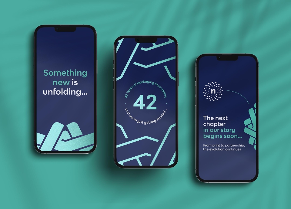
This Devon-based, family run business has been crafting print for over 42 years. This rebrand marks a new chapter, positioning the company firmly within the packaging sector while honouring its heritage, craftsmanship and long standing client relationships.
THE CHALLENGE:
The brief was to create a new identity that reflected the company’s refined focus on printed packaging, moving away from the broader perception of a general print provider.
With over four decades of family led expertise behind them, the brand needed to communicate trust, stability and deep rooted knowledge, while signalling progression and clarity of direction.
The challenge was to balance heritage with evolution. The identity had to feel established and dependable, yet purposeful and forward looking. It also needed to visually reference the craft of packaging itself, ensuring the brand’s specialism was woven into its core.
THE CONCEPT:
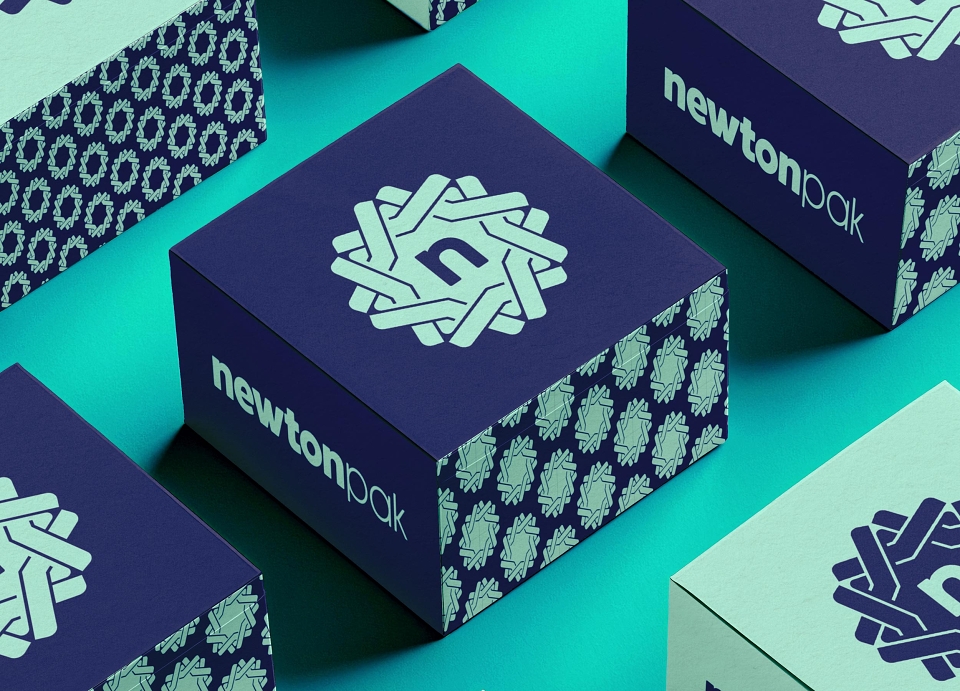
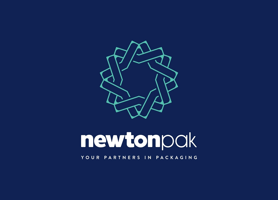
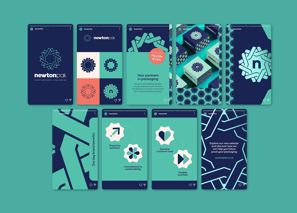
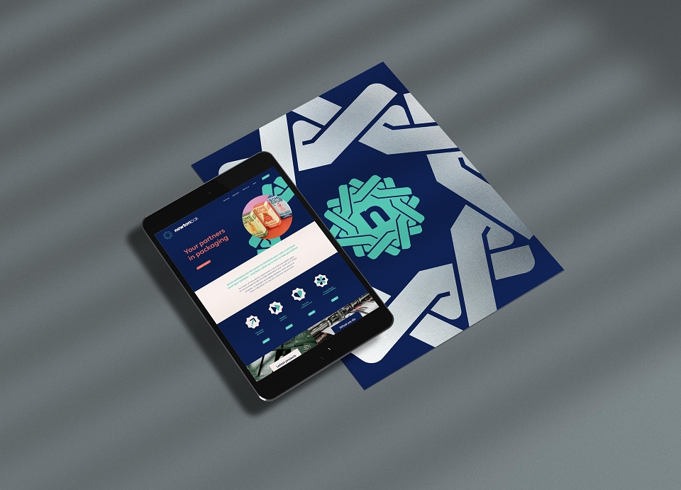
An identity drawing inspiration directly from the physicality of packaging - the folds of paper, paper-over-board construction and the form of an open book.
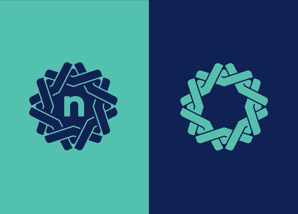
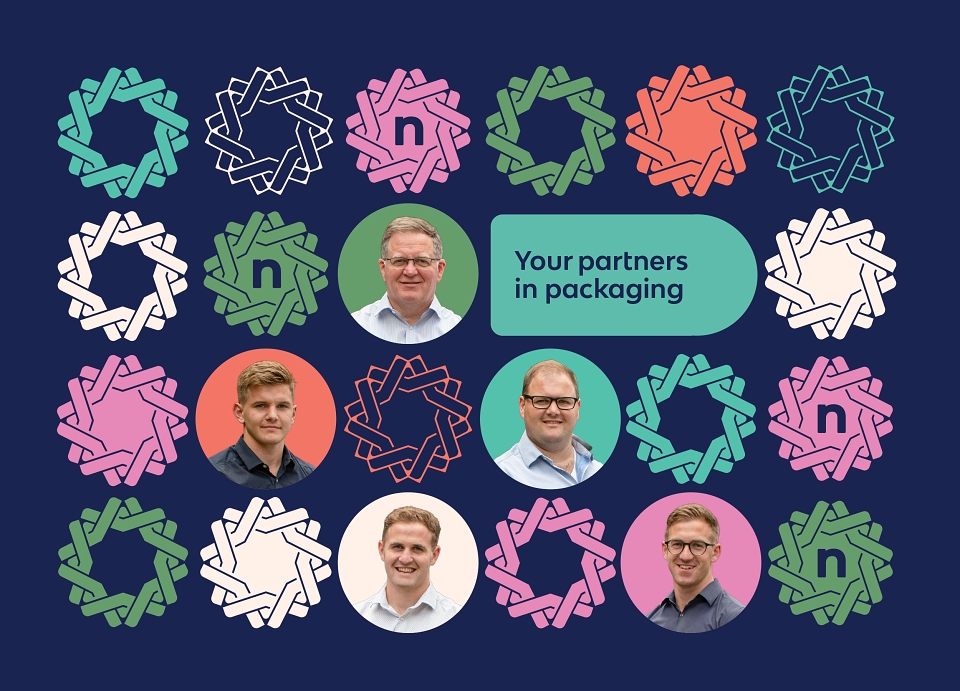
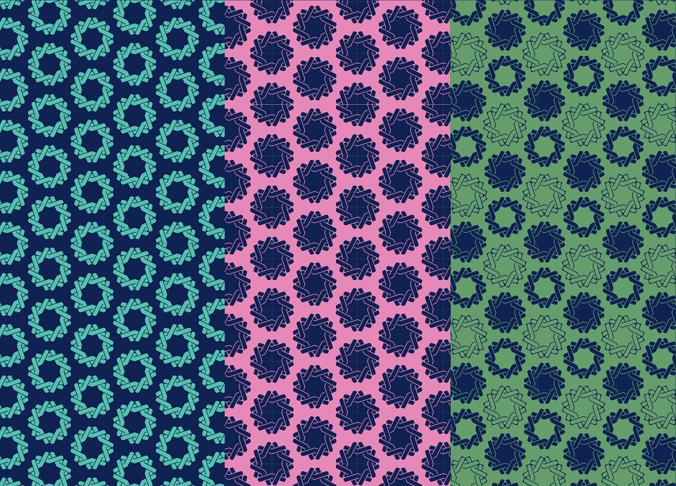
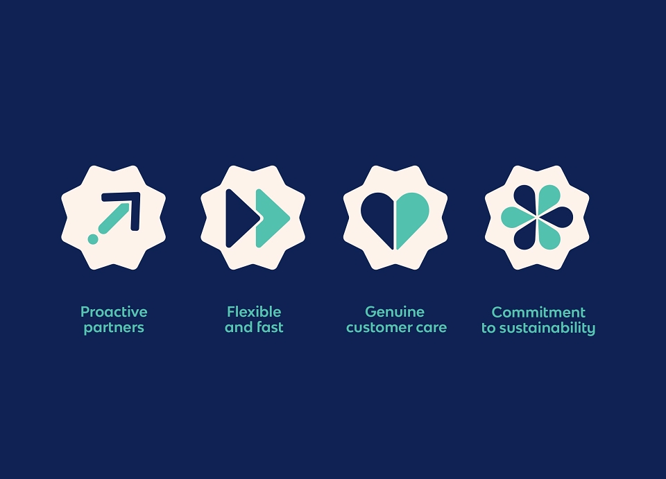
The logo is built from interlocking and overlapping shapes, echoing the structure of folded board and layered materials. These forms suggest motion and progression, each connecting and supporting the other to reflect the strong, enduring relationships the business builds with its customers. Over time, these relationships become layered into a shared history, woven together through collaboration and trust.
The colour palette reinforces this sense of heritage and assurance. A deep blue anchors the identity in knowledge, reliability and experience. Sage green introduces growth and harmony, reflecting both sustainability considerations and long term partnerships. A warm salmon tone softens the identity, adding compassion and genuine human connection, a subtle nod to the family run nature of the business.
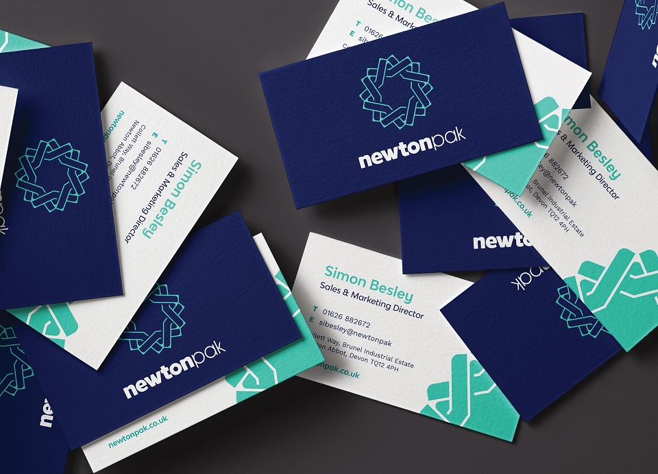
The brand icon becomes a central graphic device, scaled up and used in both positive and negative forms to create distinctive, cohesive visual assets. Cropped, layered and repeated, it mirrors the idea of construction and assembly, ensuring the visual language feels intrinsically linked to packaging at every touchpoint.
The result is a brand that feels genuine, stable and connected, honouring 42 years of family led expertise while confidently stepping into a more defined future.