Think
Manchester
ABOUT
Clearwater International wanted to launch a new division designed to unlock £250m of new domestic and international investment for entrepreneurially led high-growth businesses – Clearwater Growth.
The key challenge with this particular project was that the target audience was not familiar with Clearwater International. In fact, global financial advisories such as this were deemed intimidating to our target audience, who are mainly seeking private equity (PE) investment for the first time or looking to plan their exit strategy, but had very little understanding of what PE actually meant, or of the options available to them.
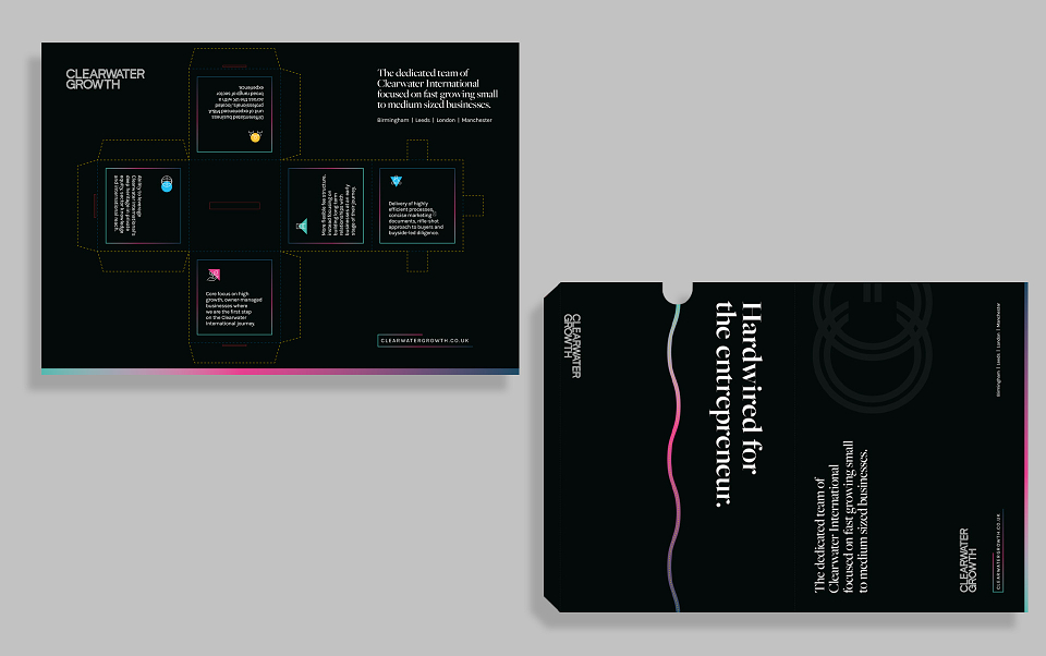
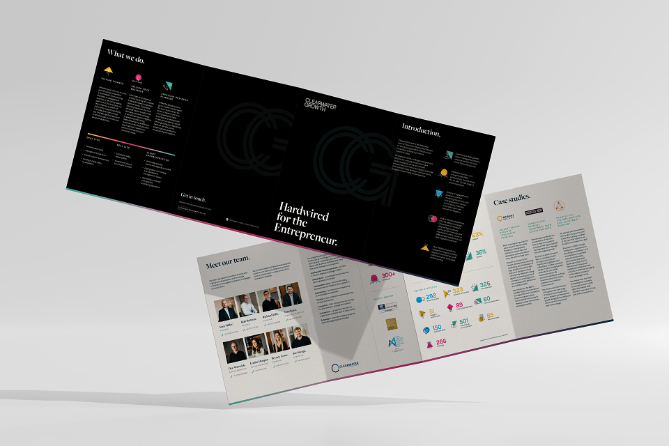
This resulted in a final positioning statement ‘hardwired for the entrepreneur’ which guided the creative and helped stakeholders feel comfortable with the decision to move away from the current branding. We ensured that the credibility of Clearwater International was leveraged across all touchpoints at the appropriate point in the journey.
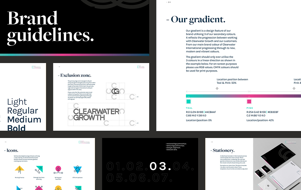
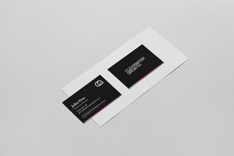
A custom design logotype was fashioned with an inline feature – white lines appearing inside the character letterforms. This formed the ‘hardwire’ that courses through Clearwater Growth’s team creating a confident and striking design.
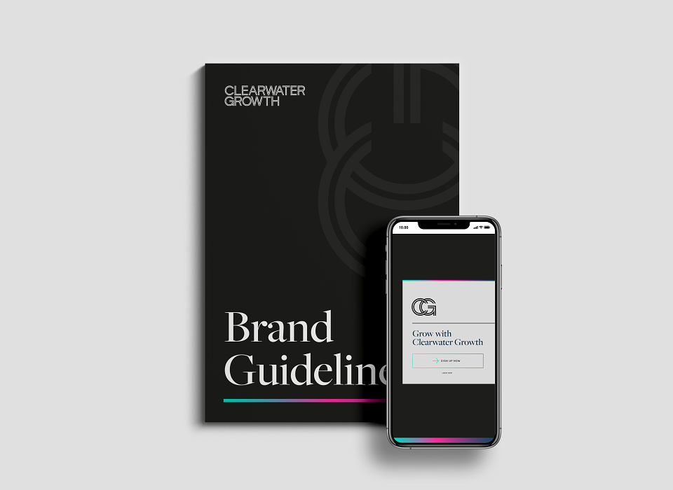
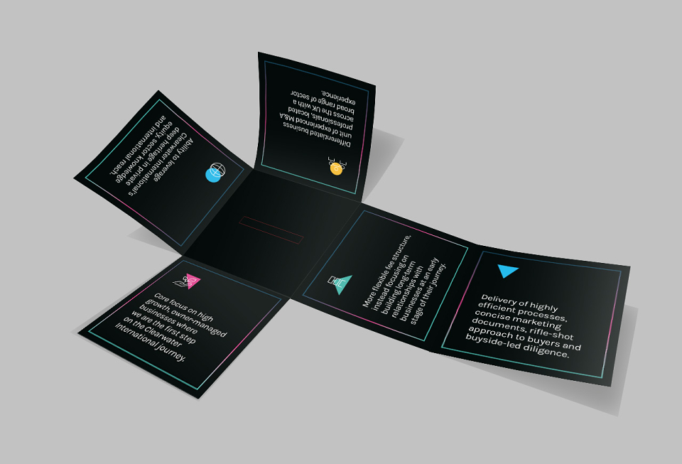
This enabled the wider brand identity to be professional but with a younger feel. A strong use of black and white, supplemented by minimal use of bright colours, lifted the identity away from the expected norm in this sector, and created its own space.