The Weather
Berlin
ABOUT
QphoX is a quantum technology company focused on scaling quantum computing and enabling the future quantum internet through advanced hardware. Their core innovation lies in quantum transduction — a technology that bridges microwave-based quantum processors with optical networks, converting microwave signals into room-temperature optical signals. This enables long-distance connectivity and unlocks parallelization across quantum systems.
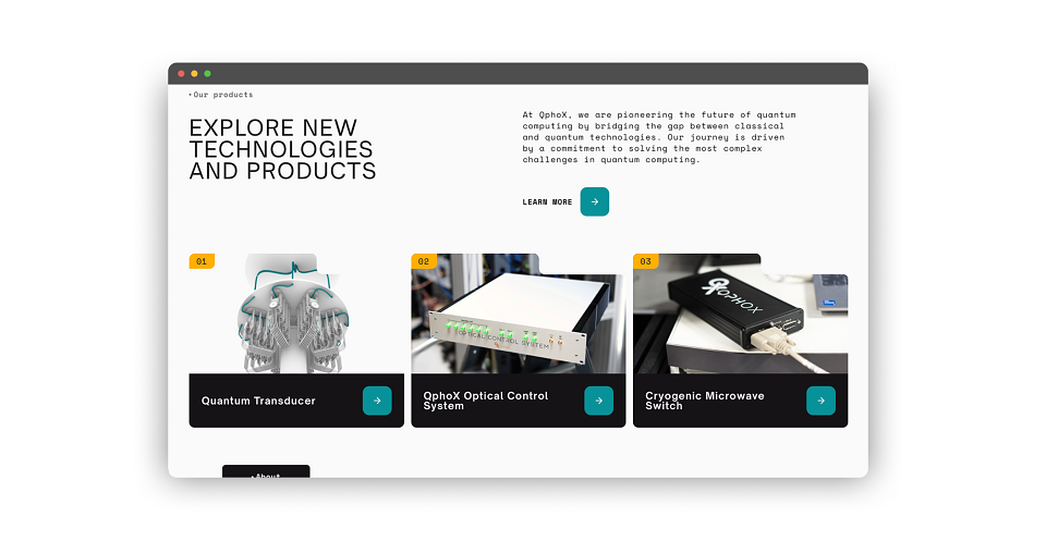
QphoX is bridging the gap between microwave-based quantum processors and optical networks. To support their mission of enabling the quantum internet, the brand needed to evolve from an R&D-focused startup into a commercially mature B2B leader. This strategic shift informed every design decision—from the modular layout system to a technical yet accessible tone of voice.
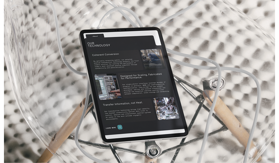
Quantum transduction is inherently complex. The design system had to translate this high-level physics into a clear, accessible narrative without compromising scientific integrity. Furthermore, the system needed to be developed and validated independently of finalized visual assets, requiring a robust framework capable of integrating complex technical imagery as the company’s hardware evolved.
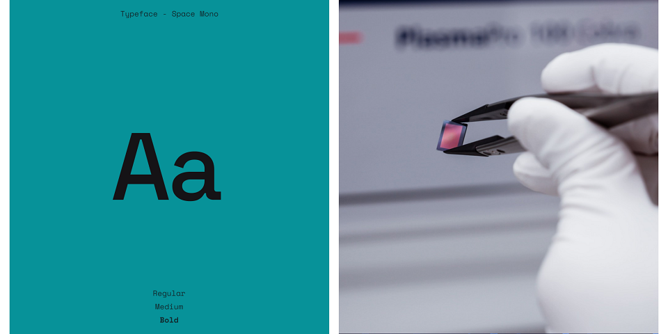
The typographic system combines Open Sauce Sans and Space Mono, balancing clarity with a subtle technical character. This pairing supports both readability and the company’s engineering-driven identity.
A neutral background system is punctuated by Amber and Teal accents. This refined palette provides enough personality to distinguish the brand in a sterile field, while maintaining the focus required for technical documentation and data-heavy interfaces.
Web Design: Maxim Kalinskyy, Valeria Rimkevich
Web Development: Milutin Jovanovich, Alejandro Meschini
Project Management: Hanna Pylypenko