

In life sciences, information is everything. But information alone doesn't change minds, build confidence or move science forward.
How it's communicated matters just as much.
White Papers. Data Sheets. Case Studies.
Familiar formats, often treated as functional necessities. Yet each represents an opportunity to do something considerably more powerful: turn complex scientific information into communication that informs, engages and influences.
For organisations operating across pharmaceuticals, biotechnology, medtech and clinical research, these documents carry real weight. They explain scientific capabilities, present evidence, demonstrate expertise and help people make decisions where accuracy, credibility and understanding are non-negotiable.
And yet, too often, the thinking stops at the content. The information is there. The science is sound. The data is comprehensive.
But the experience of reading it is another matter.
Dense copy. Relentless tables. Charts that require interpretation. Pages competing for attention. Important information buried beneath layers of technical detail.
The challenge isn't to make complex information simpler than it really is. It's to make it easier to understand, navigate and remember.
Start with understanding, not aesthetics.
Designing for life sciences demands more than a good eye and a knowledge of typography.
The audiences are sophisticated. Scientists, clinicians, researchers, procurement specialists and pharmaceutical decision-makers bring different perspectives, different priorities and often highly specialised knowledge to the same document.
They recognise imprecision. They question unsupported claims. They understand the difference between an interesting statistic and meaningful evidence.
You cannot simply dress up the science and expect it to work.
You have to understand what you're communicating, why it matters and what the reader needs to take away. That means getting beneath the surface of the brief, interrogating the content and working alongside scientific and subject-matter experts to establish the story within the information.
Only then can design do its job.
Making data work harder.
Life sciences generate extraordinary quantities of data. Clinical outcomes, performance metrics, research findings, technical specifications, comparative studies and manufacturing capabilities.
But putting information in a table doesn't automatically make it accessible. And presenting a graph doesn't guarantee understanding.
Good information design is about finding the relationships, patterns and points of significance within the evidence.
It's knowing when a comparison deserves visual prominence, when a chart can communicate more effectively than a paragraph and when a simple diagram can make a complicated process immediately understandable.
Typography establishes hierarchy. Colour creates distinction. Scale directs attention. Composition gives information room to breathe.
Every decision has a purpose.
The objective isn't to make data look interesting for the sake of it. It's to make the important things easier to see, understand and retain.
And critically, to do so without compromising scientific accuracy or changing the meaning of the evidence.
White Papers. Authority through understanding.
A White Paper should do more than demonstrate how much an organisation knows.
It should give its audience something worth knowing.
Whether exploring a scientific development, examining an industry challenge or presenting a new approach to an established problem, the document needs a clear argument and a compelling narrative.
Design creates the conditions for that argument to land.
A strong editorial structure establishes the journey. Considered typography makes extended reading more inviting. Data visualisation and scientific illustration bring difficult concepts into focus. Pace and composition prevent the information from becoming overwhelming.
The result should feel authoritative without being intimidating, sophisticated without being inaccessible.
Not a sales brochure wearing a White Paper's clothes, but a considered piece of communication that earns the reader's attention.
Data Sheets. Precision with purpose.
Data Sheets have a different job.
They are working documents. Often consulted rather than read, revisited rather than consumed from beginning to end.
Specifications, product characteristics, technical capabilities and performance data need to be presented with absolute clarity.
The design challenge is to establish an information hierarchy that makes finding, comparing and understanding details effortless.
That means consistency, discipline and a close understanding of how the information will actually be used.
Good design doesn't get in the way. It removes the obstacles.
Case Studies. Put the evidence into context.
Perhaps no format has greater potential to connect scientific achievement with commercial value.
Life sciences organisations have remarkable stories to tell. Complex clinical programmes. Research milestones. Manufacturing challenges. Technologies helping to advance scientific understanding.
Yet too many Case Studies become inventories of services delivered and statistics achieved.
The most compelling stories go further.
They establish the challenge, explain the thinking, reveal the complexity and demonstrate what changed as a result. They connect the technical achievement with the people, patients, researchers or organisations it ultimately serves.
Design brings those elements together.
Strong editorial storytelling, purposeful imagery, carefully selected evidence and meaningful data visualisation create a narrative that makes the achievement tangible.
Because a result is more powerful when people understand what it took to achieve it, and why it matters.
One brand. Many stories. A consistent experience.
For established life sciences organisations, these documents are rarely isolated pieces of communication.
They form part of a much larger brand experience, produced across departments, portfolios, markets and audiences.
Without a considered methodology, inconsistency creeps in. Different layouts, competing visual styles and disconnected approaches to presenting information gradually dilute the brand.
The answer isn't to force everything into a template.
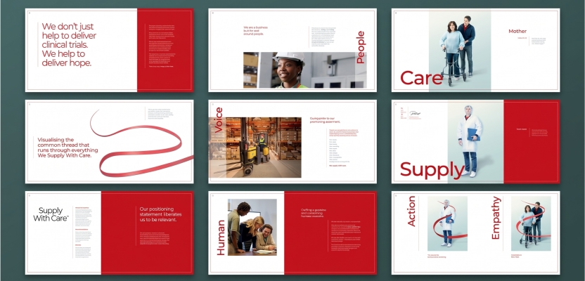
It's to develop a flexible design language that provides structure without sacrificing individuality. One that allows a scientific White Paper, a technical Data Sheet and a commercial Case Study to serve very different purposes while still feeling unmistakably part of the same organisation.
Consistency should create recognition, not restriction.
The thinking behind the page.
Having worked with more than 300 life sciences and healthcare organisations around the world on thousands of documents, we've learned that effective communication in this sector begins long before the first design takes shape.
It requires curiosity about the science, respect for the evidence and an understanding of the people who need to make sense of it.
It means knowing when to challenge the content, when to question a visualisation and when to bring scientific expertise into the creative process. It means understanding that a technically accurate document can still fail if its audience cannot find, interpret or connect with the information it contains.
At The Mission, we bring together strategic thinking, scientific understanding, editorial design and visual communication to make information work harder.
Not simply making documents look better, but making them more useful, more engaging and more effective.
Because in life sciences, the quality of the information matters.
But so does the quality of its communication.
Make the science clear. Make the evidence compelling. Make every page matter.