ABOUT
Unifying global e-commerce.
Hunter Douglas sits behind some of the world’s biggest e-commerce names in window coverings. Its brands – Blinds2Go, Select Blinds and Tuiss – reach millions. Our brief was to unite these businesses under one global design system, position them as clear leaders in a crowded global market, and build a more meaningful connection with consumers.
The challenge: Standing out in a ‘copycat’ sector
Most players compete on range and cost alone, careful not to appear too premium for fear of being undercut. But Hunter Douglas’s brands had more to offer: quality, and a legacy of design-led innovation, including high-profile collaborations.
Operating in this sector, defined by price promotions and copycats, Hunter Douglas faced the challenge of differentiating its leading e-commerce brands – Blinds2Go, SelectBlinds, and Tuiss – which were fragmented under different identities. This lack of consistency prevented the businesses from leveraging their collective reputation, missing the opportunity to inspire consumers and leaving them overwhelmed by technical jargon. To lead the market, the brand needed a unified system that replaced consumer frustration with a meaningful, emotional connection.
The strategy: Reframing a functional category
By shifting the conversation from the product itself to what it enables – light, sleep, and atmosphere – we reframed functional utility into emotional connection. This strategic pivot is anchored in the core philosophy to ‘Play with light,’ a concept that threads together photography, illustration, and language to make shopping enjoyable. Ultimately, the brand purpose is to redefine window décor, empowering customers to transform their homes through high-quality design at surprisingly affordable prices.
The visual and verbal design system
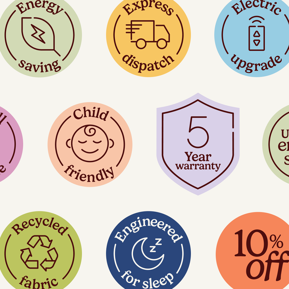
The new tone of voice we developed follows an 80/20 rule, balancing 80% functional clarity with 20% creative wit. This ‘warm, bright, and light at heart’ tone elevates standard sales messages with emotional hooks, such as pairing blackout blind discounts with the promise of better sleep.
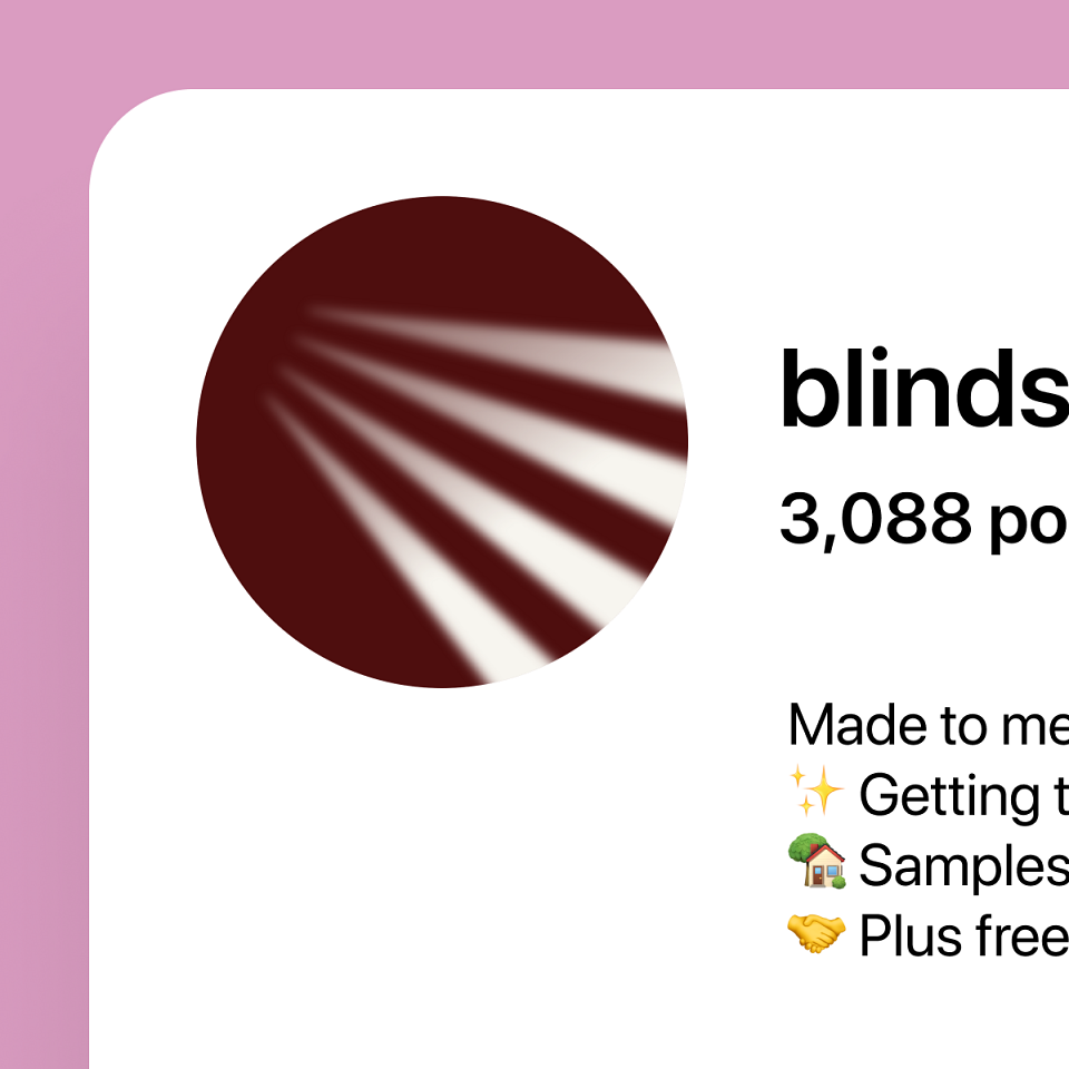
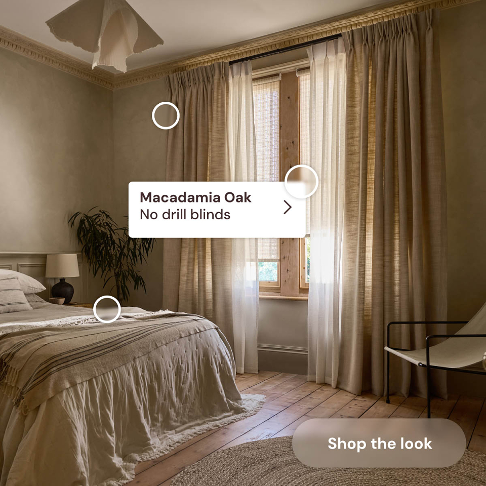
The visual system uses a primary palette of Dark Wood and Ivory. A supporting palette of ‘moments’ – including Morning Glow, Golden Hour, and Dusk – is inspired by natural light cycles to set specific moods within a home.
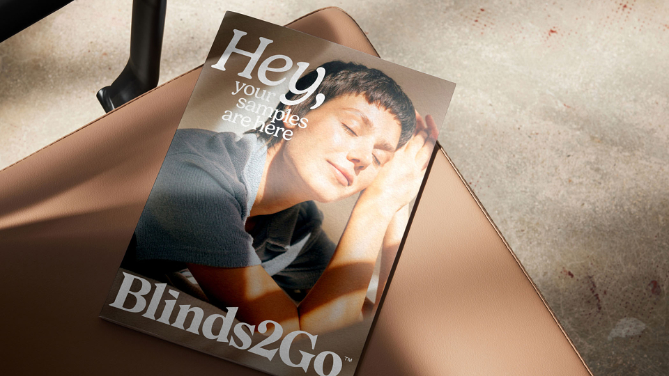
Photography has shifted from sterile product shots to cinematic lifestyle imagery set in lived-in homes. By using natural light to enhance textures and show ‘everyday joy,’ the brand highlights emotive benefits over simple mechanics.
To reflect that light never stands still, the brand features a dynamic motion system with animated sunlight. Used as backgrounds for digital platforms, these beams add movement that mimics light filtering through blinds without distracting the shopper.
The Results
A global e-commerce design system: our work set the design blueprint for the Hunter Douglas e-commerce blinds portfolio, aligned with a new online platform to improve conversion.
A clarified market positioning: we elevated the brand from a value-led retailer to a design-led authority.
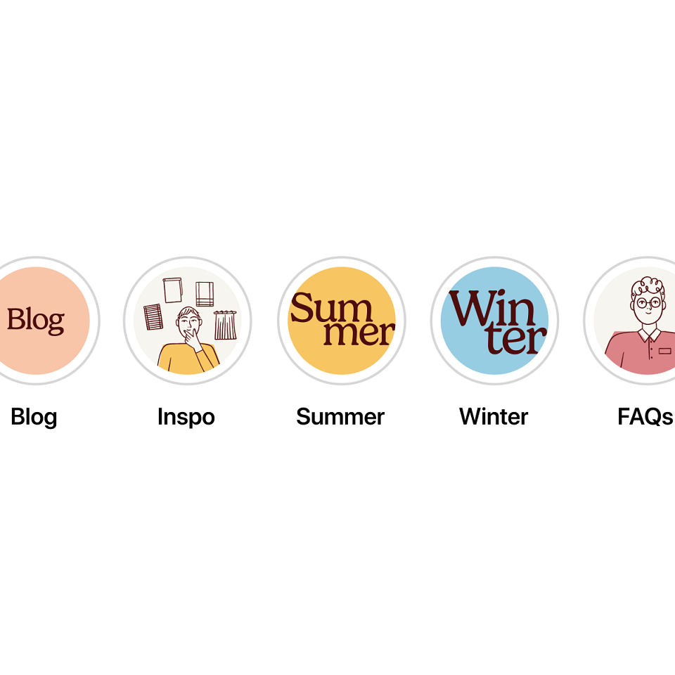
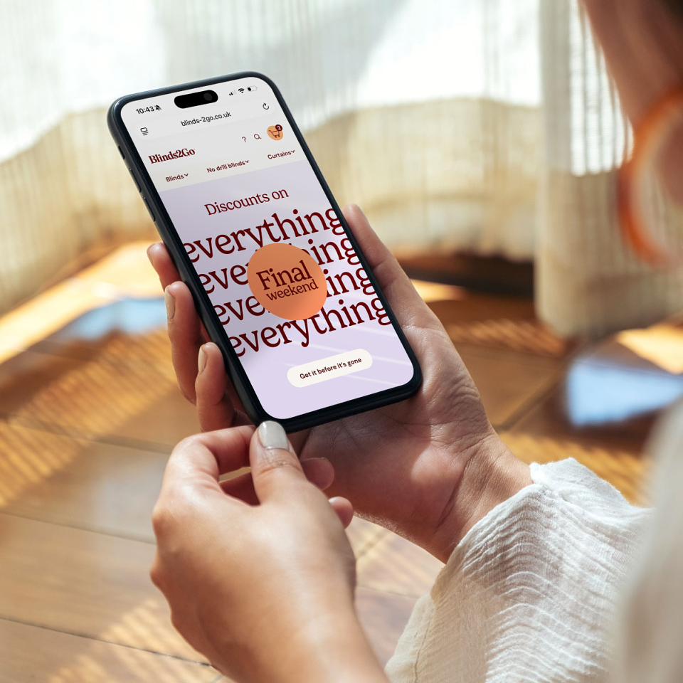
An integrated, omnichannel system: our work extended to provide the platform for seamless rollout across Instagram, TikTok, and primetime broadcast slots.
Disciplines:
Brand strategy & architecture
Visual identity
Tone of Voice
Campaign blueprinting & creative strategy