

When Moa Technology (a biotech scale-up spun out of Oxford University) needed a brand that could match the ambition of its science, they turned to The Clearing; a team that understood how to turn complexity into clarity. Facing a tight deadline and a crucial round of Series C funding, Moa asked for more than a website—they needed a bold identity to stand out in a crowded, conventional market.
Managing Director Amanda Kubale and Creative Director Pete Dewar led a collaborative creative process that translated microscopic science into a powerful, human story: solving one of the world’s biggest agricultural crises by thinking small.
What was the brief?
Moa Technology are a pioneering agricultural biotech firm. Spun out from Oxford University, they are a group of scientists and industry experts who are revolutionising the way herbicides work. Creating a new generation of weed resistant and environmentally friendly herbicides to help farmers protect their harvests.
They came to us as a scale-up, at a point when they’d completed their Series B funding and were preparing to start their Series C funding. To attract and secure new investment, they needed a brand positioning and identity that could stand out in an increasingly competitive and complex category with a compelling story to the market and a new website as a primary vehicle for the new brand.
How did the initial pitch/brainstorming phase go?
We already had an established relationship with the client having worked together on a previous brand, so they trusted us and were keen to work together. However, they needed to reassure their senior stakeholders, which we were able to do through case study examples and a water-tight process.
We selected case studies that had a lot of parallels to their world; B2B tech brands with complex products & processes that were struggling to communicate their offer succinctly.
What was the process behind ideating the concept?
Our approach is always to have consultants, writers and designers working together, coming at the brief from different perspectives to solve a problem based on deep insight. From early in the process, we’re putting strategic ideas on the table and visualising different scenarios so clients can quickly get a feel of what they mean.
An important part of this is to understand the category generics. All Moa’s peers claimed to have revolutionary ambitions, proprietary platforms, the best people and a commitment to sustainability. Their stories communicated the science – with pictures of people in labs and a proliferation of ‘earthy’ stock imagery (seeds, saplings, fields). We used this to identify where they should ‘fit in’ (using enough of the category codes to demonstrate credibility) and where they could ‘stand out’ (to demonstrate their point of difference).
We presented two very different routes, both of which focused on the tangible outcomes Moa were looking to achieve. One route centred on the growing challenge of weed resistance and the innovation needed to overcome this. The second route presented a more macro view – identifying the growing risk to global food security and the need for a leader in the industry to empower farmers across the globe. This is the route they selected.
What was the production process like?
Quick! Other than a logo, Moa came to us with no brand identity elements, and they needed a new website live in four months. Which meant building a website from the ground up, including all brand assets and web copy.
What was the biggest challenge during production? How did you overcome it?
Timing was the biggest challenge, and the way you overcome that is to work collaboratively, not in a linear way.
Another challenge was about being able to simplify and tell the right part of the story that would motivate their different audiences (from investors and partners through to the farming and scientific community).
What kit/tools/software were used to create the project?
We were using Figma on a daily basis, we needed to make sure the website felt real as soon as possible. This meant the client team was able to test it at very early prototype stage, rather than just looking at static visuals.
What’s the main message of this project and why does it matter?
Although they are looking at herbicides at a molecular level, the impact of what Moa are doing is huge. There hasn’t been a new herbicide on the market in decades and weed resistance is growing, which threatens famers’ harvests, and ultimately global food security, biodiversity and our climate.
A good comparison to the work Moa are doing is to look at antibiotics, which need to keep evolving to stop bacteria building up resistance and becoming fatal. The same applies to weed resistance, weeds could take over crop supply, leading to global food shortages.
Moa may be a company that most people will never hear of, but for us it was about communicating the bigger picture of their work, and the impact it will have on everyone’s life.
Can you describe the creative spark or inspiration behind the initial concept? Was there a specific moment or insight that ignited the idea?
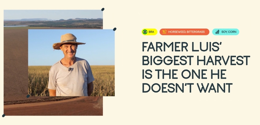
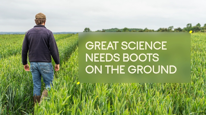
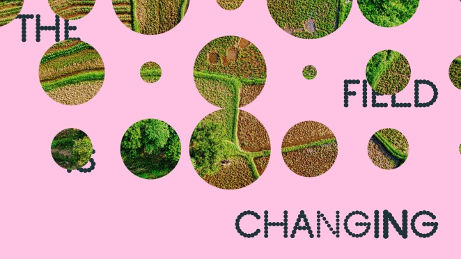
The inspiration was based on the idea ‘that to solve one of the world’s biggest challenges, you need to think small’. This inspired the visual identity by looking in at a molecular level, creating a graphic device using circular shapes representing molecules. As they expand, they show the bigger picture, becoming a window into the world of real farmers dealing with real problems. This made them an essential part of the story showing the real and tangible impact of Moa’s work.
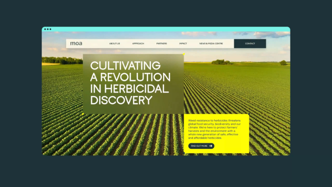
The identity is there to build and communicate the brand strategy. At the heart of this story is a brand promise: to help farmers, investors, and colleagues harvest their full potential—whether that means growing healthier crops, making smart investments or building rewarding careers. It is designed to present Moa as smart, innovative and progressive. At the cutting edge of herbicide development – but able to connect with all their audiences and demonstrate the vital nature of their work and what it will achieve.
How did you ensure that the concept aligned with the brand's values, goals, and target audience?
The way we work is to always make sure that our creative decisions are rooted in the strategy and insight. We test creative ideas early in the process to make sure the approach works, and we follow the mantra that everything we do is for a reason.
What role did consumer research or market analysis play in shaping the concept and its execution?
We looked at the market, identifying what the patterns or tropes are and how Moa can stand out.
We gained a lot of insight at the beginning from having conversations with the Moa team, who knew the science, the scale of the challenge, the needs of investors and had first-hand experience being in the field alongside farmers trying to understand why their crops were failing.
Can you discuss any unique or unconventional production techniques or approaches used to bring the idea to life?
We enabled the client team to access the Figma files so they could suggest changes directly in the live files. We also created a live text document so that we could work collaboratively alongside the client to generate content, review it and make edits.
We prioritised pages so that they could be designed whilst content was still being developed for other pages.
What do you hope it achieves for the brand?
The next step for the brand is to secure their Series C funding, to enable them to scale their business further and deliver the next generation of safe and effective herbicides that will provide greater food security – helping farmers produce more crops, more environmentally and efficiently.

From a brand perspective, the aim was to show that just because your organisation is in a serious market, tackling a serious challenge, it doesn’t mean your brand can’t be different and exciting. You can have a clear point of view and demonstrate it with imagination, creativity and credibility.
Credit list for the work?
Jonathan Hubbard, Creative Director (Design)
Pete Dewar, Creative Director (Brand Language)
Amanda Kubale, Managing Director
Piyush Aggarwal, Strategy Director
Oliver Bielby-Smith, Designer
Alex Courbat, Writer