The Collaborators
Bristol
ABOUT
BACKGROUND & BRIEF
Inspired by Latin American food and born from a market stall, Capsicana is now listed in all major UK supermarkets and owned by AB World Foods.
The 2025 packaging refresh represents the latest chapter in the brand’s evolution, although it began in 2021 when we first worked with the team. Our brief: to sharpen positioning and create a brand world (excluding logo and packaging) that captured the spirit of Latin America.
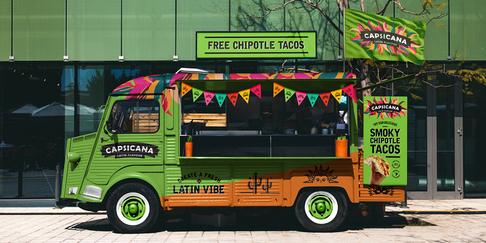
Our early work established the core idea – Create a Fresh Latin Vibe – and distinctive look that continues to drive the brand today. For the latest refresh, our task was to bring the vibrancy and emotion of the brand world into packaging to build equity, drive standout, improve navigation and create cohesion across an expanding range.
OUR SOLUTION
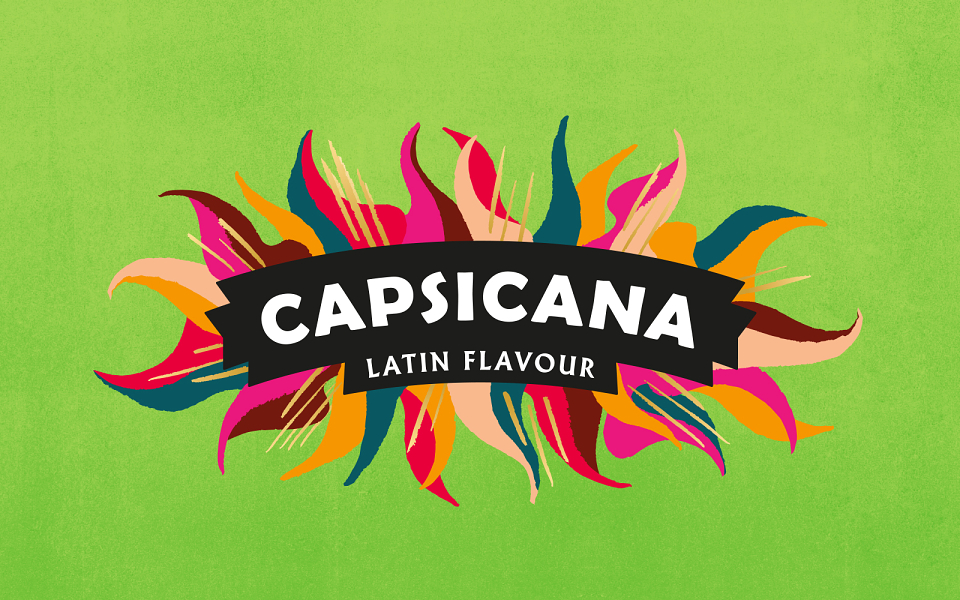
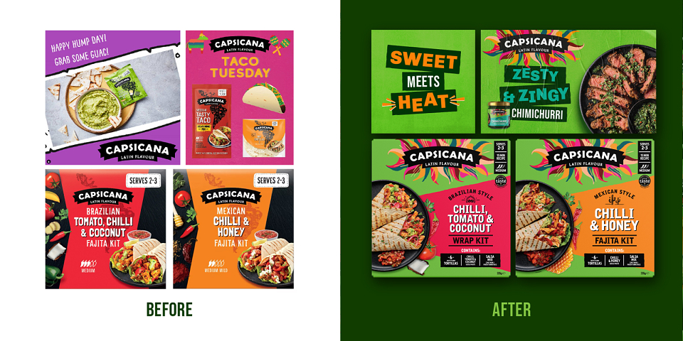
Visually and strategically, the refresh builds on our original branding work. We’d created a dynamic logo lock-up of flames and sparks – a visual metaphor for the flavour and passion of Latin America – along with a citrus-green brand colour, bold type and a confident, upbeat brand voice. Previously used off-pack only, the refresh brought these elements onto pack and elevated them to the next level.
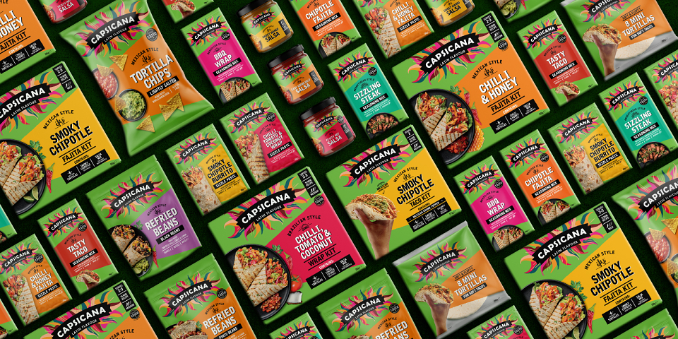
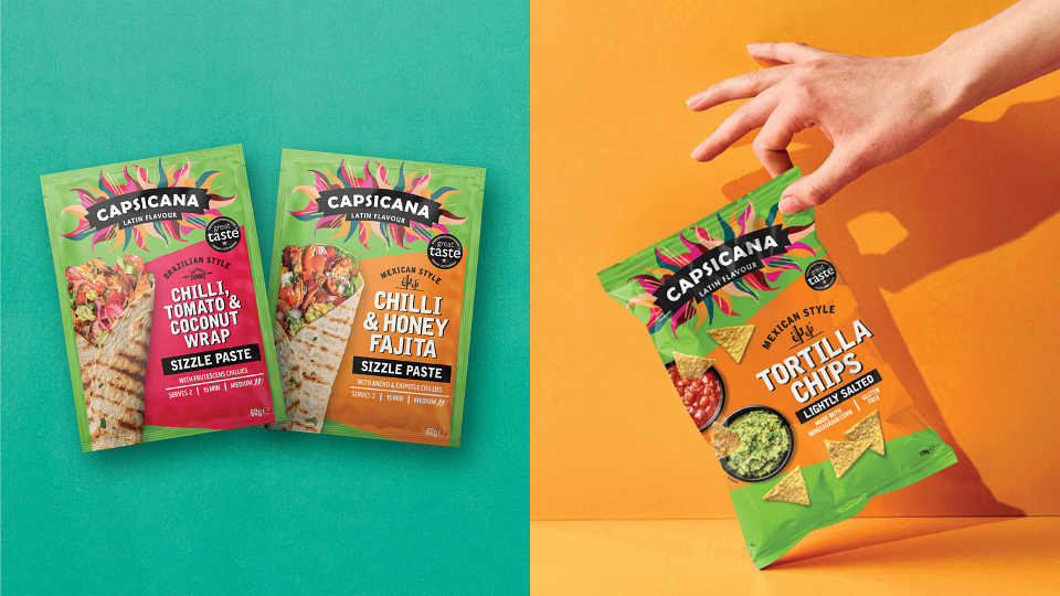
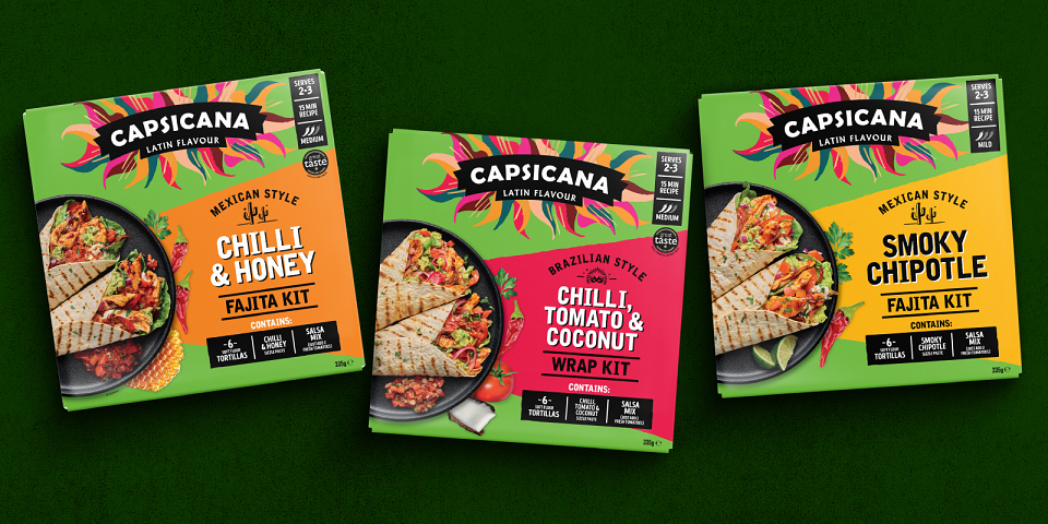
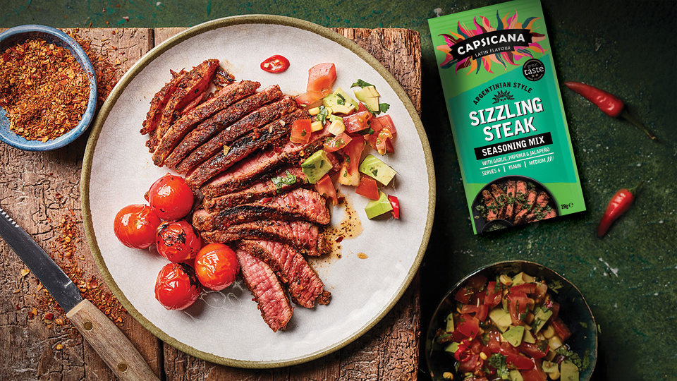
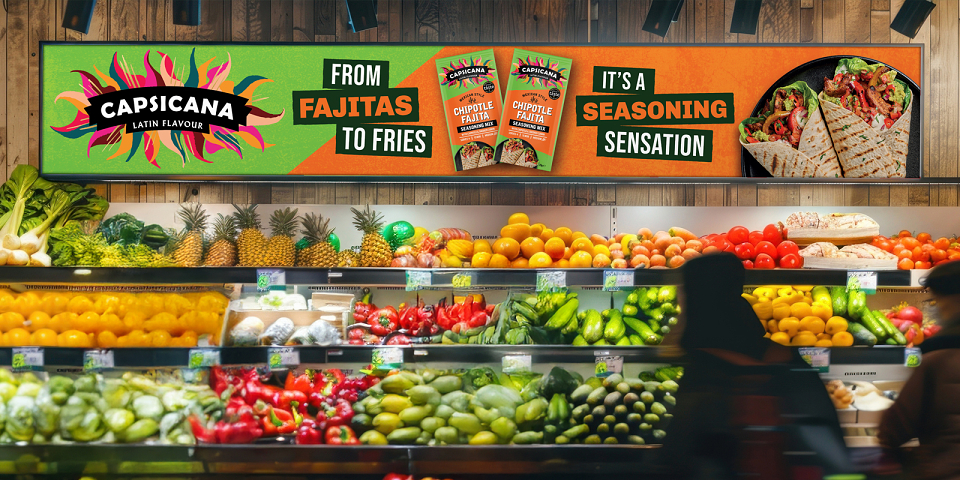
We intensified the signature zingy green to deliver brand blocking and stand-out. Vibrant shards of colour create a joyful fiesta-feel at fixture and differentiate flavours. We refined messaging hierarchy and emboldened type to shift focus from the product format to Capsicana’s superpower – flavour! Product photography is fresher and more inspiring, whilst illustrative icons celebrate provenance and aid navigation.
RESULTS
Our original strategy and brand world project contributed to Capsicana securing listings in all leading UK supermarkets and its acquisition by AB World Foods.
The 2025 refresh and new packaging amplify its impact, bringing every part of the brand together – strategically, visually and emotionally.