Taxi Studio
Bristol
ABOUT
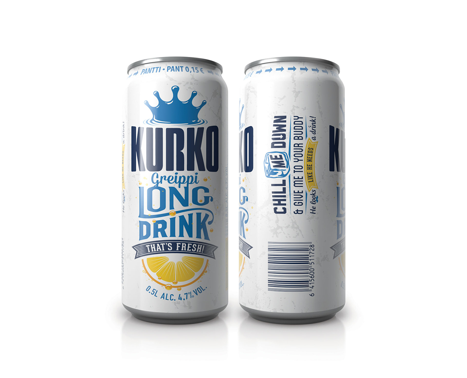
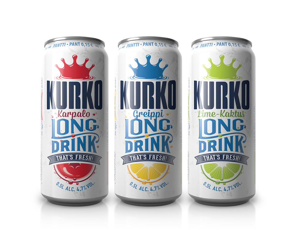
Existing packaging for long drink Kurko was deemed too masculine and lacked appeal among target consumers. Somewhere between evolution and revolution was in order; optimising brand equities to make it more modern, witty and relevant to a unisex audience. Kurko’s key equity (the crown logo) had to remain untouched.
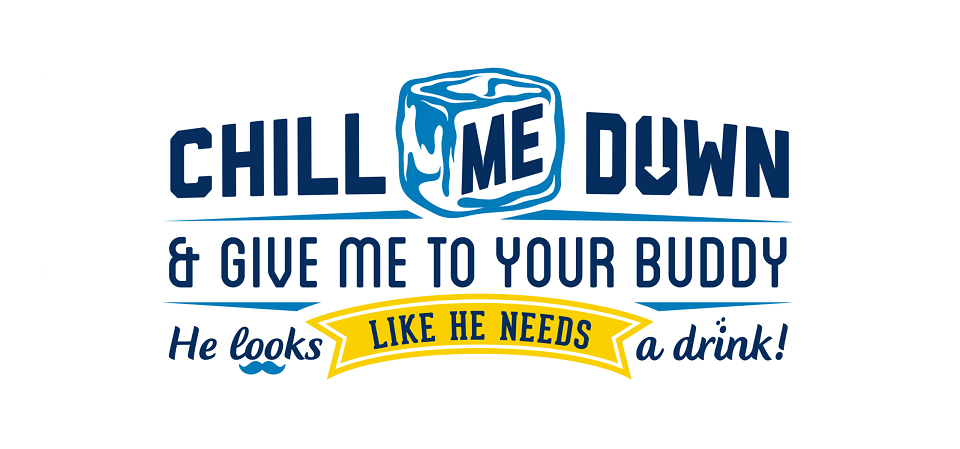
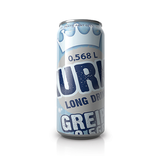
Slang for ‘King’, the word ‘Kurko’ is used among friends to give praise. This insight inspired us to create a conversation on-pack. We developed a proprietary typographic style that flows like friends chatting to each other. Then we ignored the client’s brief by reimagining the crown, adding a touch of wit along the way.