Taxi Studio
Bristol
ABOUT
Counterpoise, formerly known as CPW (Counterpoise Wellness), is a one-stop hub offering personalised mental health support at a time when this has never been more important. Its’ practitioners are real people who understand the complexity of the mind and the human condition. Our task was to rejuvenate CPW, bringing a sense of humility and highlighting its human-focussed accessible offering.
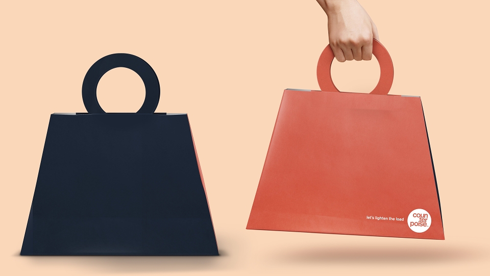
Our solution features a bold-yet-playful identity that splits the brand name into its syllables, highlighting the word’s ‘read’ while simultaneously challenging the mind. The simplified name, ‘Counterpoise’, projects their purpose more succinctly and with empathy – the key attribute that underpins the brand’s reason for being, shifting its essence from clinical to approachable. Balancing each syllable on top of each other represents the ‘load’ we all face.
“The new identity brings warmth to our brand, reminding those who need it that we are here to help them, and it doesn’t have to be a daunting battle with unsympathetic gatekeeping. We are so pleased to have a new look and suite of playful assets that suits our mentality of inviting those who need it to seek help, regardless of their background and experiences.”
- Kitty Alice, Counterpoise practitioner
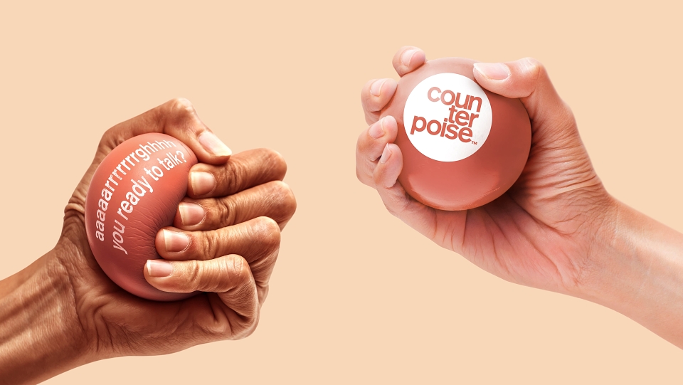
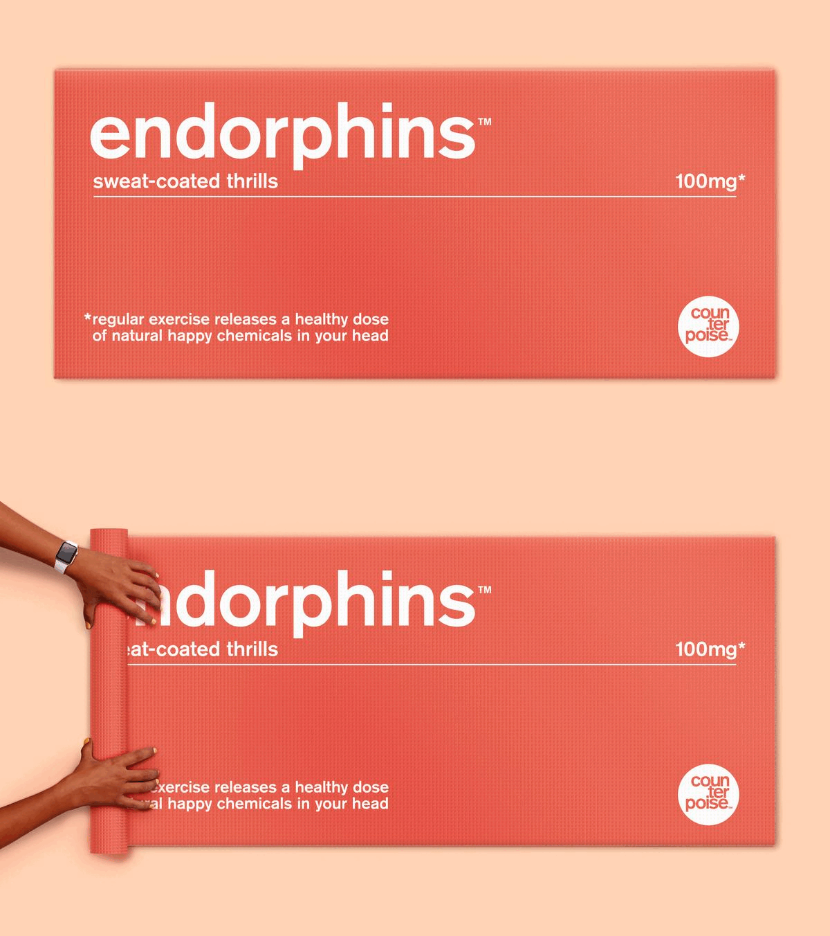
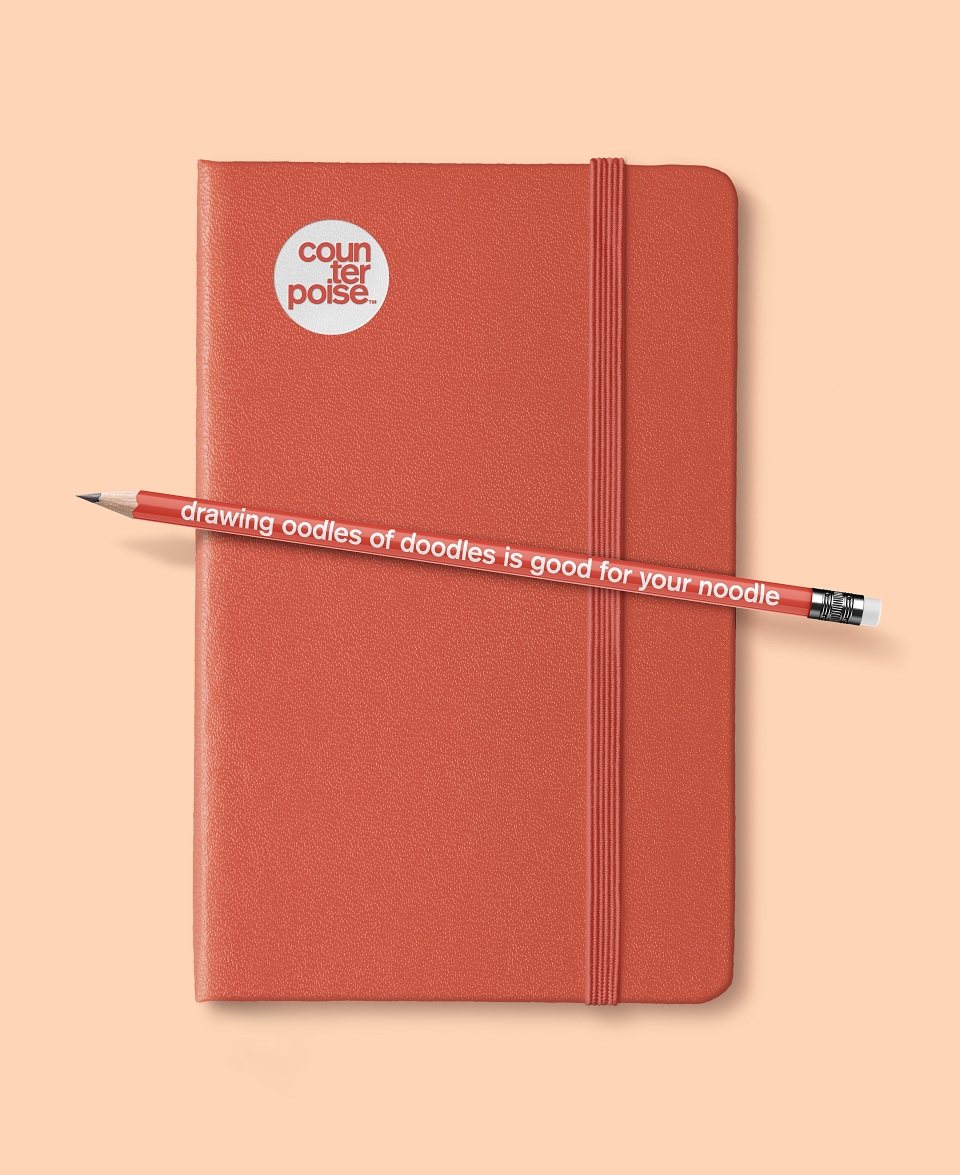
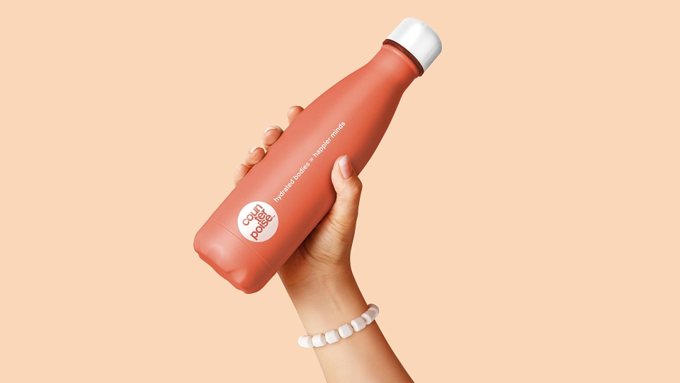
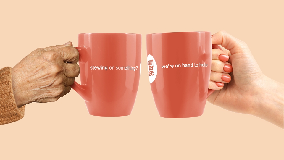
The flexible identity system arms the brand with a suite of ‘positive reinforcement’ assets – one in which the medium becomes the message, entrenching the brand in people’s everyday lives.
Each promotional item is carefully considered to reinforce the things people can do to support their mental health in simple ways.