Tatiana Berezina
Designer
ABOUT
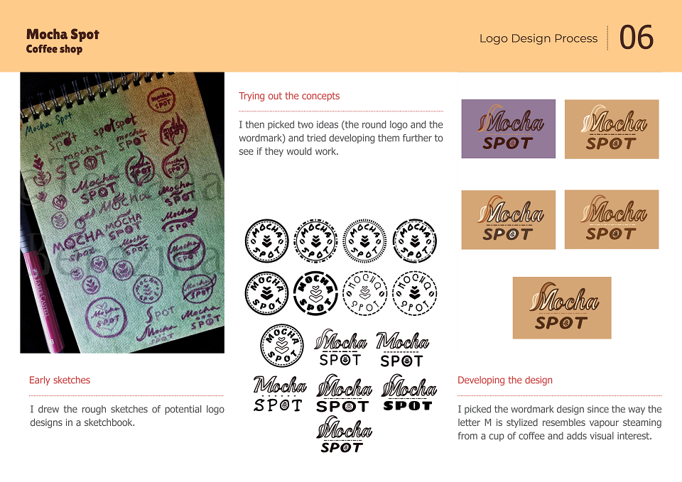
Early sketches:
I drew the rough sketches of potential logo designs in a sketchbook.
Trying out the concepts:
I then picked two ideas (the round logo and the wordmark) and tried developing them further to see if they would work.
Developing the design:
I picked the wordmark design since the way the letter M is stylised resembles vapour steaming from a cup of coffee and adds visual interest.
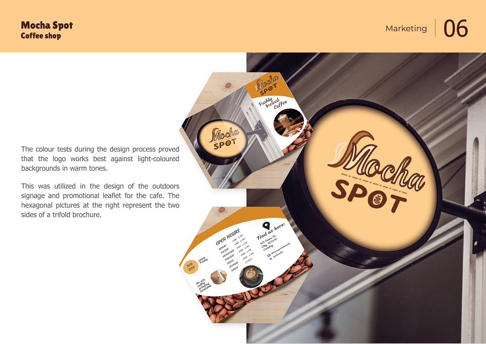
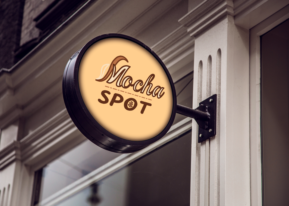
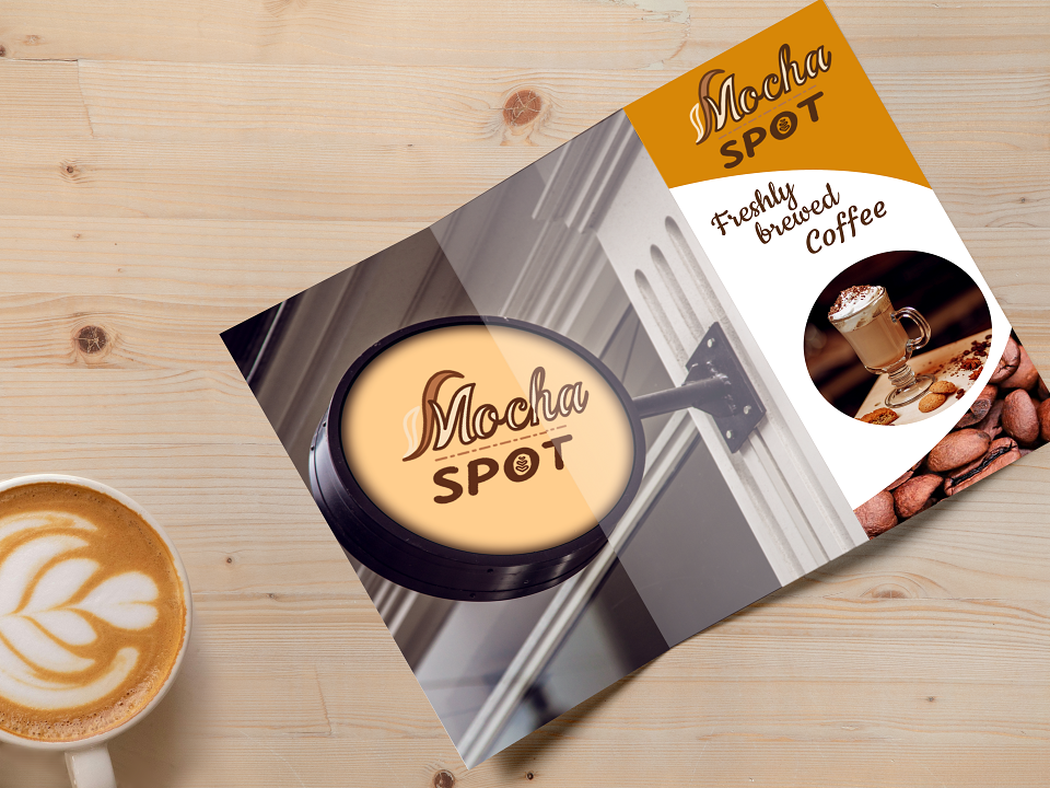
The colour tests during the design process proved that the logo works best against light-coloured backgrounds in warm tones.
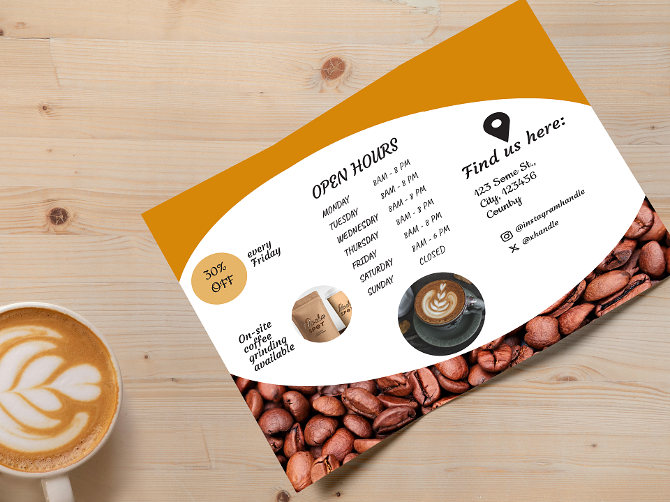
This was utilized in the design of the outdoors signage and promotional leaflet for the cafe. The hexagonal pictures represent the two sides of a trifold brochure.
MADEIT CREDITS
-

Tatiana BerezinaLogo Design