Tatiana Berezina
Designer
ABOUT
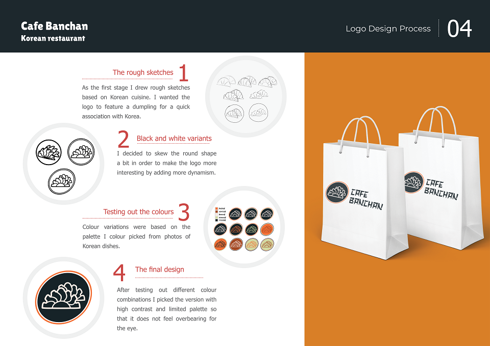
1) The rough sketches
As the first stage I drew rough sketches based on Korean cuisine. I wanted the logo to feature a dumpling for a quick association with Korea.
2) Black and white variants
I decided to skew the round shape a bit in order to make the logo more interesting by adding more dynamism.
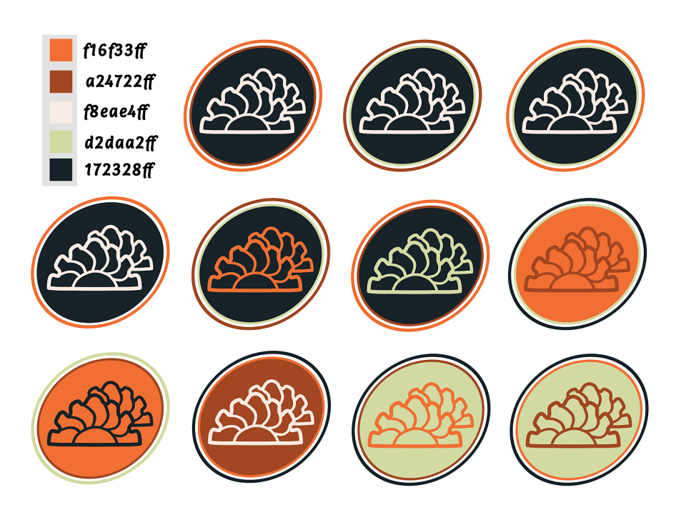
3) Testing out the colours
Colour variations were based on the palette I colour picked from photos of Korean dishes.
4) The final design
After testing out different colour combinations I picked the version with high contrast and limited palette so that it does not feel overbearing for the eye.
MADEIT CREDITS
-

Tatiana BerezinaLogo Designer