Tanya Be
Branding Designer
ABOUT
BRAND OVERVIEW
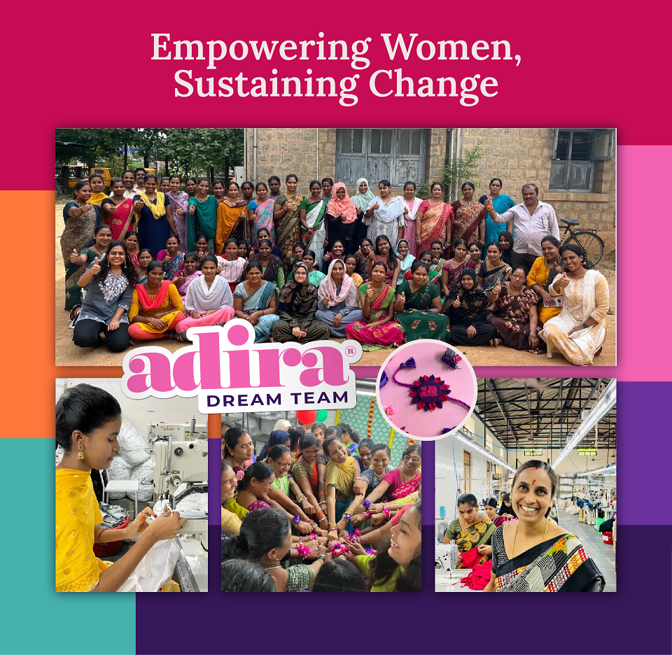
Adira is a well-established brand specializing in high-quality functional underwear for women, designed to support them through life’s vulnerable moments, such as puberty, maternity, and menopause.
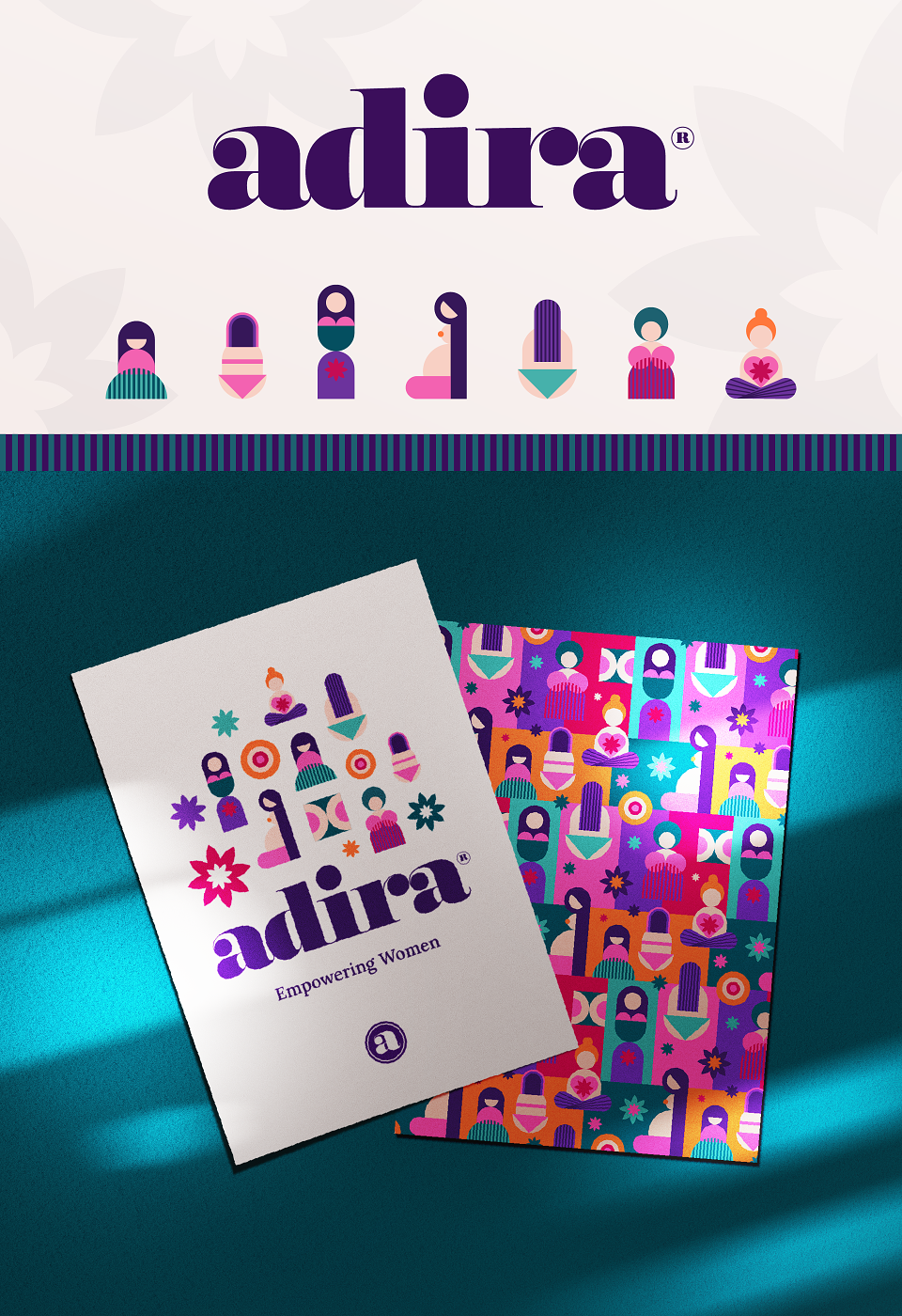
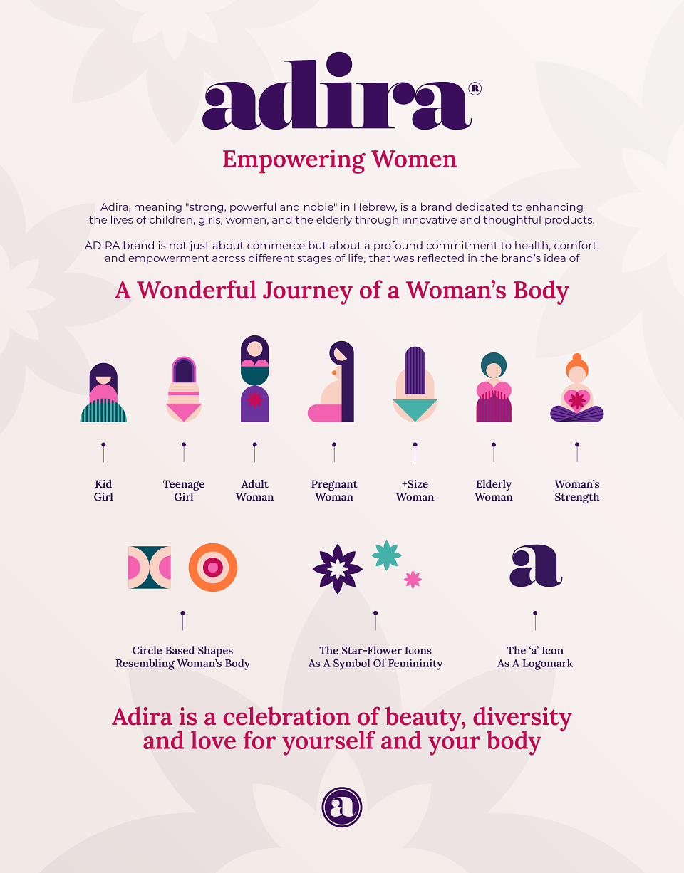
The name Adira, meaning "strong, powerful, and noble" in Hebrew, encapsulates the brand’s essence — enhancing the lives of women across all ages through innovative and thoughtful products. Adira is a celebration of beauty, diversity, and self-love.
Despite its strong mission and exceptional product offering, Adira required a comprehensive and impactful brand identity system to consistently communicate its values and attract an even more loyal audience.
CLIENT’S REQUIREMENTS & CREATIVE TASK
Requirements
The existing Adira logo had to be retained due to its established recognition.
A new visual communication system needed to be developed around it.
Creative Direction
The challenge was to visually represent the evolving journey of a woman’s body — an experience that is inspiring yet not always physically easy. The design needed to convey:
Empowerment & Comfort
Strength & Support
Confidence, Trust & Self-Love
A Sense of Homecoming
The brand should look simple yet classy, bold yet soft, engaging, and inspiring. It should reflect care, comfort, and empowerment — steering clear of any objectification of women.
Branding Goal
To build a strong emotional connection with customers, ensuring their loyalty to Adira throughout different life stages and product needs.
Target Audience
Adira’s wide product range caters to women of all ages, including those with specific health concerns. The typical customer is:
Worldly wise, values intellect and capability
Self-loving, confident, and socially active
Comfortable with online shopping
Engaged with social content
PROJECT EXECUTION
Visual Concept
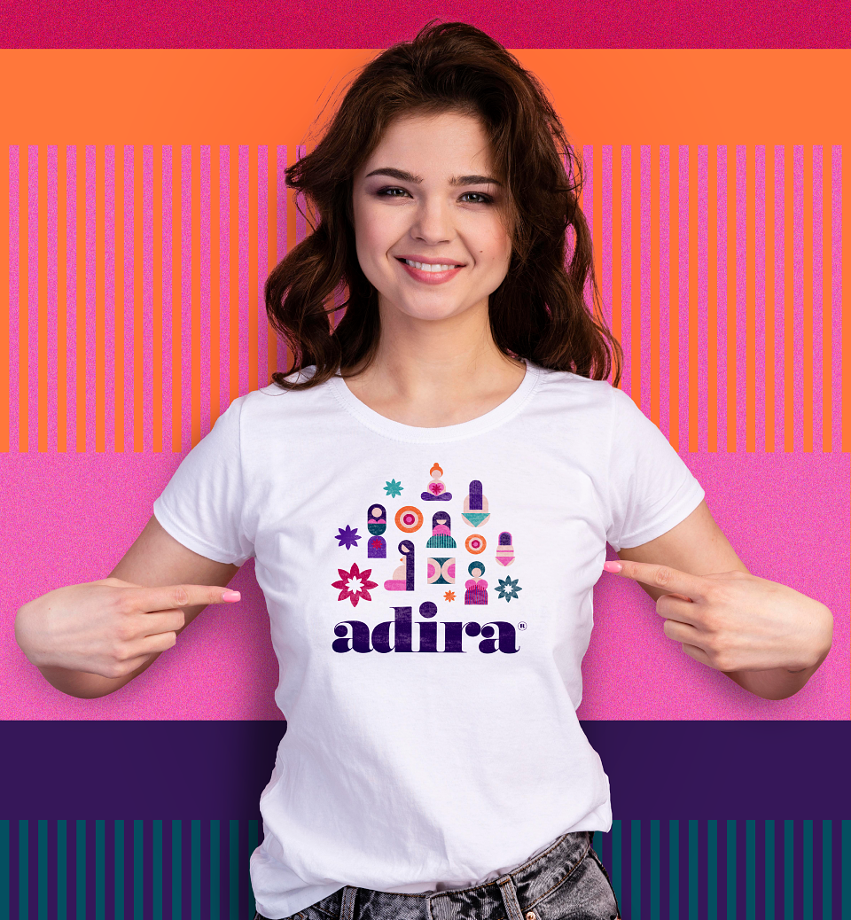
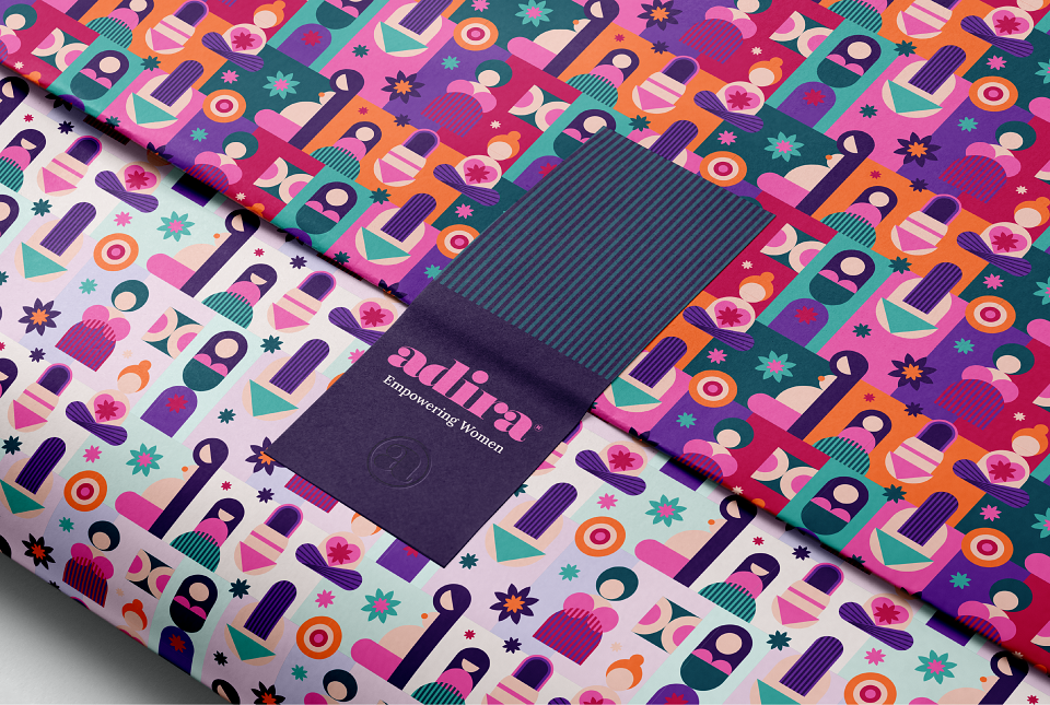
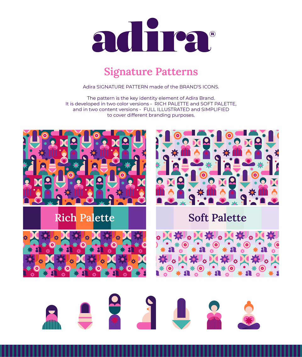
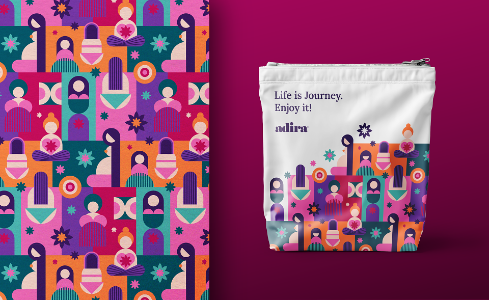
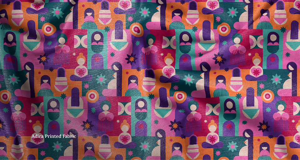
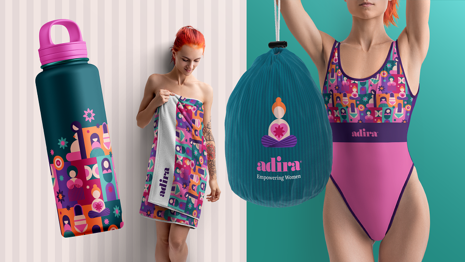
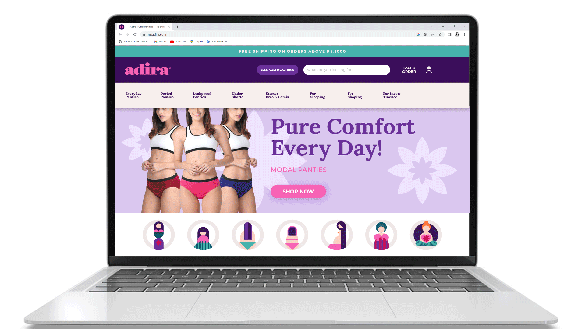
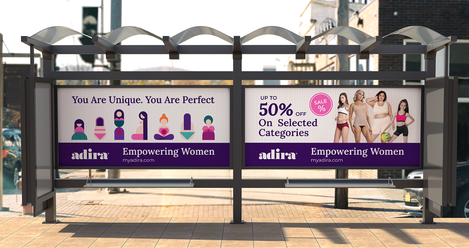
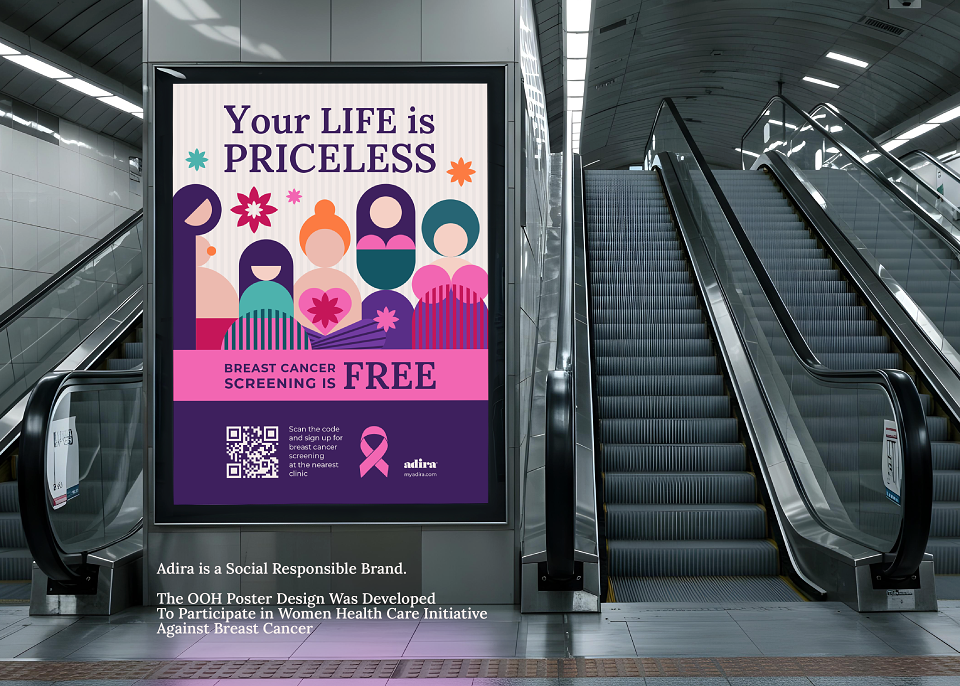
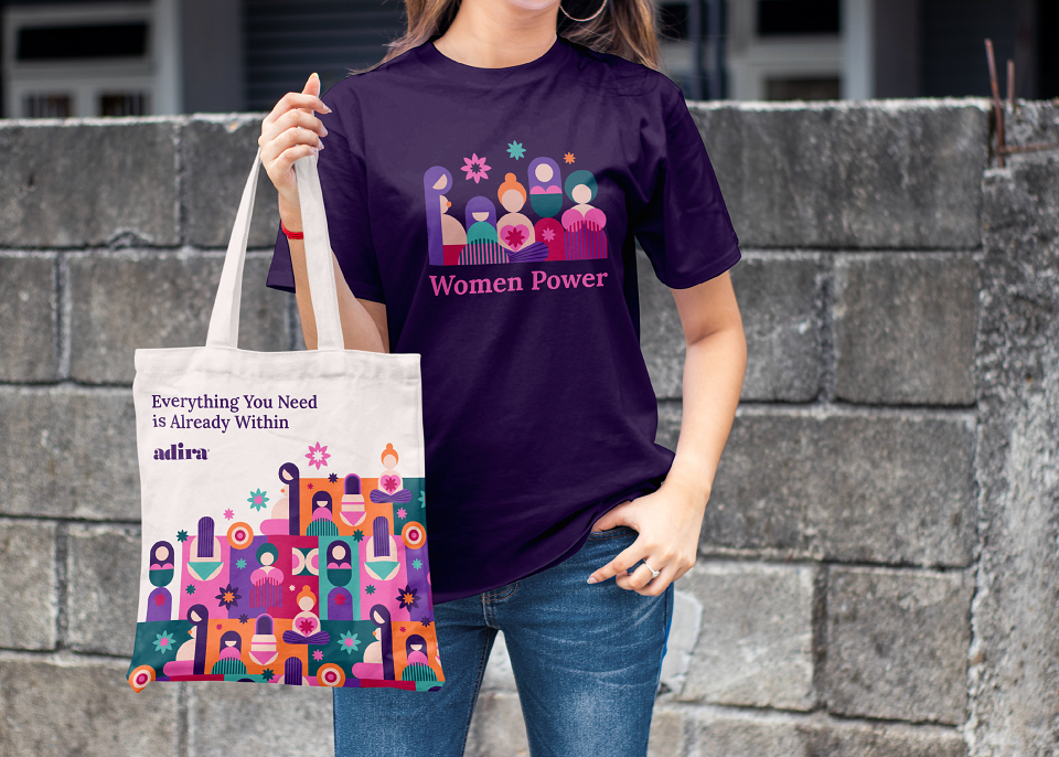
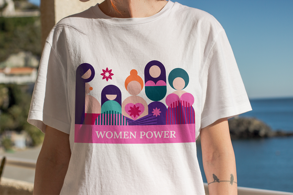
Trying to encapsulate the brand’s idea in the most impactful yet simple and appealing way, I decided to create illustrations representing each stage of a woman’s life — from a baby girl to a senior woman. The illustrations are geometrically built in a minimalistic style; they resemble symbols rather than images, yet at the same time, they are instantly recognizable and emotionally convincing.
Combined together, united by a single strong idea and bold visual style, impactful in their simplicity, the illustrations became a core element of the new visual identity for the Adira brand. Consistently used across different touchpoints, they are designed to enhance emotional connection with the target audience and contribute to the brand’s recognizability and its ability to stand out from competitors.
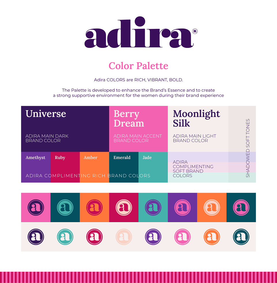
Color Palette & Typography
A well-curated color palette and typography are crucial for an effective brand identity. My selection prioritized both visual appeal and functional efficiency.
Color Palette:
A set of bold, vibrant colors reflecting Adira’s strength, confidence, and empowerment.
Complementary shades ensure adaptability across different brand applications.
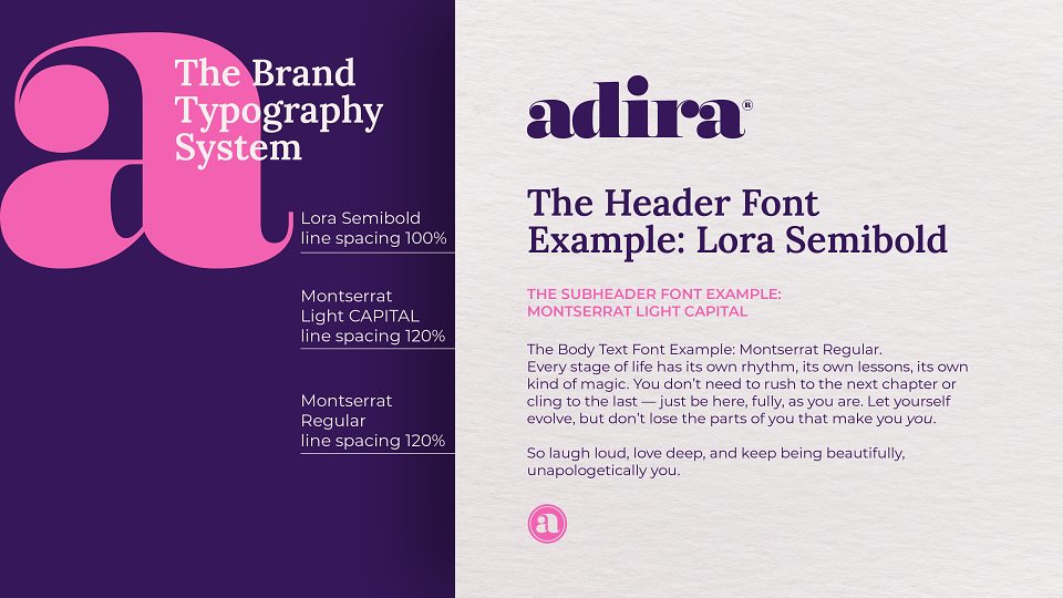
Typography:
Lora (Serif): The primary font, chosen for its modern yet warm feel, subtle calligraphic roots, and high readability — a crucial factor given the brand’s diverse audience, including elderly women.
Montserrat (Sans-serif): used for body text, offering a clean, timeless, and highly legible complement to Lora.
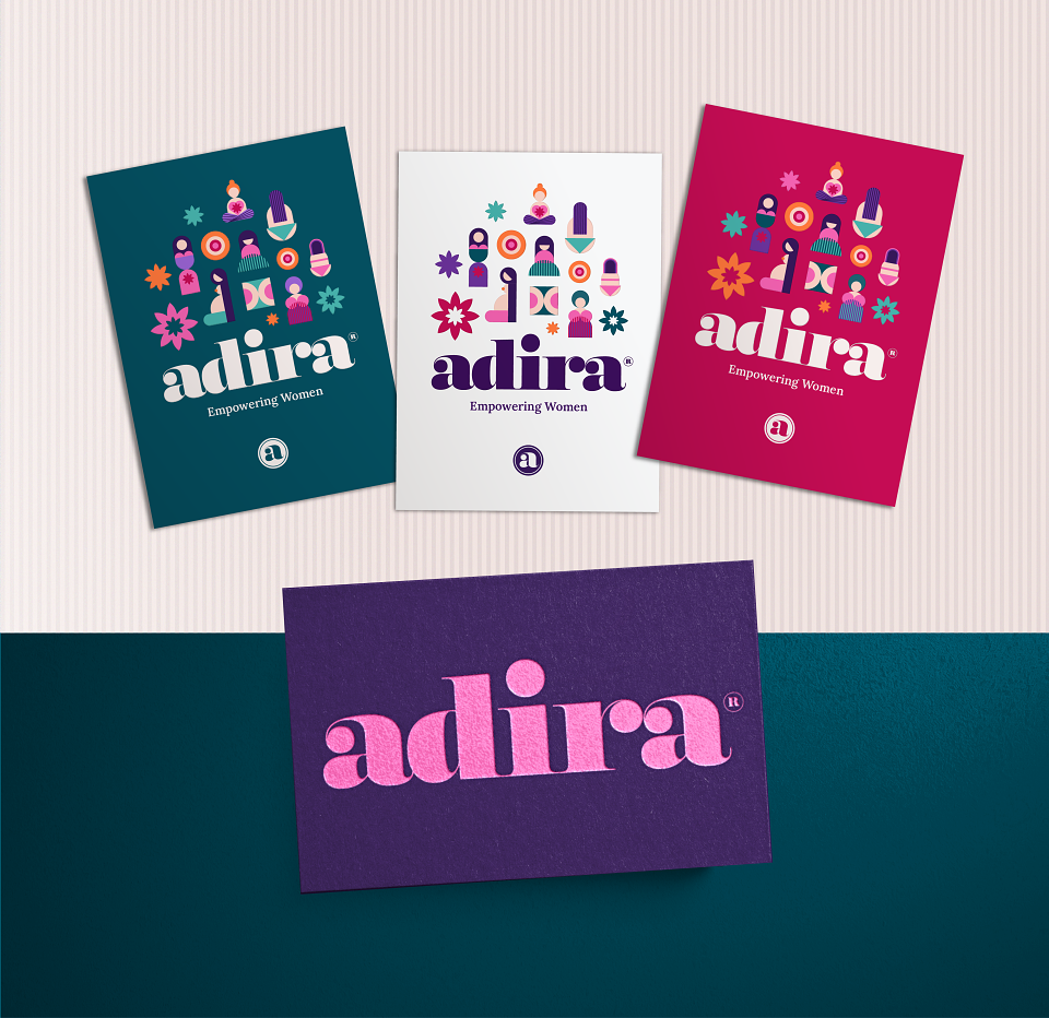
Brand Graphics & Design Elements
Expanding on the core illustrations and color palette, I developed a functional and versatile visual system that works consistently, enhancing the brand’s presence and synergetically enforcing it’s impact.
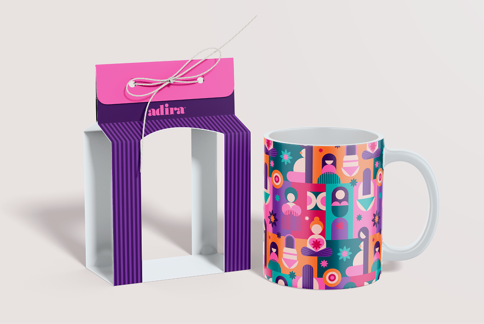
Thus I developed a Signature Brand Pattern — a dynamic, flexible pattern made from core illustrations, adaptable for various product lines and branding needs, and supporting graphic elements: stripped backgrounds, shapes and refined textures to enhance visual engagement.
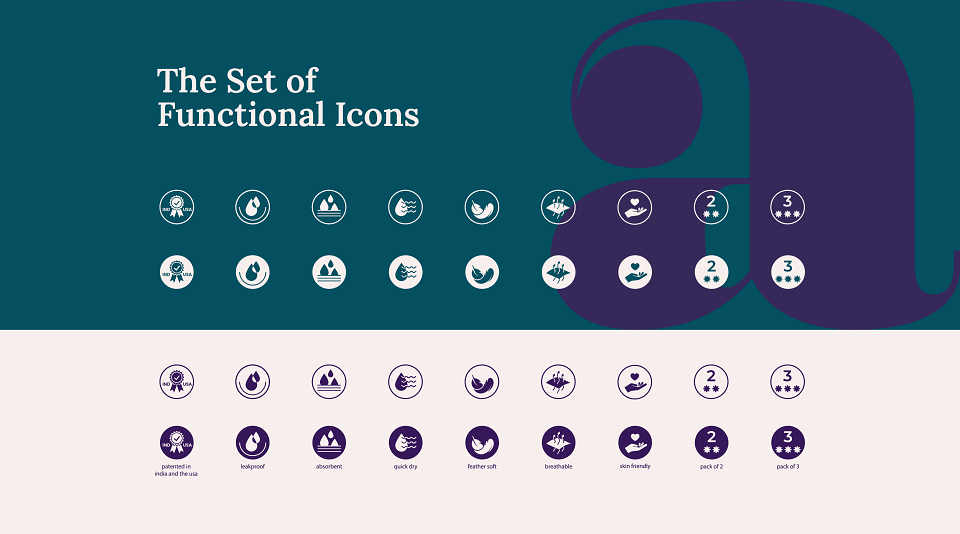
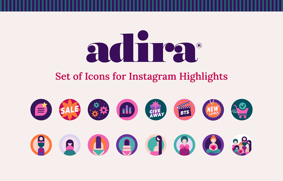
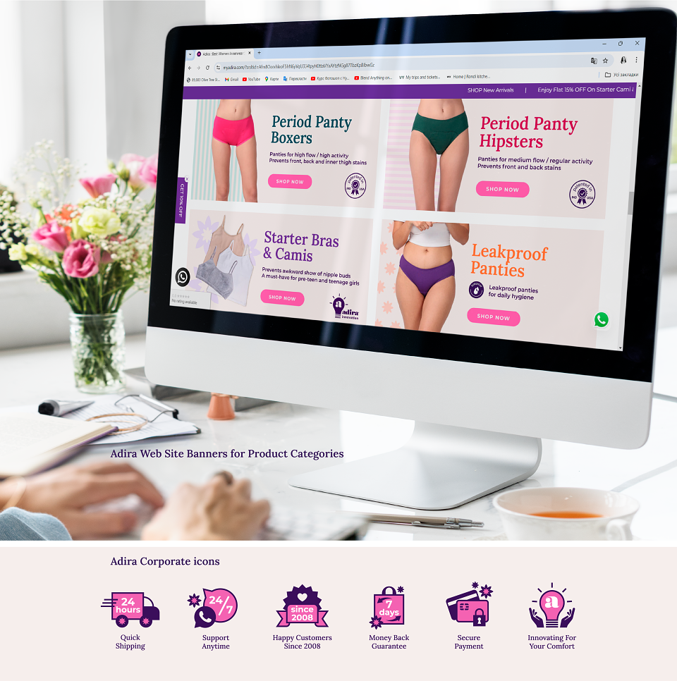
Also I thoroughly crafted a set of Functional Icons: a custom-designed set of icons representing product features and service advantages, available in different versions for seamless application.
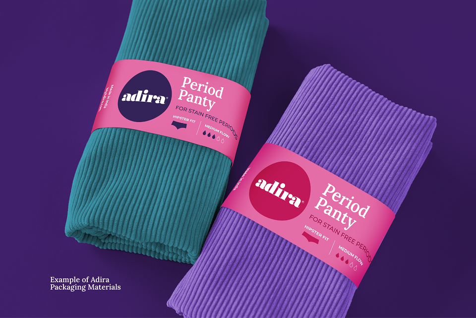
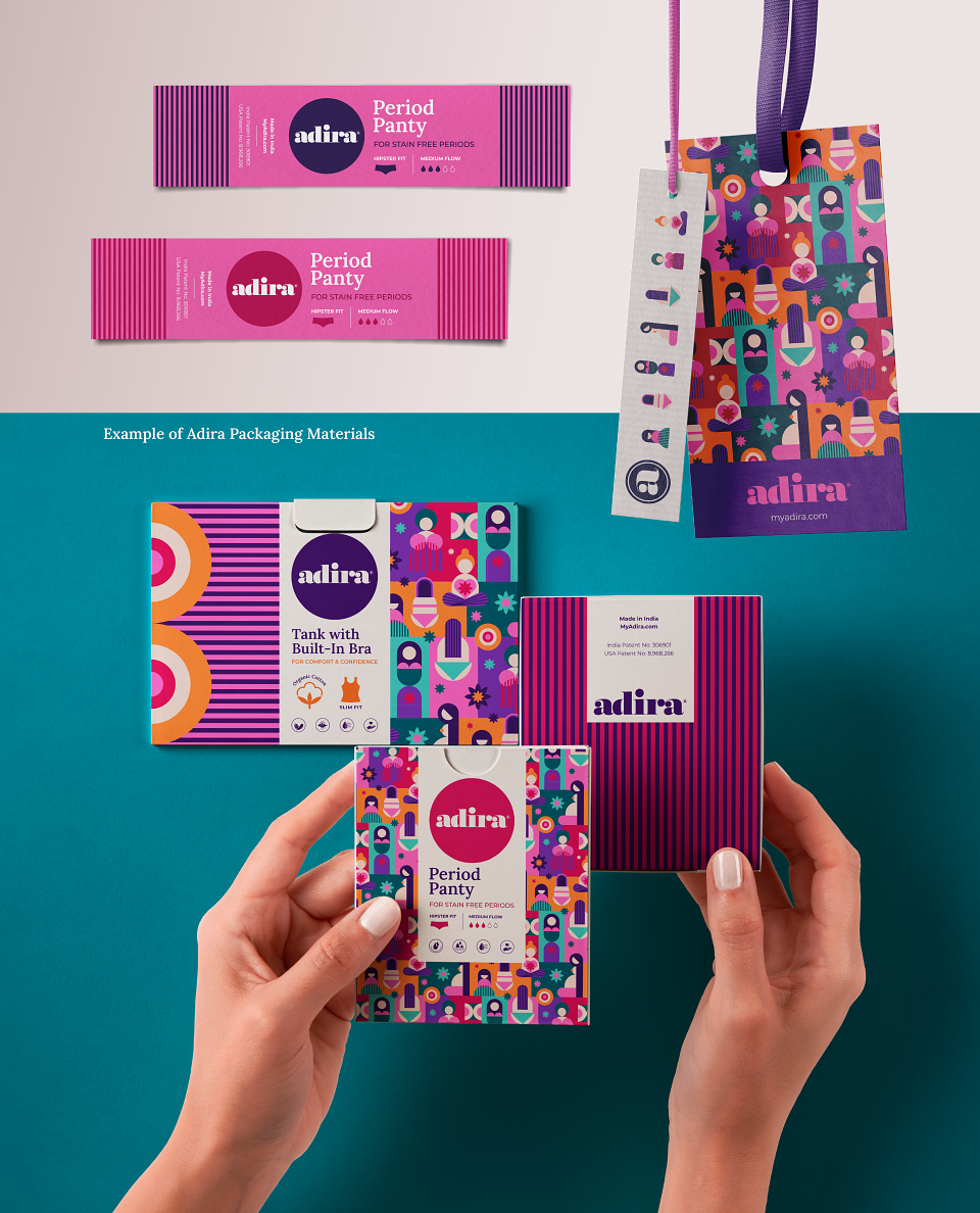
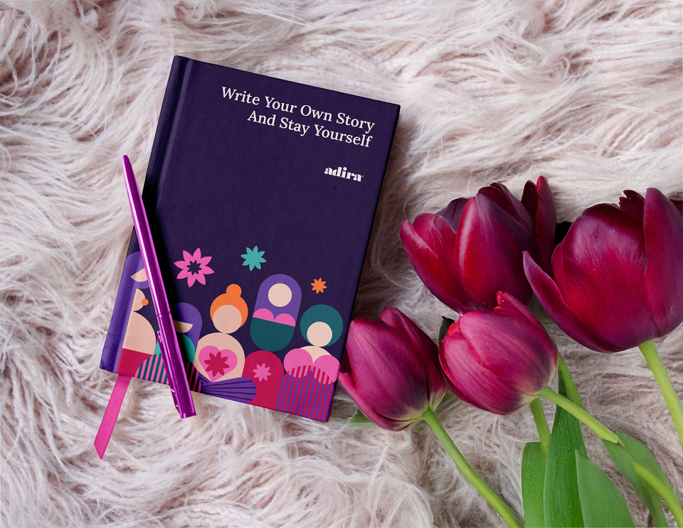
Branded Materials
To maintain consistency across various communication channels, I designed:
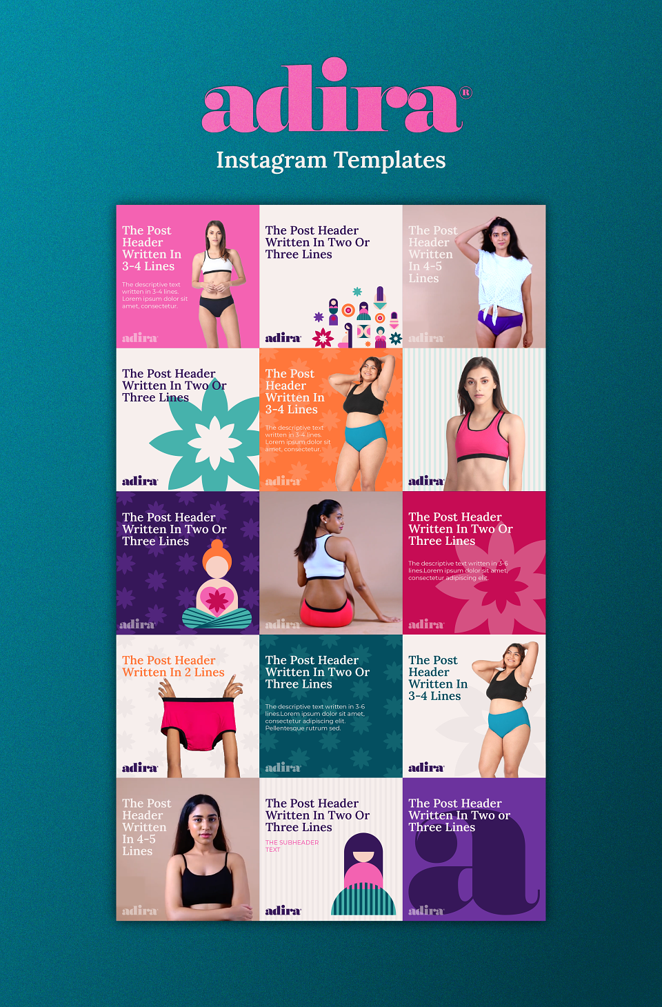
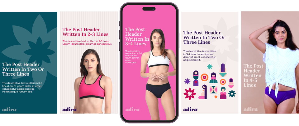
Instagram Kit: Highlight icons, post and story templates
Website Layouts: Specific page designs
Digital Banners: For product promotions and offers
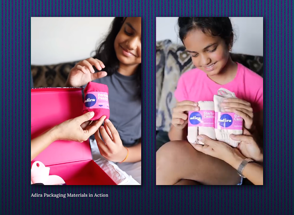
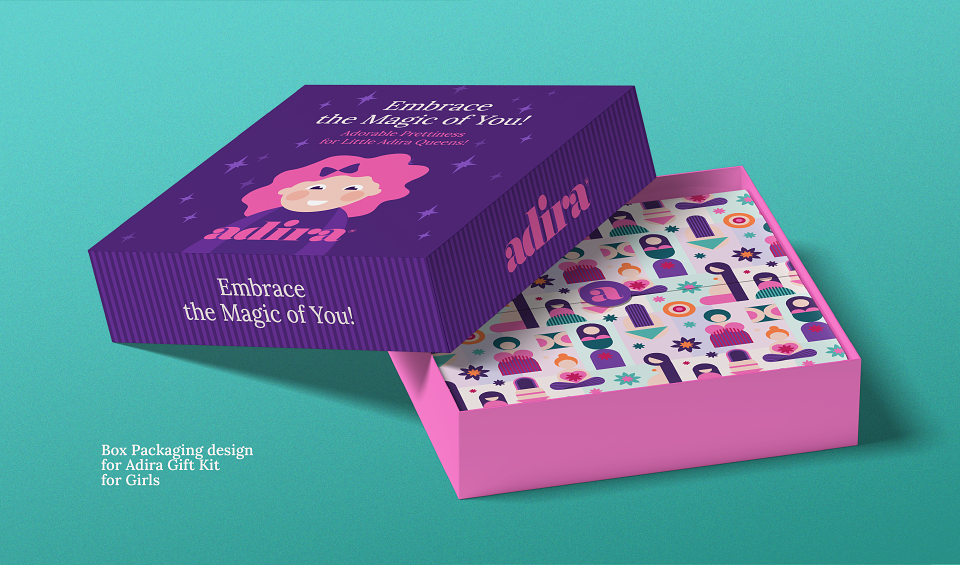
Packaging Materials: Branded bags, tags, and product packaging elements
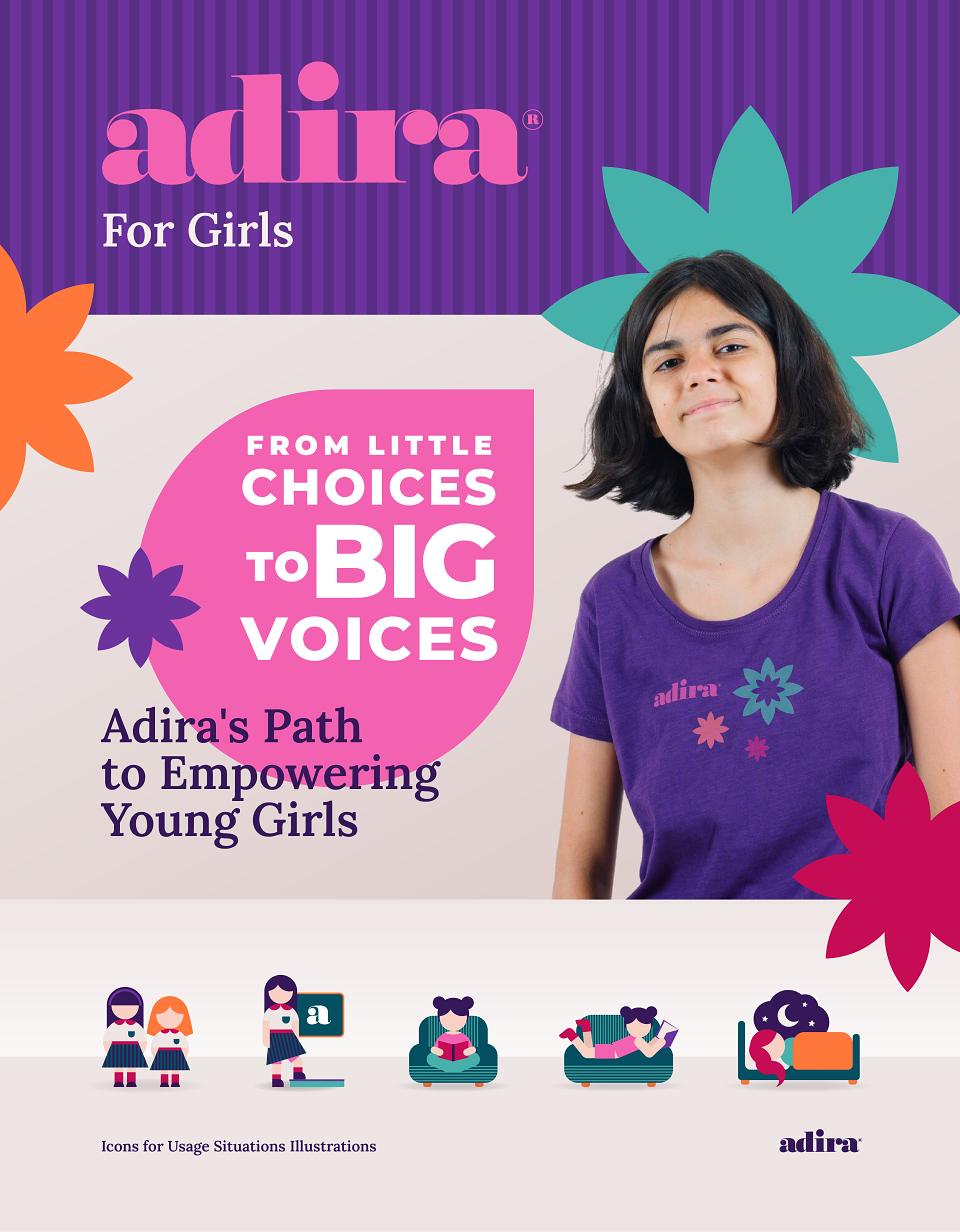
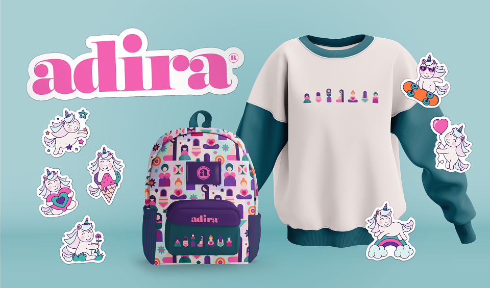
Extensions: Adira for Girls
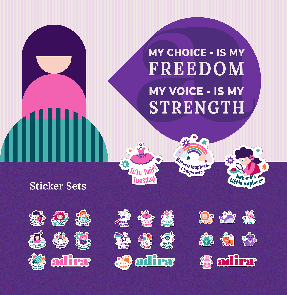
Adira cares for the women of all ages, including little girls. Adira not only provides young girls with high-quality, comfortable underwear but also empowers them with confidence to make their own choices.
To support this mission, I designed:
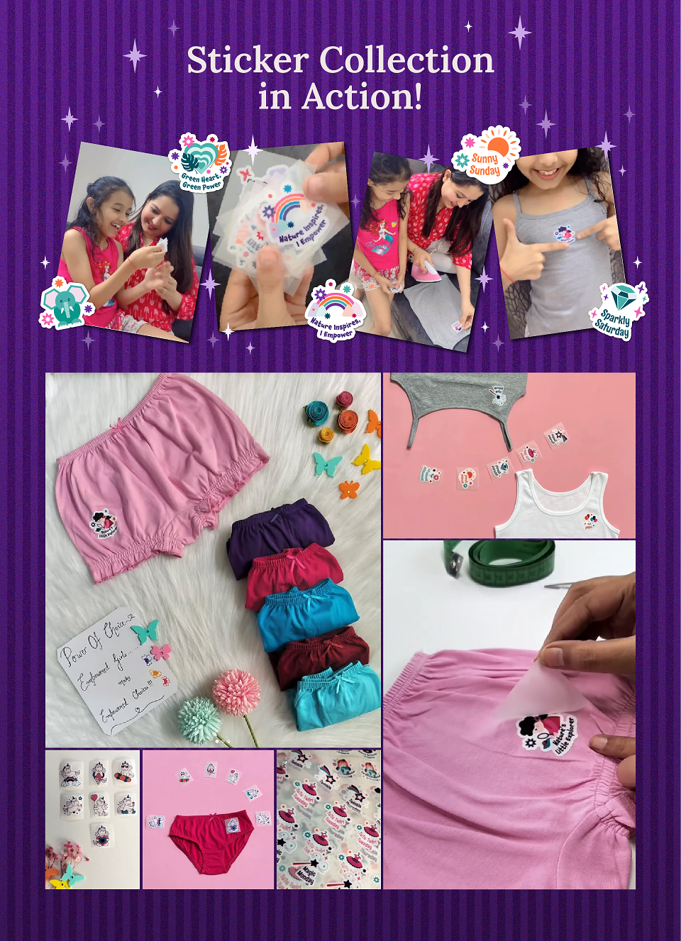
Illustrated Sticker Collection:
Created based on client requirements, aligning with the Adira brand identity while ensuring a cute, appealing aesthetic for children.
Usage Illustration Set:
Visual guides explaining product functionality for young users.
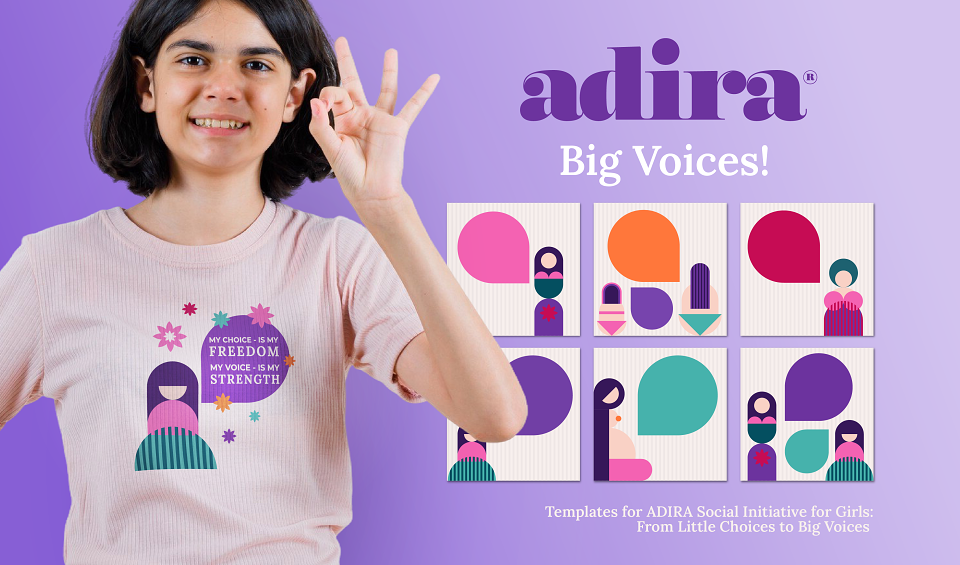
Instagram Templates:
Supporting the “From Little Choices to Big Voices” campaign, reinforcing empowerment for young girls.
CONCLUSION
Adira’s foundation is more than just commerce — it is a commitment to health, comfort, and empowerment across all stages of life. This vision is embodied in the brand’s core idea: The Wonderful Journey of a Woman’s Body.
Through this project, I successfully visualized and reinforced this concept, providing Adira with a cohesive, impactful, and emotionally engaging brand identity. My client’s feedback confirmed that the new identity significantly contributed to Adira’s continued growth and success.
It has been (and it is currently) an honor to be part of Adira’s brand journey — one that transcends fashion and becomes a movement toward a better quality of life for women and girls.
My Client’s Success is My Success.
Let’s create a better world together!
MADEIT CREDITS


Annual 2025 BronzeBrand Identity for Adira underwearBranding
Project featured: on 12th May 2025
Contributor:
Invite
x3
Tanya Be has been a Contributor since 25th November 2015.