Mag. Vladimir von Bergdorff, MA
Group Managing Director
ABOUT
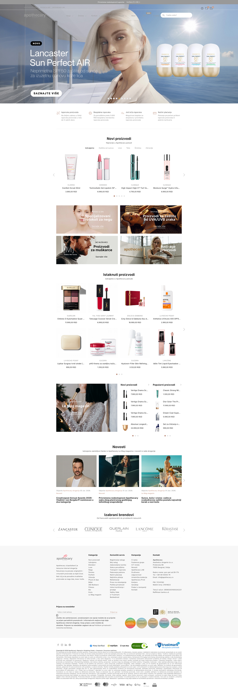
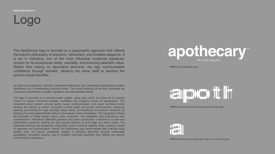
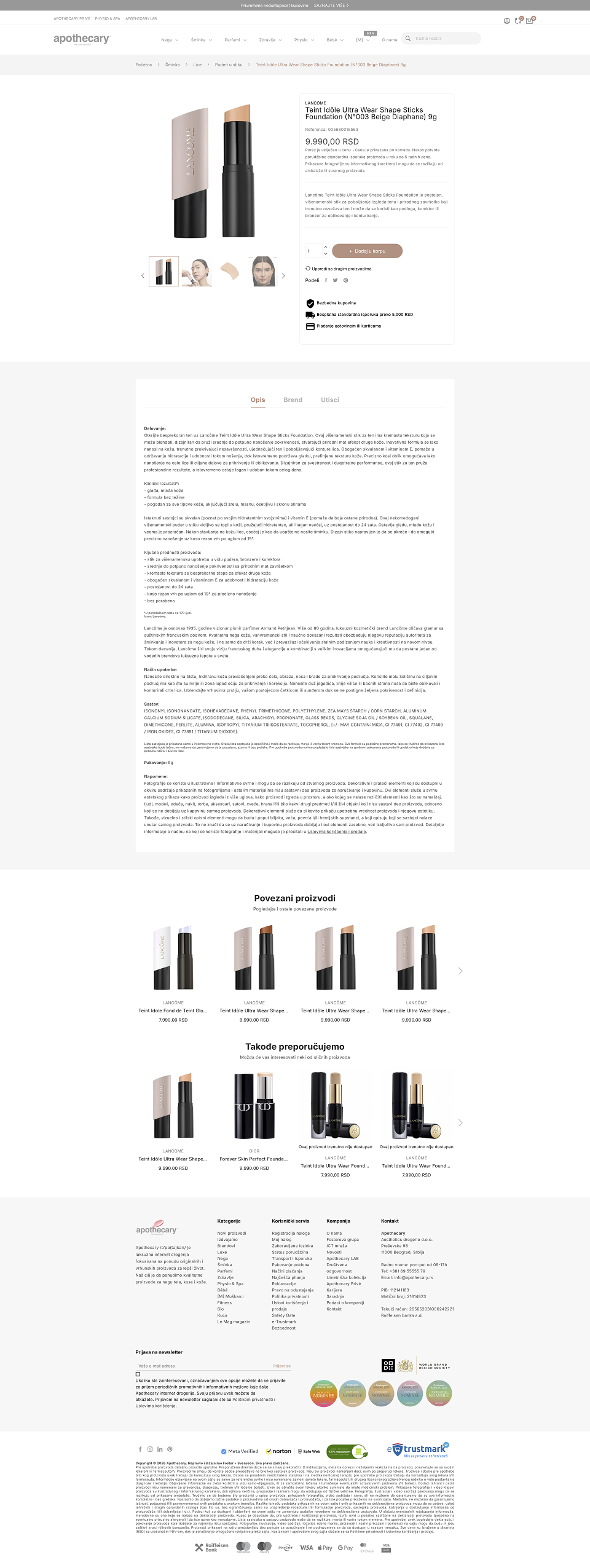
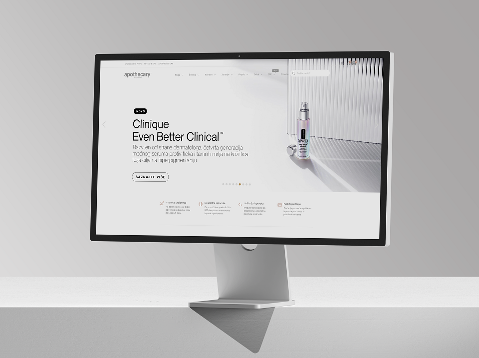
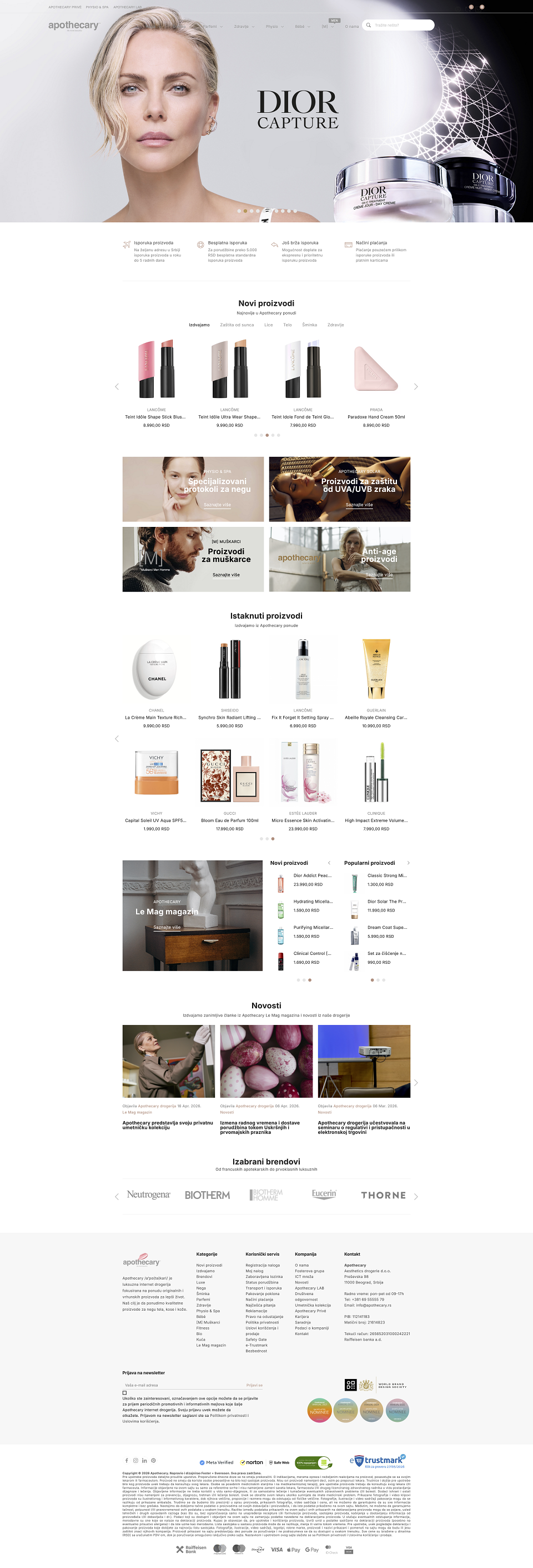
Apothecary is a premium e-commerce platform focused on luxury skincare, wellbeing and carefully selected health products. Positioned between a contemporary pharmacy, a concept wellness store and an editorial destination, the project was created to challenge the conventional visual language typically associated with online drugstores and pharmaceutical retail.
The website was designed as an extension of the Apothecary brand itself - calm, refined and intentionally restrained. Rather than relying on aggressive sales-driven design patterns common within the category, the experience prioritises clarity, atmosphere and trust through a carefully constructed visual system built around typography, spacing, colour and imagery.
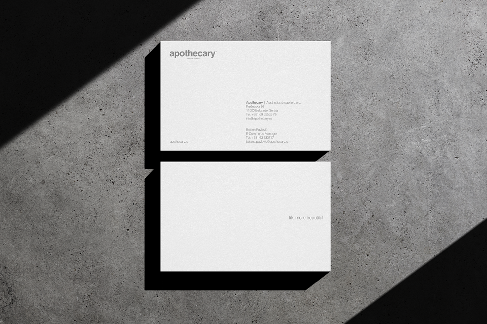
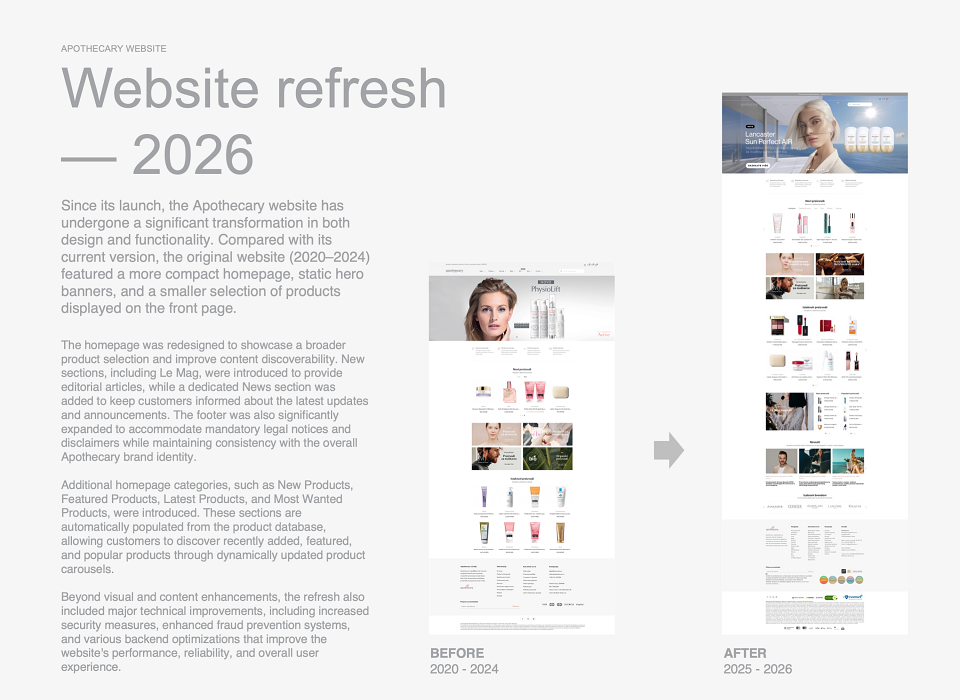
A major part of the project lies in its continuous evolution. Apothecary is treated as a living digital platform, constantly refined through subtle updates to typography pairings, font systems, photography direction, editorial layouts and colour palettes. These changes are never purely cosmetic. They are part of an ongoing effort to keep the brand visually relevant while maintaining consistency and recognisability across every touchpoint.
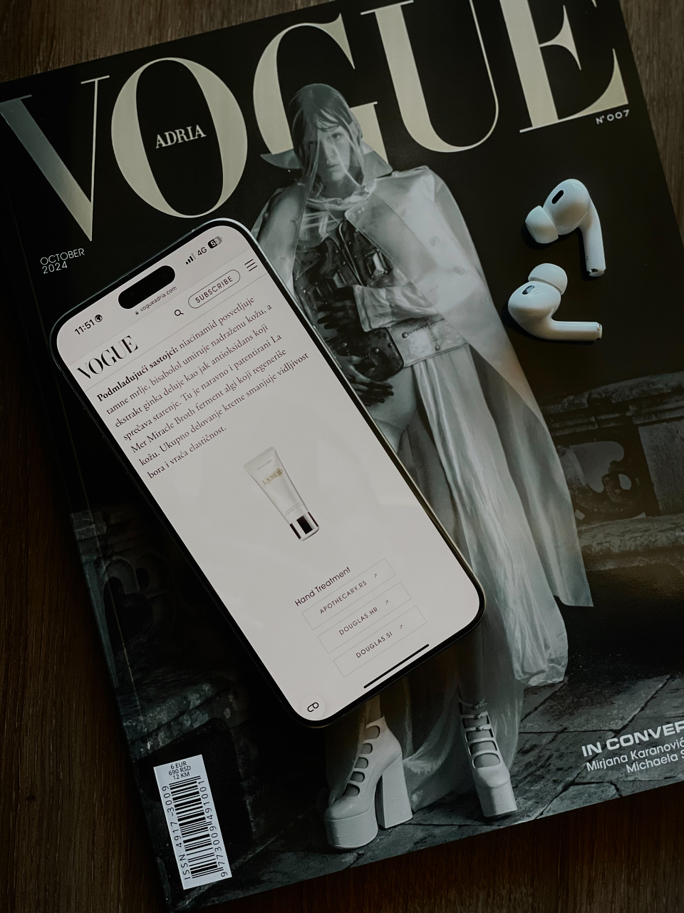
This process of refinement has also been shaped through external industry recognition and feedback. To date, Apothecary has received four nominations from Creativepool, each bringing valuable insight from the jury and wider creative community. Rather than treating recognition as a final destination, the project embraced this feedback as part of its ongoing development, carefully adopting and implementing observations across the platform to further strengthen the user experience and visual identity.
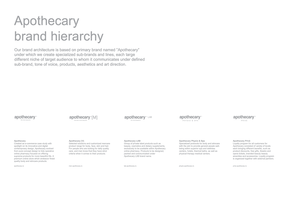
One of the project’s most distinctive challenges was building a coherent digital experience across a highly diverse multi-brand environment. Apothecary works with a wide range of international skincare, wellness and supplement brands, each arriving with its own established visual identity, photography style, packaging language and creative direction. Managing this level of variation without creating visual inconsistency required a highly controlled and flexible design system.
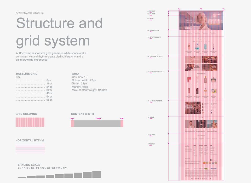
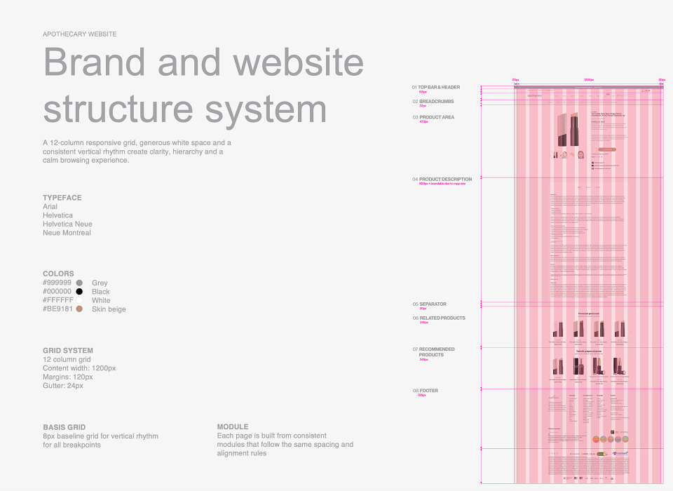
Rather than overpowering the individual brands, the platform was designed to respect and preserve their identity while carefully bringing them into the wider Apothecary ecosystem. Through consistent typography, spacing, colour balance, pacing, grid and layout structure, the website creates a unified experience without stripping away the character of the products themselves. This balance between brand individuality and platform consistency became one of the defining aspects of the project.
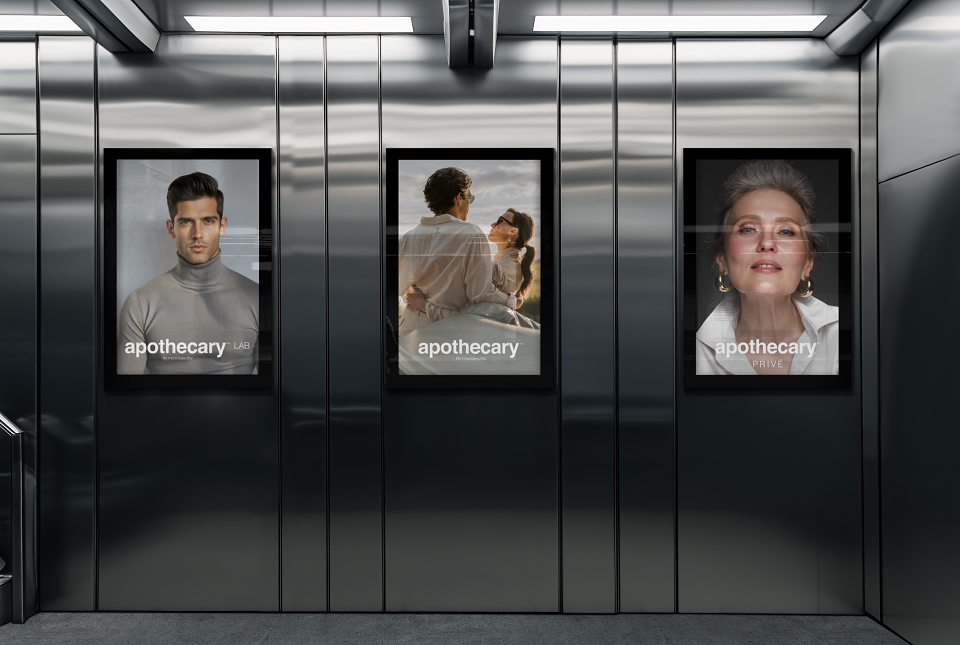
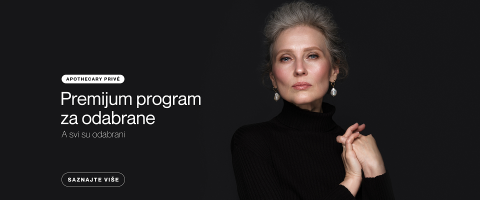
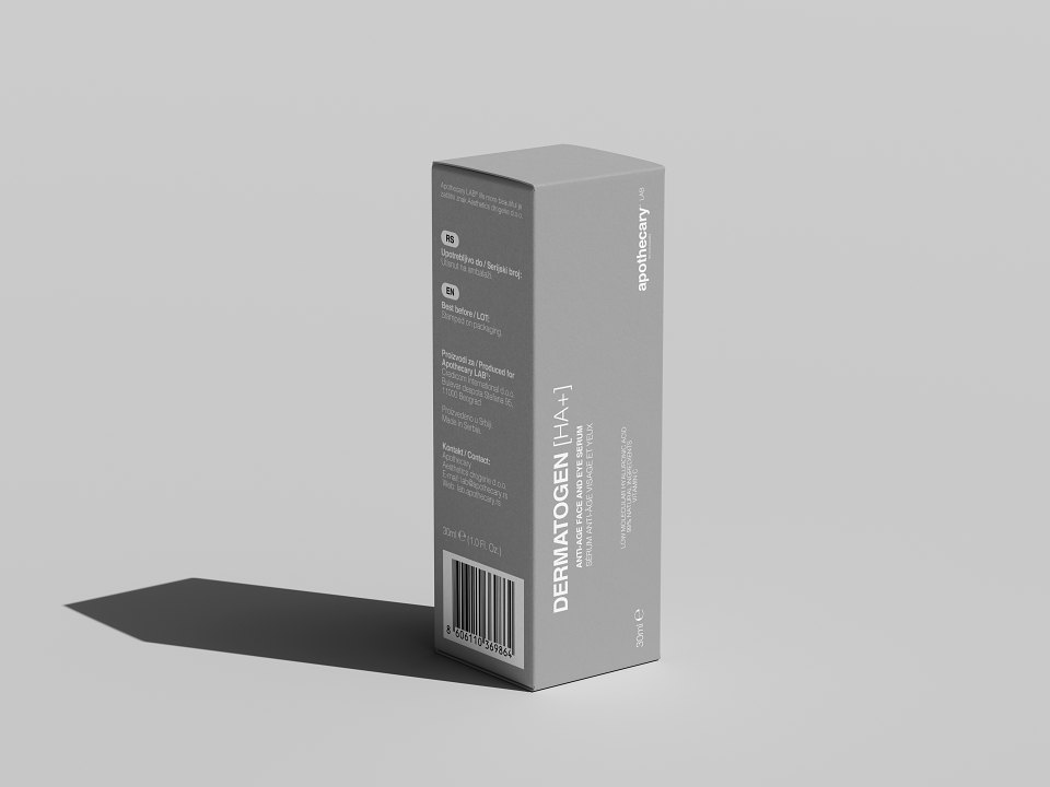
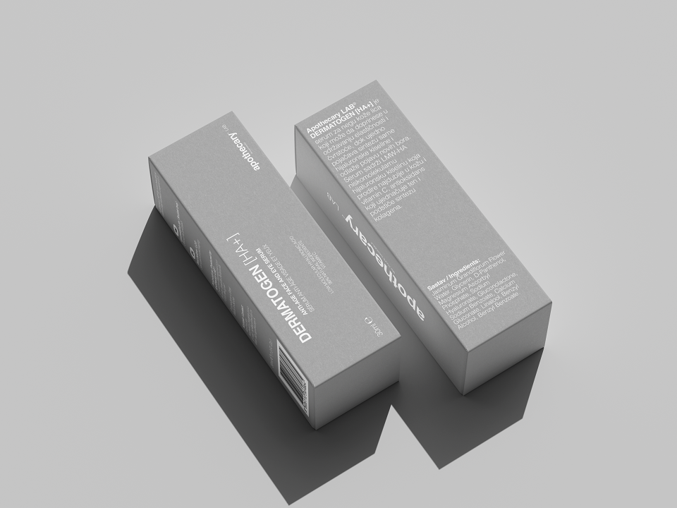
Special attention was also given to creating balance between clinical precision and emotional warmth, an important challenge within the wellness and skincare sector. The interface avoids unnecessary noise and allows products, ingredients and storytelling to exist within a more curated and considered environment. Photography and art direction play a central role in shaping this atmosphere, combining a clean, contemporary aesthetic with softer editorial sensibilities more commonly associated with luxury publishing and beauty campaigns. Yet, regulatory and mandatory product details remain written and shaped under the Apothecary visual line.
The design system was developed to support a broad and evolving product catalogue, from high-end skincare and dermocosmetics to dietary supplements and wellness products, while preserving a coherent visual identity throughout. Every interaction, transition and layout decision was approached with long-term flexibility and scalability in mind, ensuring the platform can continuously adapt without losing its character.
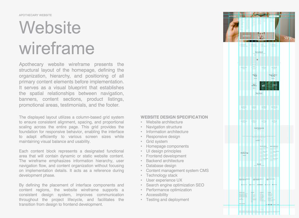
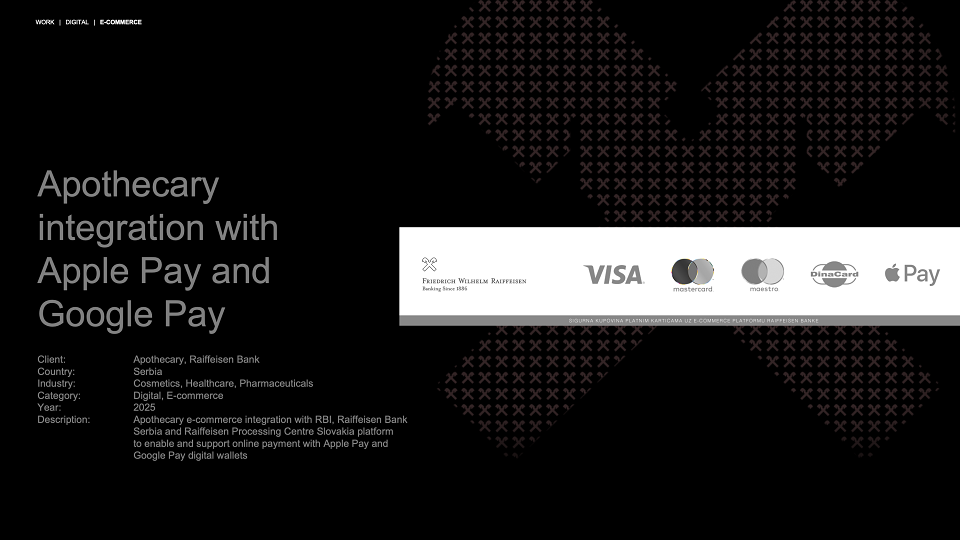
Technically, the project focused equally on performance, responsiveness and usability across devices, allowing the visual language to remain consistent regardless of context or screen size. The result is a digital experience that feels both highly functional and emotionally engaging, combining the trust and clarity expected from a pharmacy with the visual sophistication of a contemporary luxury brand.
In a category often defined by generic interfaces and transactional experiences, Apothecary offers a quieter and more deliberate alternative: an e-commerce platform shaped through ongoing refinement, strong typography, thoughtful art direction and an uncompromising attention to detail.
The position of the Apothecary is not just an e-commerce website, but as an evolving digital brand system with clear creative authorship and long-term design thinking behind it.
MADEIT CREDITS
-

ApothecaryClient
-

Mag. Vladimir von Bergdorff, MAGroup Managing Director -

Aleksandar NikolicHead of Digital
Annual 2026 People's ChoiceApothecary brand refreshWeb
Project featured: on 28th May 2026