Superfried
Manchester
ABOUT
Identity/ Editorial design
–
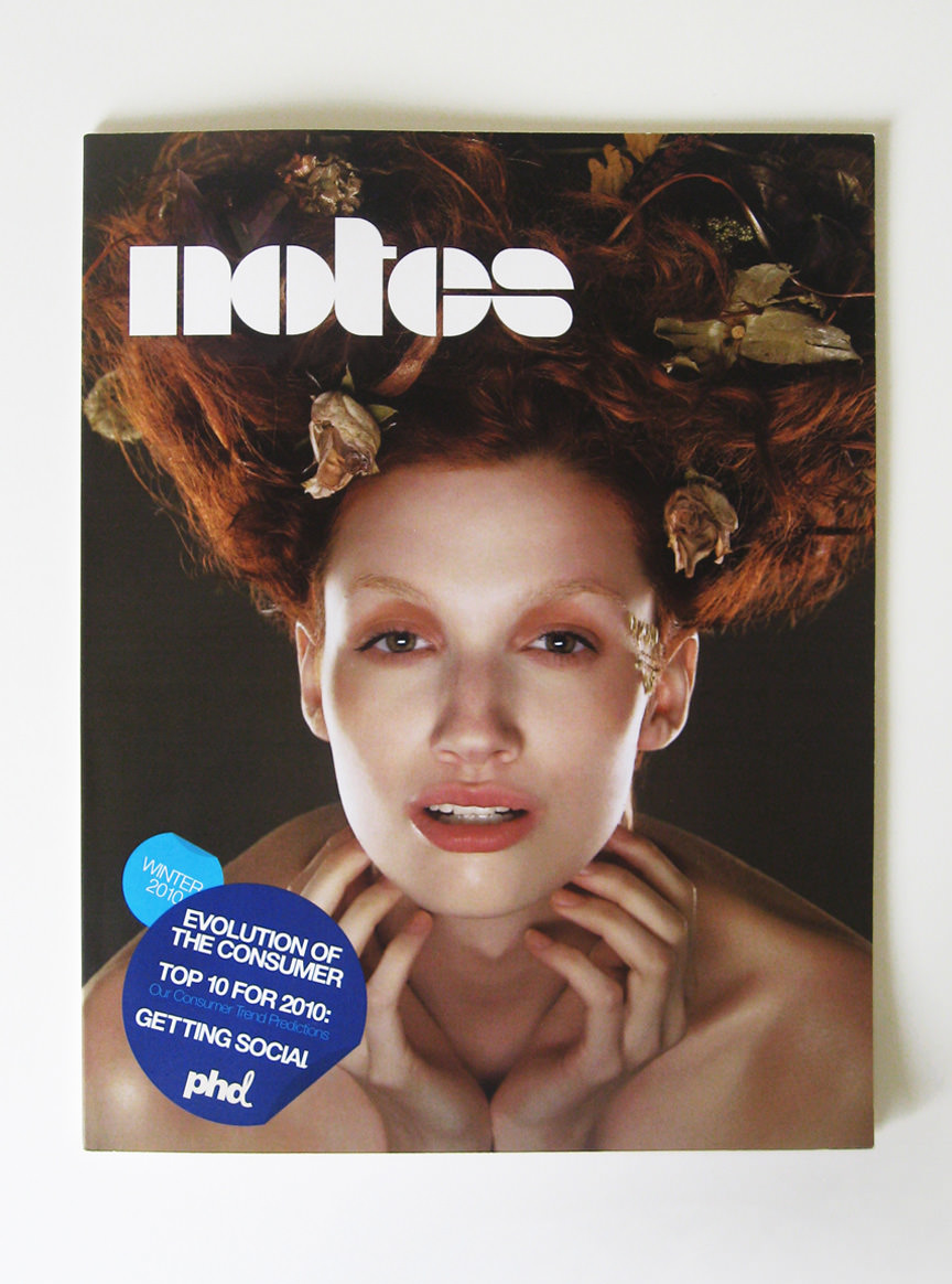
Notes is an internal publication providing insight to developments throughout the cosmetics industry.
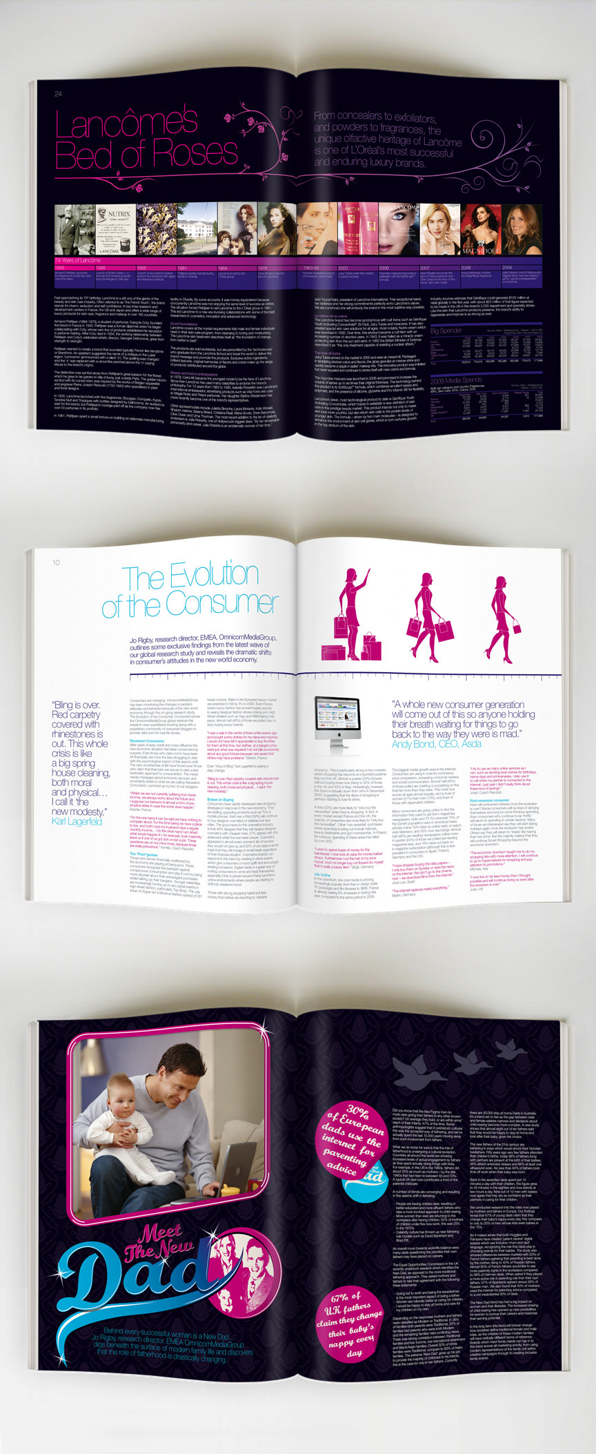
In collaboration with a global media agency Superfried were asked to showcase industry findings for Elizabeth Arden, in the form of a trade magazine. Tasked with the job of developing the brand identity, editorial design and art direction throughout, this was a great project allowing unexpected freedom for a corporate b2b product.
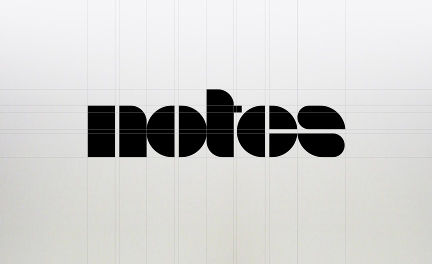
For the identity a strong, retro and distinct logotype felt apt. Inspired by the classic 1930 typeface Braggadocio, Superfried developed a bespoke lettering style.
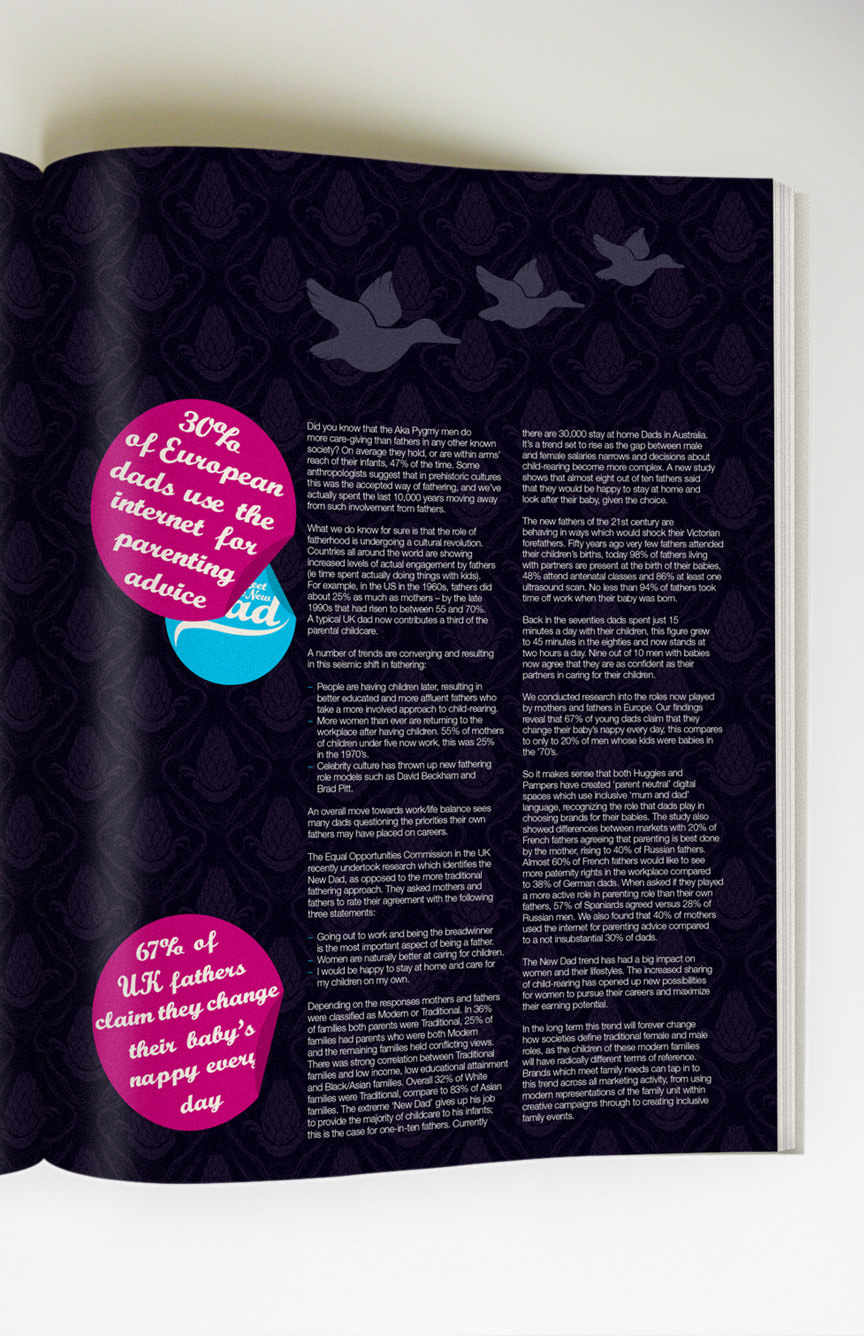
To continue the clean, geometric feel of the masthead it was important for the cover to follow suit. This was achieved by the use of a 'sticker' graphic device to contain the cover lines. This device was then utilised for key information and pull quotes throughout the publication.
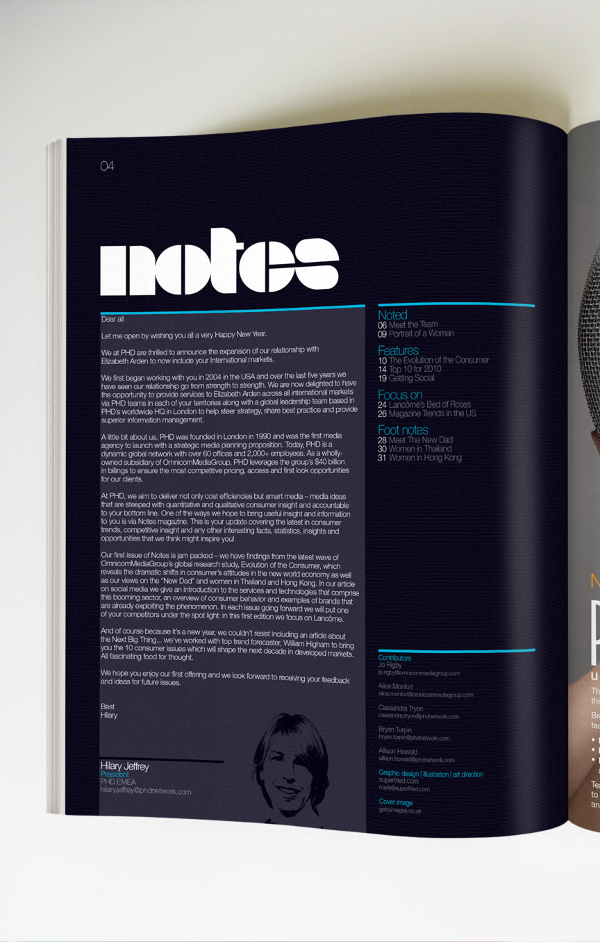
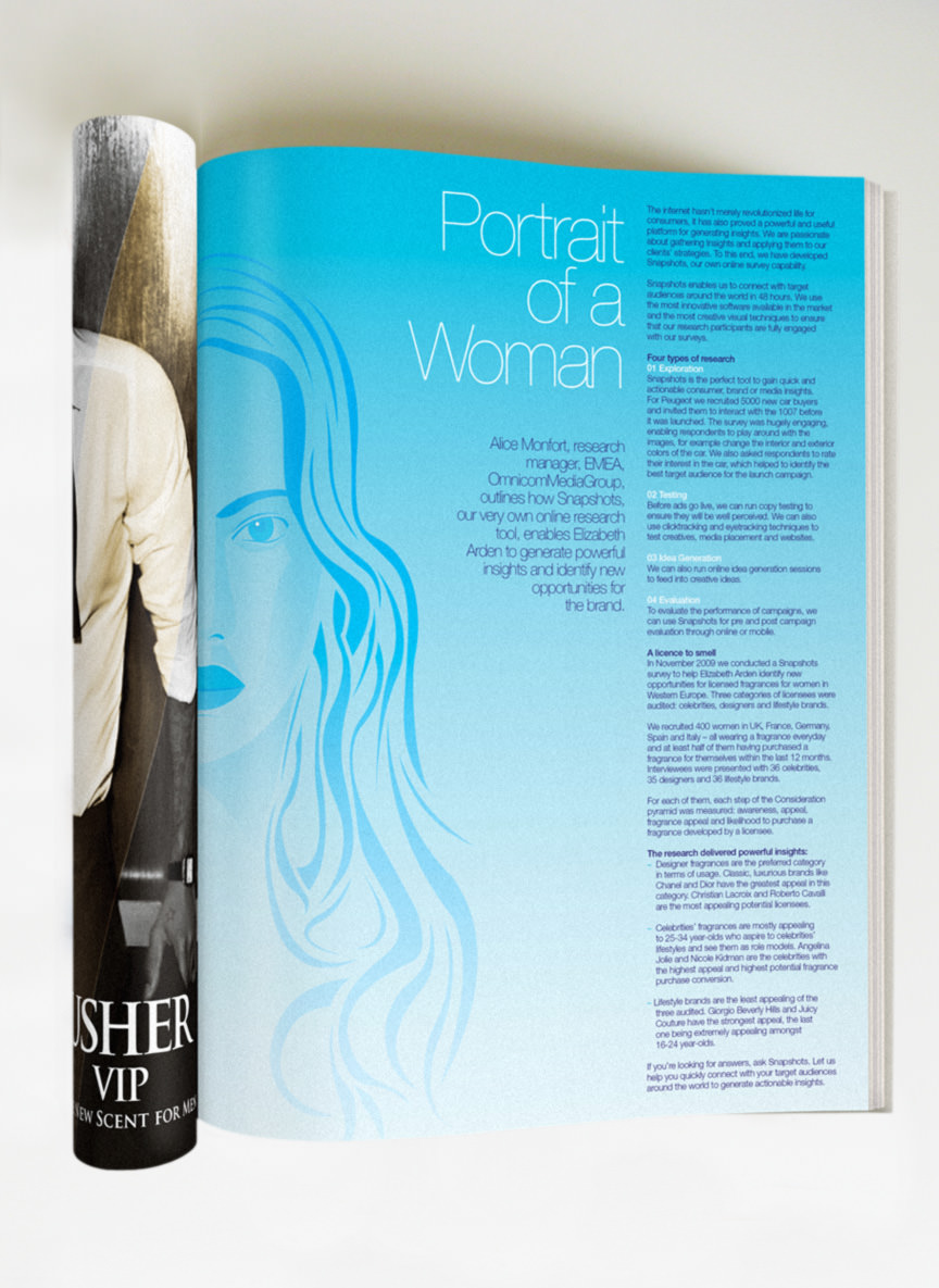
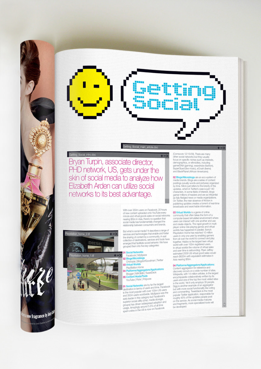
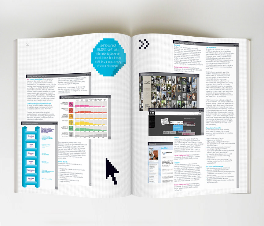
Inside the grid was kept to a minimum and the style of each spread was dictated by the content. This led to a very eclectic, interesting and ever-changing view for the reader.