Superfried
Manchester
ABOUT
Typographic experiment
–
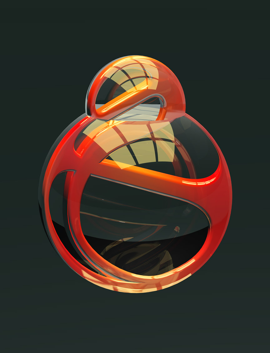
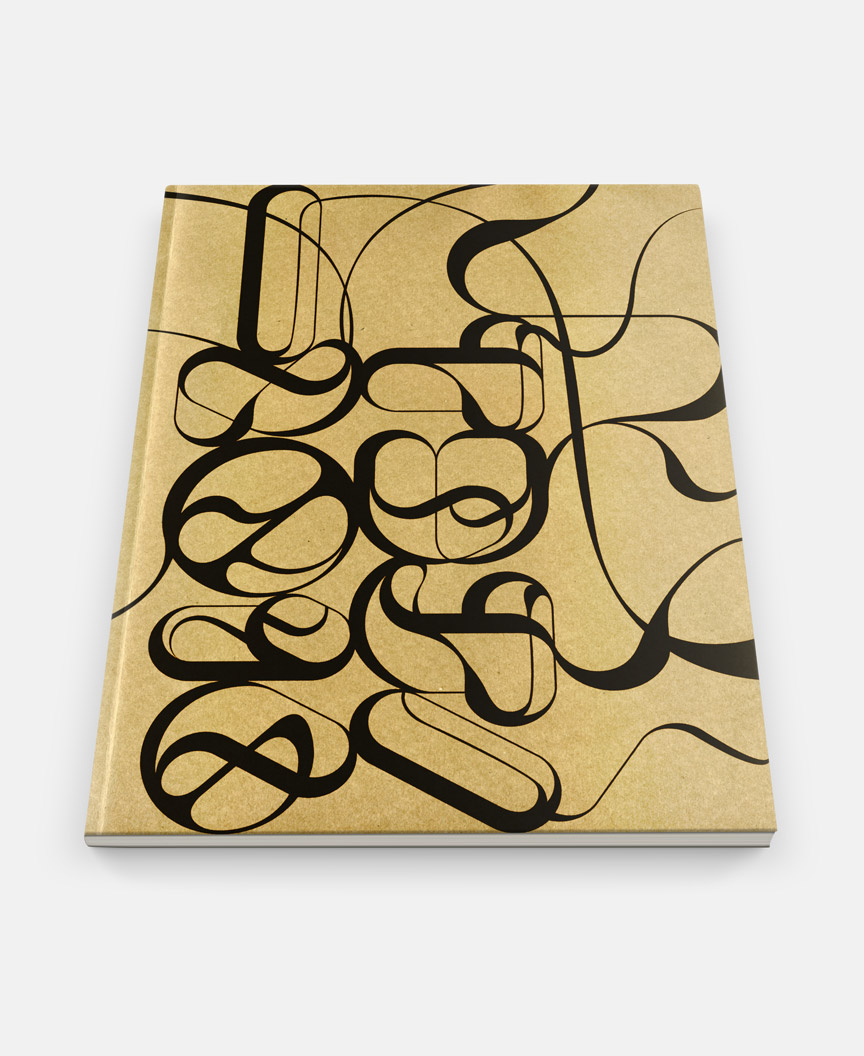
Whilst developing a typographic style for a US client, this route was relegated from the process. Initially it started as 3D numbers – see 100 visual – with a slightly organic centre. This idea still had potential, so I took everything back to flat 2D and started to develop a complete set of numerals. It was here that the forms started to become more intricate and a reminiscence to the internal patterns of classic marbles emerged.
The freedom of the paths allowed for experimentation across a variety of graphic styles. The first experiment formed the basis for my Max Richter – Dream 3 sleeve submission to Secret 7"s 2016. With Marbles now the designated name for the project it would be remiss not to experiment in C4D to create the marble style for real. Lastly experimentation with flat colour also led to interesting results.
The project has been featured on the new type section of the Creative Review blog, Behance, HOW, Type Worship, TypeRoom, Creativepool, Dsgn News and Riensche. It has also been featured in Computer Arts magazine [Aug/2016] and PRINT Magazine [Fall 2016].
MADEIT CREDITS


Annual 2017 WinnerMarbles – Typographic ExperimentTypography
Project featured: on 27th June 2016