Summit Creative
Nottingham
ABOUT
The word Ananda has its roots in ancient Sanskrit, and carries the profound meaning of 'bliss' and 'joy.' Following an in-depth conversation with the team at Ananda, we found this meaning should be central to the brands ethos. As well as other Hindu themes
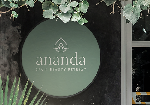
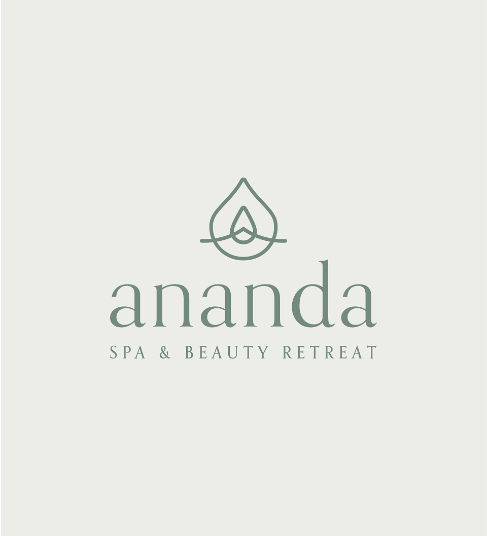
The pictorial logo was crafted by amalgamating elements like the Diya, a sacred Hindu lamp symbolizing Diwali, the majestic Ananda mountain signifying the soul's ascent, the radiant flame within a Diwali lamp, and a delicate lotus petal.
Opting for a classic, enduring font the use of lowercase provides a striking juxtaposition with the contemporary symbol. Finding a balance between up-market feel and inclusivity.
Inspired by the earthy tones of the cottage garden, we crafted a brand grounded in serenity and bliss.
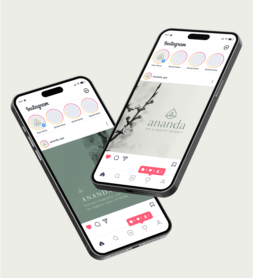
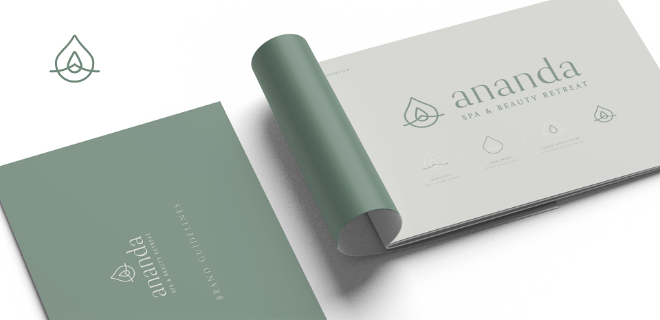
We created a logo and brand guidelines which included responsive versions of the logo and how they are to be used, colours, fonts, social media templates and examples of various branded spa items. Ananda had everything necessary to launch their business and convey the essence of bliss at every interaction with customers.
MADEIT CREDITS
-

Summit Creative -

Brogan ShawGraphic Designer