Studio Moross
London
ABOUT
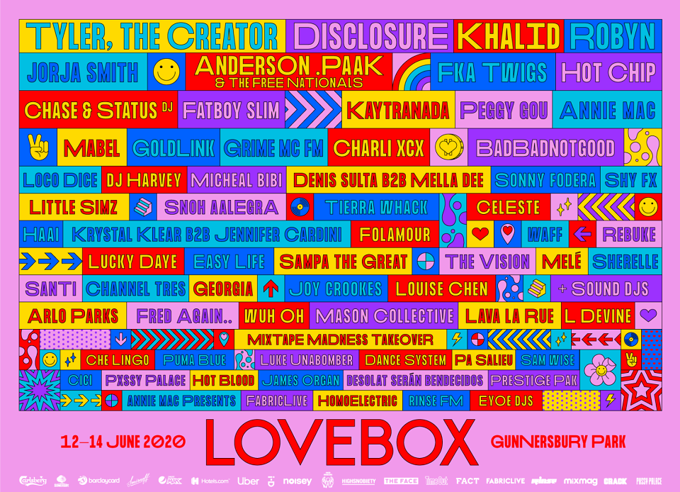
Towards the end of 2019, we were tasked with
rebranding the well-known festival, Lovebox.
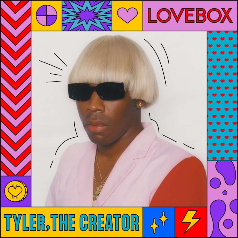
The identity we came up with is vivid, cheeky
and energetic, using a vast array of illustrative
icons and patterns, lending the overall identity
nicely to motion design.
Similarly we used a contemporary display
typeface, featuring extended—or stretched—
alternate characters to help keep the pace of
things feel dynamic and unpredictable.