Studio More Design Ltd.
London
ABOUT
How we helped…
Visual identity / Messaging / Packaging / Website /
Didsbury Gin – Come together
We’ve worked with Didsbury Gin since Christmas in 2018 with founders Liam Manton and Mark Smallwood. Liam and Mark are entrepreneurs with a passion for Manchester, a shared sense of humour and their very own craft gin to wow gin lovers with. After a successful pitch on Dragons’ Den, they needed a new brand that would help their gin stand out from the crowd.
Didsbury Gin – The Brandmark
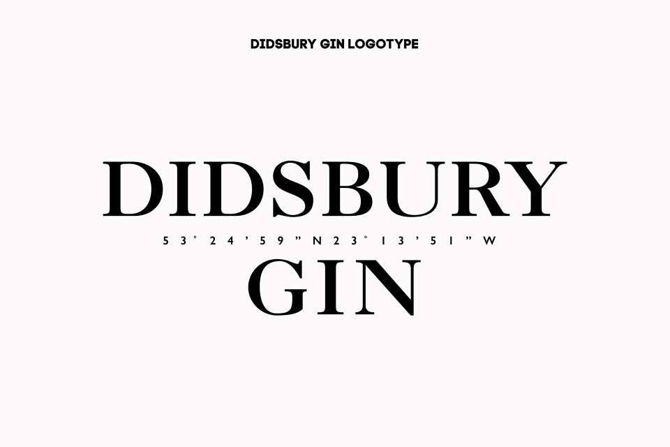
We understood Didsbury Gins need to carve an ownable niche. So, inspired by Didsbury in Manchester and the brand owners’ optimism, we chose ‘Spirit of life’ as the design strategy. Strong, lively and visually arresting, the brand mark hits you right between the eyes. With ‘D’ for Didsbury as the central holding device, consumers are invited through this window to make their own journey of discovery.
Didsbury Gin – The Packaging
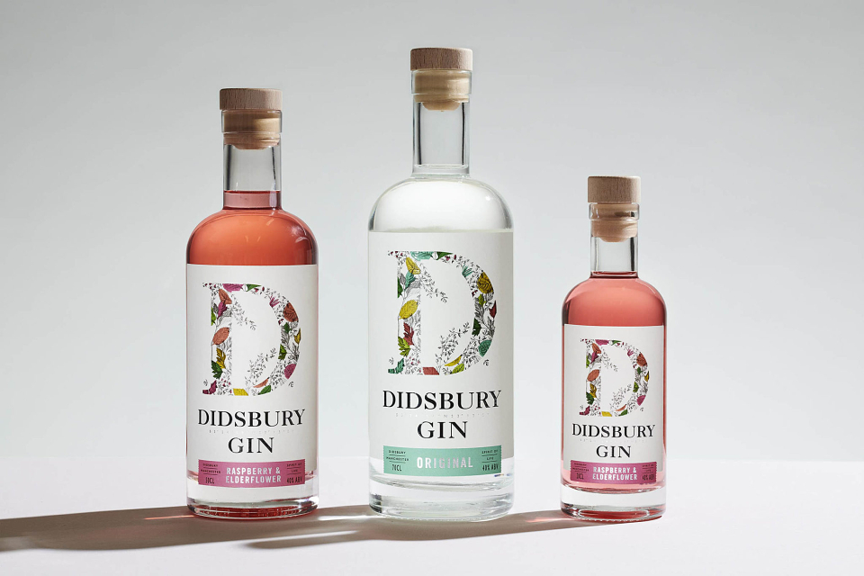
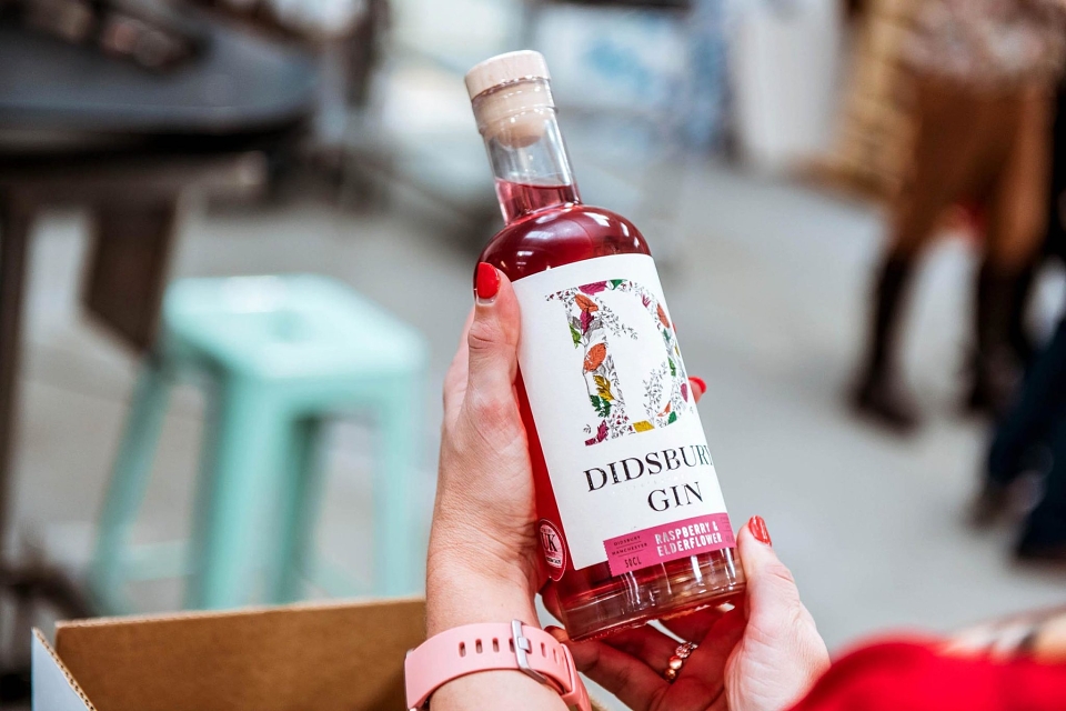
Simple and welcoming, the ‘D’ of Didsbury Gin sits proudly on the front of pack acting as the gateway into a range of fresh, vibrant and zesty gins, aided by colour coding across the different variants. Single-minded yet flexible, the design has the adaptability to accommodate new variants and even extensions beyond gin.
Didsbury Gin – The growth
Since the rebrand, Didsbury hit a turnover of £1.5million for 2019 and aren’t looking to slow down anything soon! With 300% growth increase and 750% increase on net worth, and being stocked by Wetherspoon nation-wide, Didsbury has gone from strength to strength in the last year. Amy Harrison (Marketing Manager, Didsbury Gin) says: "With the help of their creative minds, Studio More has taken our brand from strength to strength, from a local brand to a nationally recognisable household gin. "