Studio Minerva
London
ABOUT
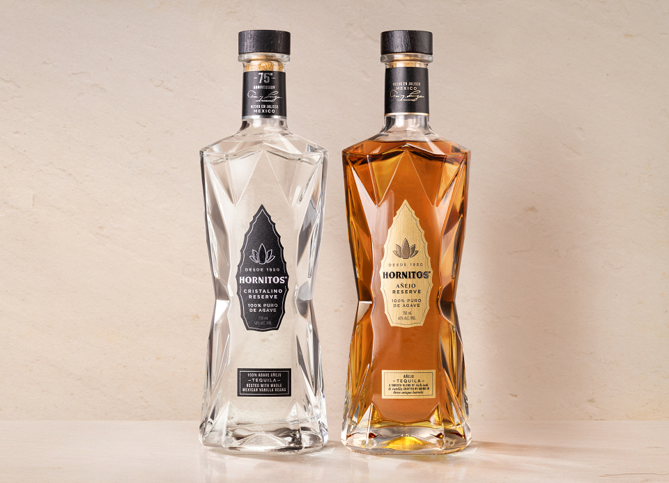
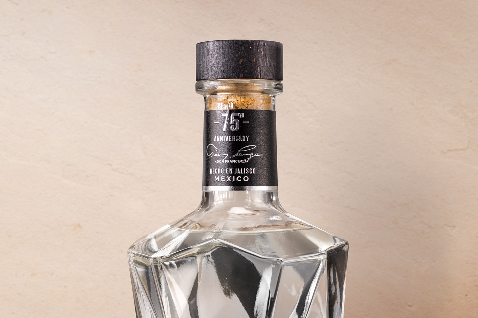
To mark its 75th anniversary, Hornitos set out to launch its first-ever super-premium expression: Hornitos Cristalino. The challenge was to elevate the brand into a more refined space while retaining the confidence, vibrancy and character that have always defined it.
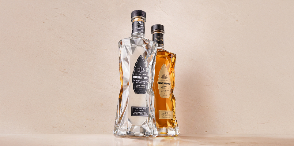
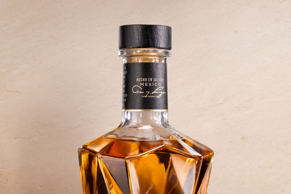
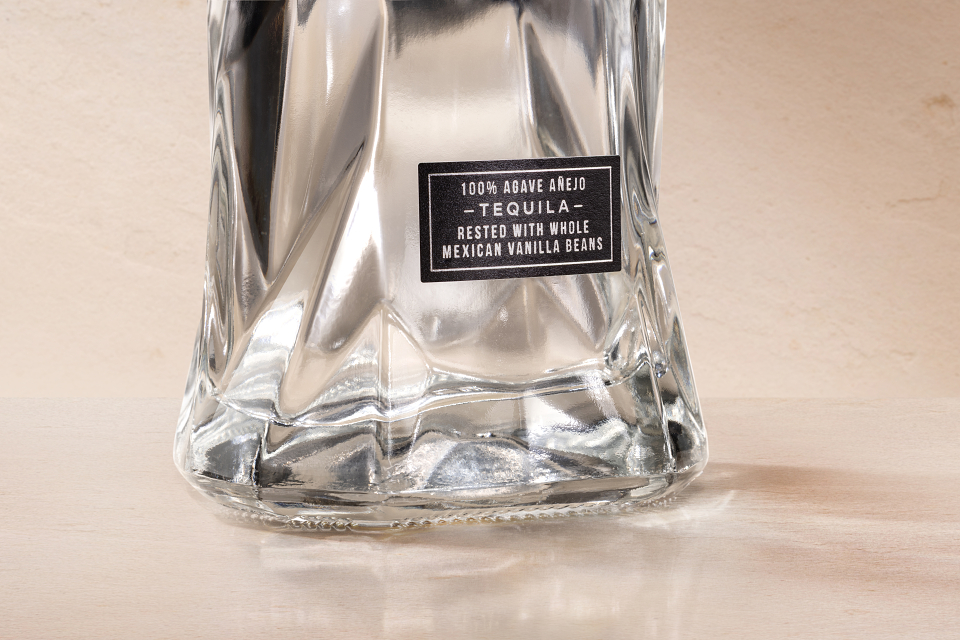
Studio Minerva developed the packaging and prestige brand world, balancing the established codes of the Cristalino category with a distinctly Hornitos point of view. Introducing two new SKUs Hornitos Cristalino and Hornitos Añjeo Reserve.
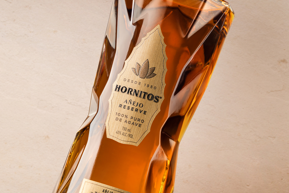
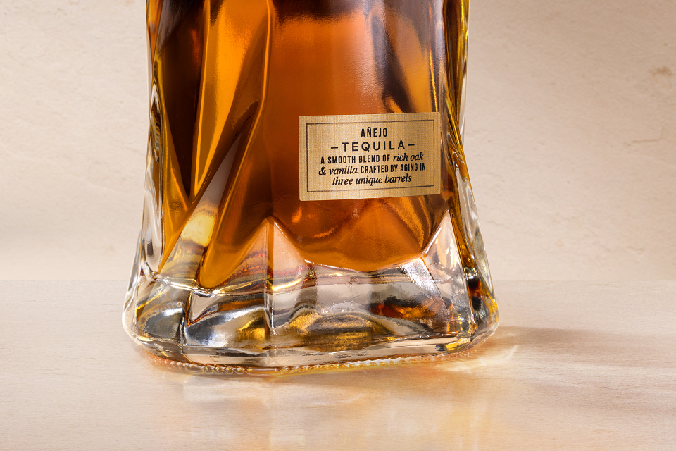
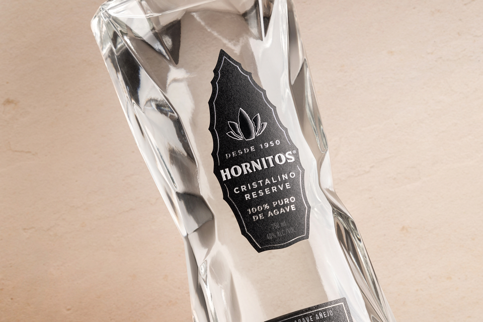
A sleek black label introduces a more sophisticated presence, elevated through silver metallic foil, detailed embossing and an uncoated paper stock.
Core brand equities were evolved with restraint. The agave leaf was redrawn with greater authenticity, while the Hornitos logotype was refined with a subtle nod to the brand’s history.
The wider visual world draws from Mexican craft and provenance. A distinctive mosaic pattern takes inspiration from original tiling at the tequila distillery, while sandstone, terracotta, hand-laid mosaic and natural finishes bring warmth, tactility and a sense of place without relying on familiar category clichés.
Film and motion extend the identity, capturing the Cristalino liquid with a sleek, sensorial quality while heroing the detail and craftsmanship of the bottle.
The result is a confident evolution of Hornitos: contemporary, expressive and unmistakably premium. A bold new expression that celebrates 75 years of the brand while setting the tone for what comes next.