Stuart Lee
Graphic design
ABOUT
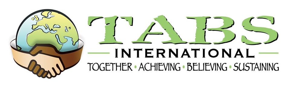
TABS International wanted a logo and identity which would show their inclusivity and highlight two different aspects of their work. One is working with disenfranchised youth over in the Uk, the next is in helping to build and work on construction of schools in Kenya and Uganda.
The colours had to be vibrant and the fonts playful. I used the hands shaking to convey this cooperation and the diverse nature of their work. The map shows the UK and Africa, which are the two locations of where the project would fundraise, recruit and build the schools.
I’ve deliberately kept the overall look to be quite young to reflect their work but also given it a slight graffiti/urban edge to reflect that they also work with young adults.