Stan Lau
Freelancer brand designer
ABOUT
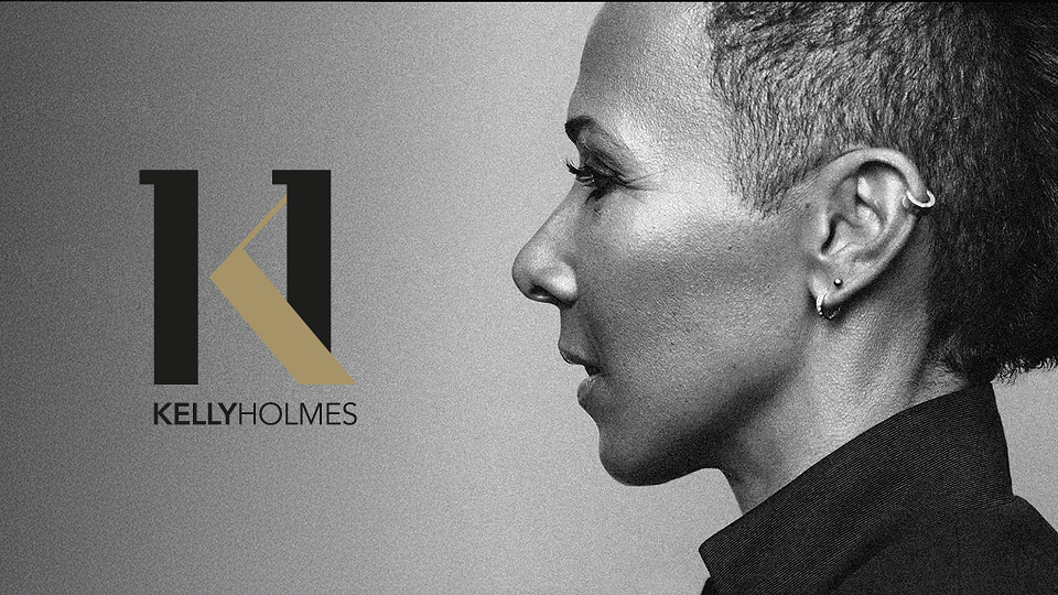
Dame Kelly Holmes is a Double Gold Olympic Champion whose brand delivers products, services and experiences designed to inspire and support health, fitness, wellbeing and sport.
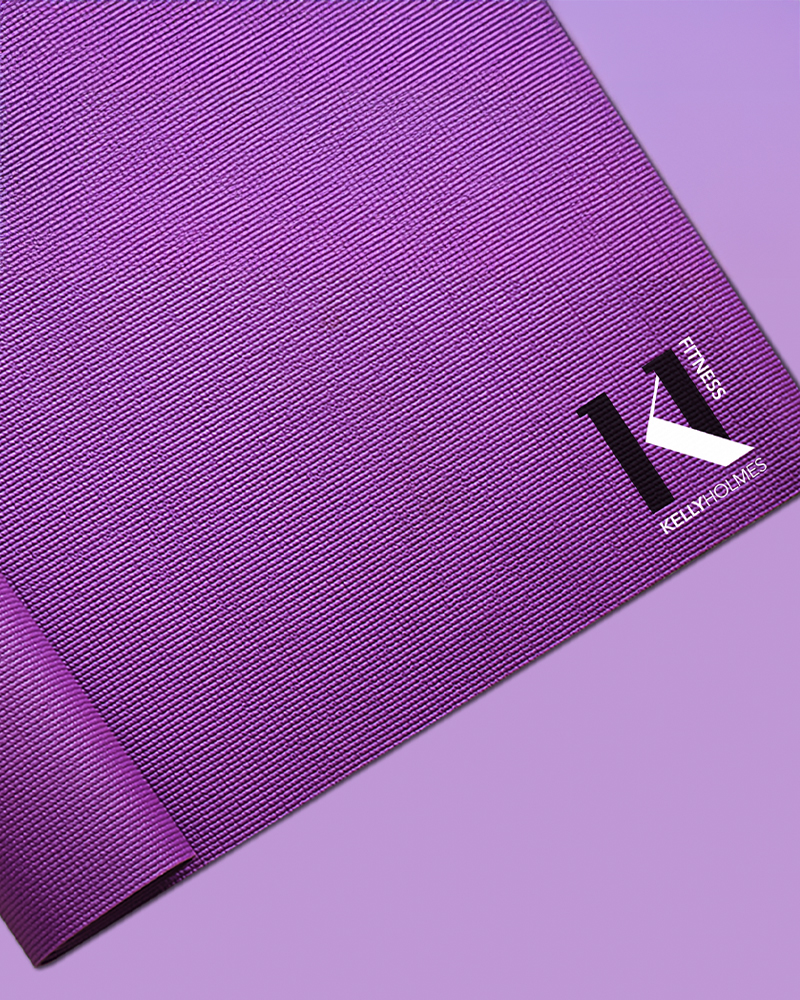
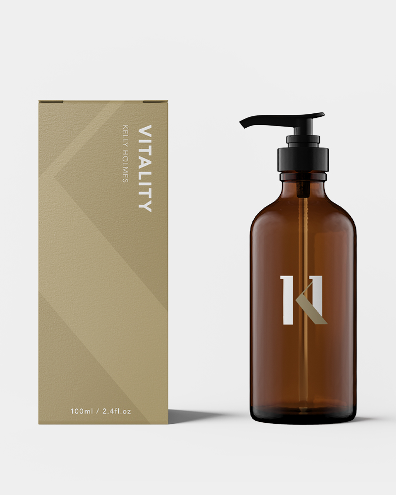
The brief was to create a logo that honoured her extraordinary sporting legacy while supporting a broad and evolving brand ecosystem from speaking and mentoring to wellbeing initiatives and commercial partnerships.
The Challenge
The Kelly Holmes brand needed a mark that felt credible, timeless and inspirational. It had to
resonate with a wide range of audiences while remaining flexible enough to grow with future
business ventures.
The Concept
The final logotype is built around the initials K and H, forming a distinctive and confident
wordmark. Within the letterforms the two ascenders are carefully designed to represent
the number 1 appearing twice. This subtle detail symbolises Dame Kelly Holmes’ historic achievement of winning two Olympic gold medals, embedding her legacy directly into the identity in a refined and meaningful way.
Outcome
The Kelly Holmes logo acts as a marque of quality and inspiration. It reflects both an
exceptional sporting legacy and a forwardlooking brand built around motivation,
wellbeing and positive impact. The identity provides a strong, adaptable foundation that supports current activities while allowing space for future growth a brand rooted in achievement designed for longevity.