Simone
Graphic Design graduate
ABOUT
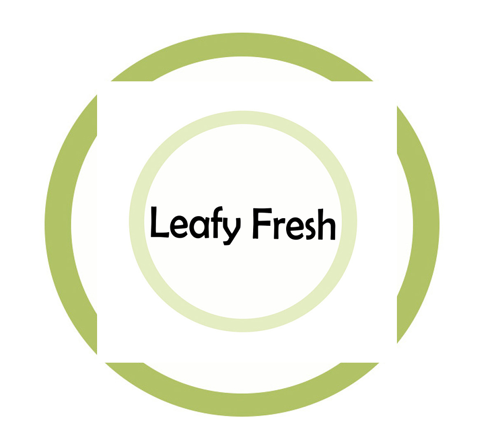
"‘Leafy Fresh’ is a take away and delivery service specialising in vegan delicacies with fresh, locally sourced, organic produce. They are looking for a logo which reflects what the company is about. Being a family run, small business, with all meals made by hand in small batches, they want their logo to have a similar handmade, natural feel. The client would like a logo that doesn’t feature the obvious hand drawn leaf, as they feel many similar companies have overused this so they would like their brand to be more unique. They would still like to convey a natural and organic feel to the logo but want to show this in the lettering and through the overall appearance of the logo. Think natural, fresh, organic, custom, handmade and earth friendly." - Breifbox
With this being said, I went about completing this task by starting off with a quick brainstorm - of which included different ways I could go about coming up with a fresh logo. Creating brainstorms allows me to write down any ideas I have, which tends to lead me from one idea to another. I wanted to keep the design, very light with a 'natural feel' as the brief explained, therefore, I stuck to very earthy colors, but on the lighter and brighter scale of the colour palette. Having leafy fresh being described as a 'family run, small business with all meals being made by hand', I got the impression it was very immediate, which could also be described as homely. For this reason, I felt a plate would be the perfect base for the design, as the dinner table is where families usually come together and bond throughout consuming their meals. I decided to include this project as it one of my favourites, not only has it been well thought out ; through the choice of colours, layout, font and general design process, I feel it has been one of my most simplistic yet effective designs.
MADEIT CREDITS
-

SimoneGraphic Designer