Shumenaz Ali
Senior Designer & Creative Lead
ABOUT
Brand Refresh | Print Design | Visual Uplift for Premium Positioning
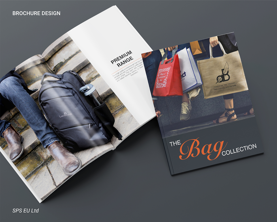
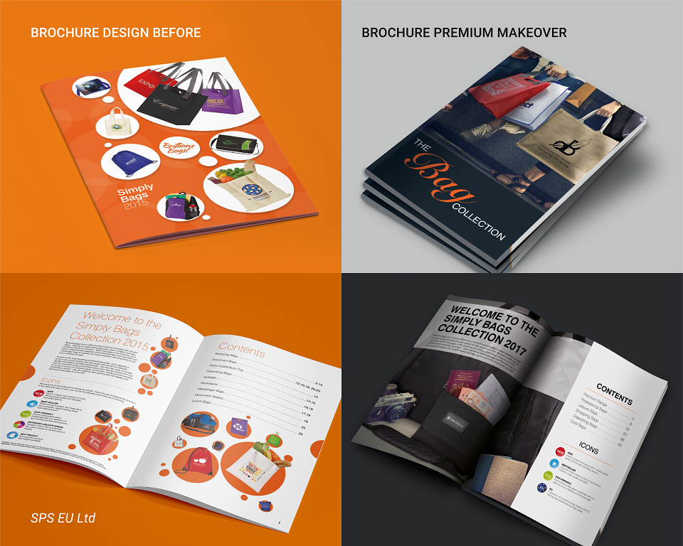
The Simply Bags range at SPS (EU) Ltd had long followed a standardised brochure format that all designers were expected to maintain. However, following the success of my rebranding and premium-focused design projects, the company approached me to reinvent the look and feel of the brochure with the goal of repositioning the product line as more upmarket and stylish.
The brief was clear: elevate the brand presentation to reflect the increasing value of the bags on offer, and to make the brochure feel more aligned with a premium lifestyle aesthetic.
Creative Direction:
Historically, the Simply Bags brochure featured an entirely orange cover, a brand colour that, while bold, lacked subtlety. To reposition the product line, I introduced a more sophisticated design language:
• Orange used as a subtle accent rather than a dominant colour
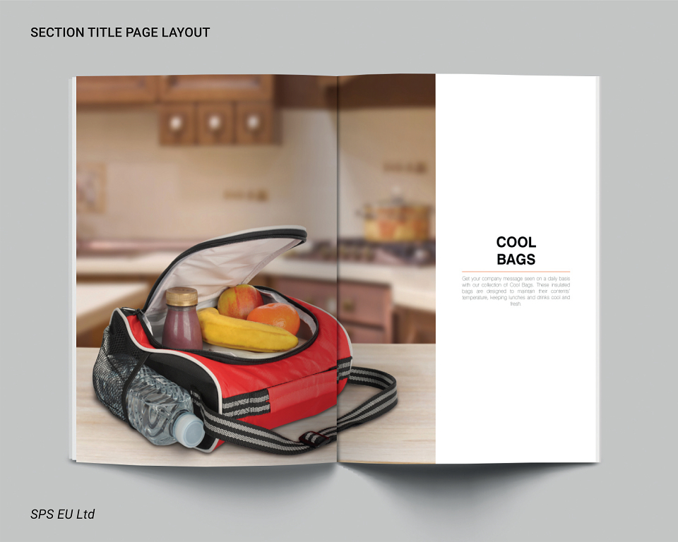
• Lifestyle imagery became central to the visual approach, helping customers visualise the bags in real-world, aspirational settings
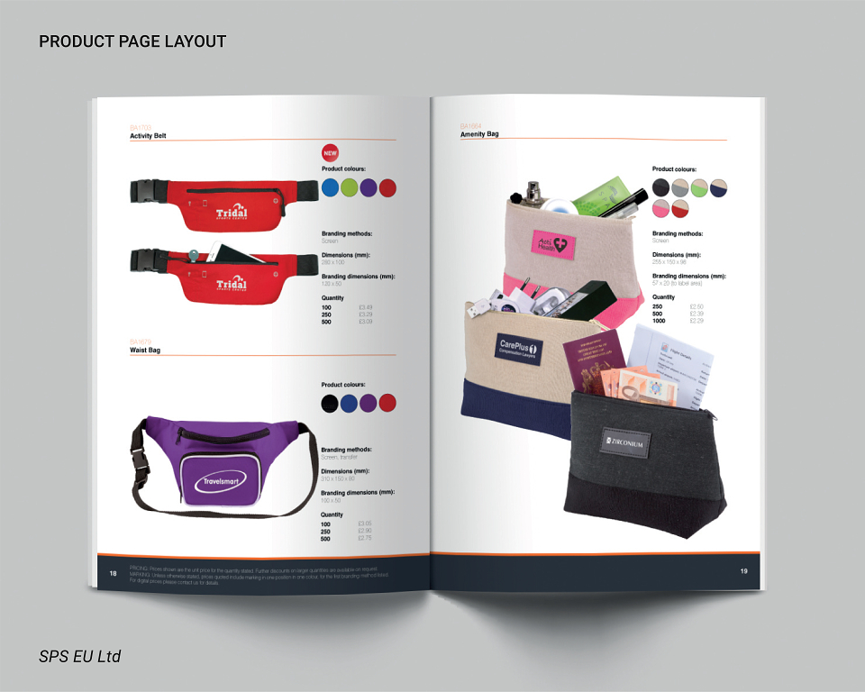
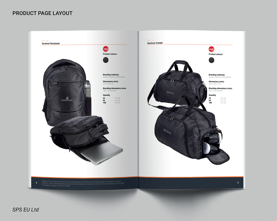
• Clean, minimal layouts with controlled white space to enhance product visibility and signal higher value
• A refined typographic hierarchy to improve legibility, tone, and visual flow
Key Contributions:
• Visual repositioning of the Simply Bags brand for a more premium audience
• Cover and interior redesign with elegant, image-led layouts
• Colour strategy that maintained brand consistency while enhancing sophistication
• Clear alignment of design tone with product pricing and perceived value
This brochure makeover demonstrated how strategic restraint in colour and layout, combined with narrative photography, can transform a standard product guide into a compelling sales and marketing tool, without abandoning brand recognition.