Shumenaz Ali
Senior Designer & Creative Lead
ABOUT
Editorial Design | Brand Refresh | Visual Systems | Print Collateral
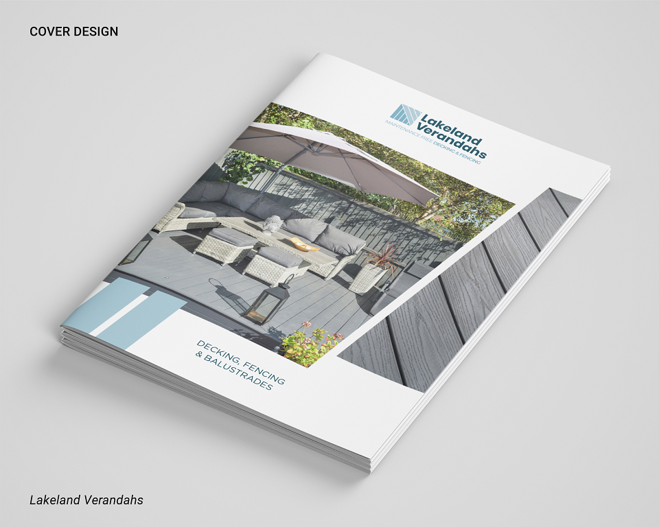
Lakeland Verandahs had a brochure that felt visually outdated and disjointed from the premium, design-led offering they were aiming to convey. The challenge was to revamp their marketing collateral to reflect a more confident, modern and visually appealing brand without straying too far from their core identity.
Design Solution:
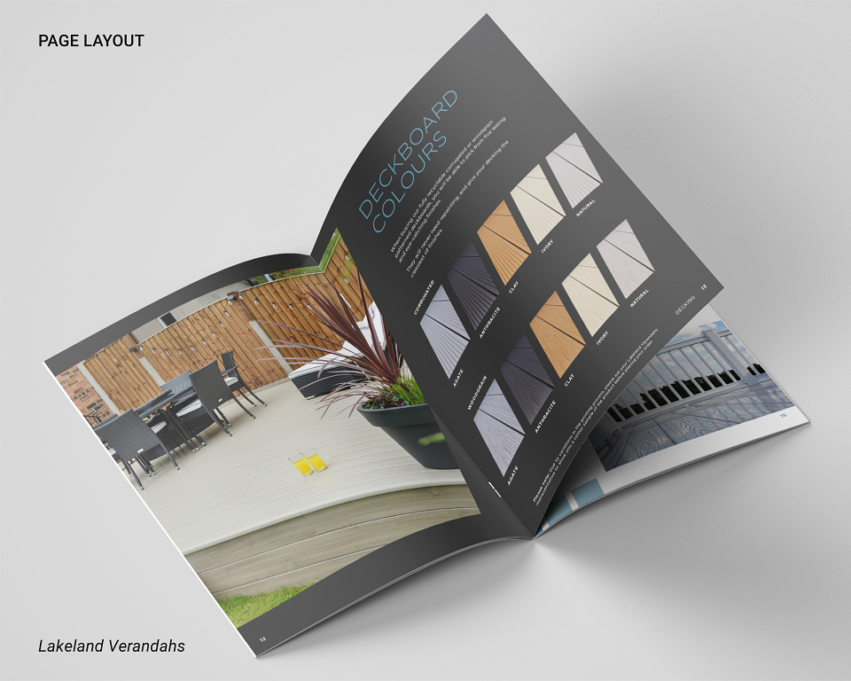
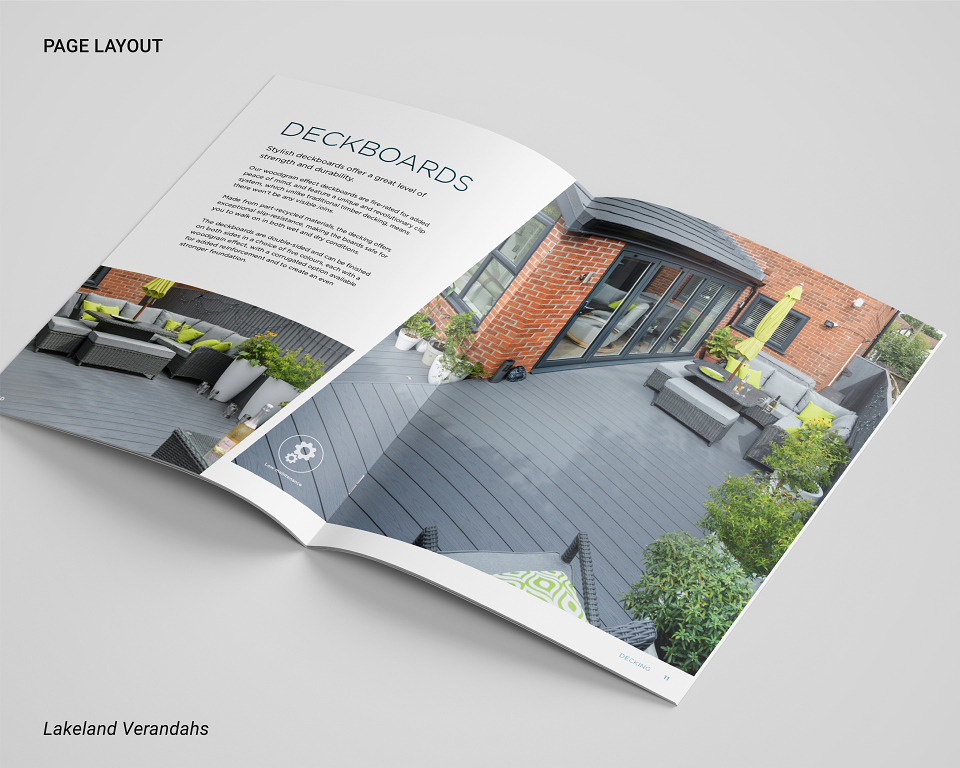
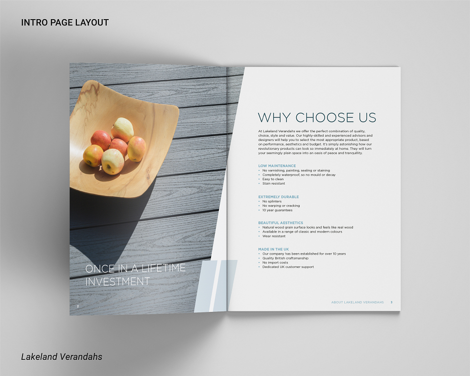
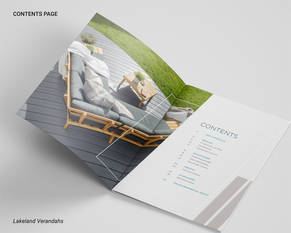
I led the complete redesign of their brochure layout, introducing a dynamic grid system inspired by the product itself - deck boards. Diagonal lines and images in slanted square shapes were used as a recurring graphic language, echoing the angles found in the company’s installations and lending the layout a sense of structure and flow.
This fresh design direction brought such clarity and confidence to the brand's visual identity that it directly inspired a logo redesign, aligning the entire brand ecosystem with the new visual DNA I established in the brochure.
Key Contributions:
• Created a cohesive brochure layout using bold, geometric forms reflective of the product
• Developed a new visual language built around diagonal/board-like elements to unify brand material
• Successfully elevated the perception of the brand from dated and conservative to stylish and aspirational
• Sparked a logo redesign that followed the visual tone set by the brochure, reinforcing consistency
• Improved layout clarity and flow to support a smoother sales journey through considered design
This project is a great example of how editorial design can lead brand evolution, turning a traditional product brochure into a strategic brand asset, one that ultimately informed the wider identity of Lakeland Verandahs.