ShopTalk/DEPT®
London
ABOUT
We have rebranded Braemar Shipping Services to emphasise their purpose-driven, human-centric experience and place Braemar at the forefront of the shipbroking industry. In 2021 the organisation brought us on to help them create a bold and recognisable visual identity for Braemar that would be able to grow and evolve with the brand. Crucially, the new Braemar brand elevates the organisation, confidently cementing Braemar’s role as the obvious choice for the discerning customer as well as highlighting Braemar’s commitment to sustainability.
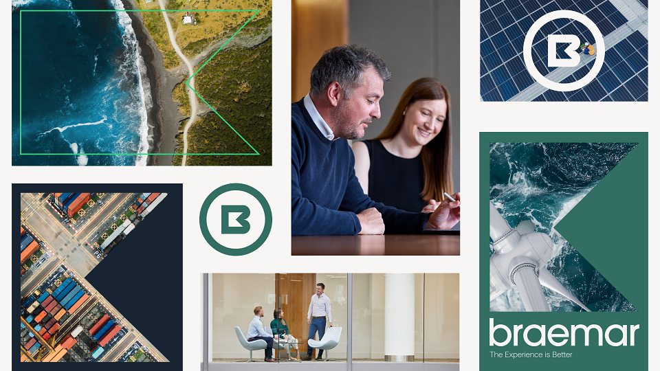
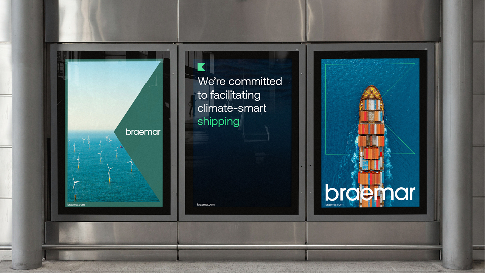
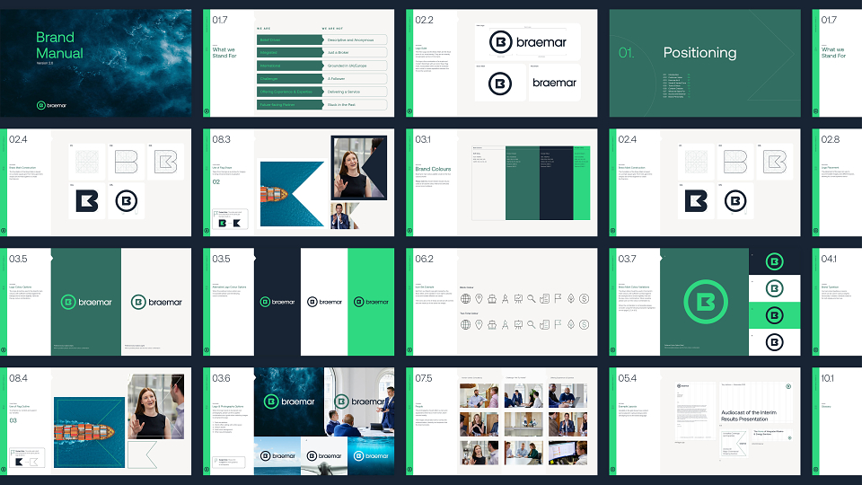
The new colour palette sets Braemar apart from chasing the pack – for whom the default choice is to have a shade of blue as their primary colour – having two shades of green, ‘Forest’, and a bright accent green that subtly strengthen their engagement for a greener future. A new logo suite is at the core of the entire Braemar brand and has been broken down into three different marks. The Hero Logo and the nautical-inspired Flag Mark, are the focal point of Braemar’s new visual identity. As a window, the Flag Mark can showcase content – particularly new photography that underlines the approachability and expertise of the organisation – or, when outlined, it enhances and supports our specific brand narrative.
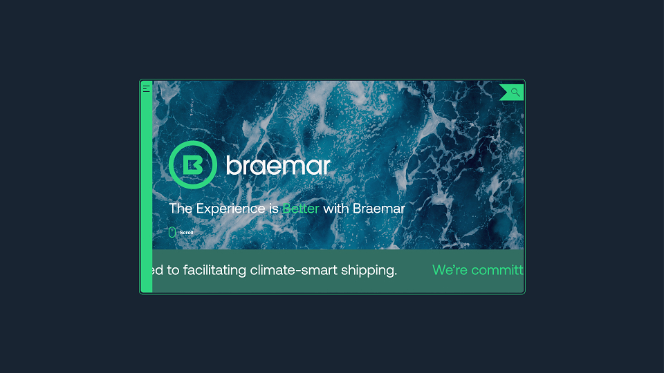
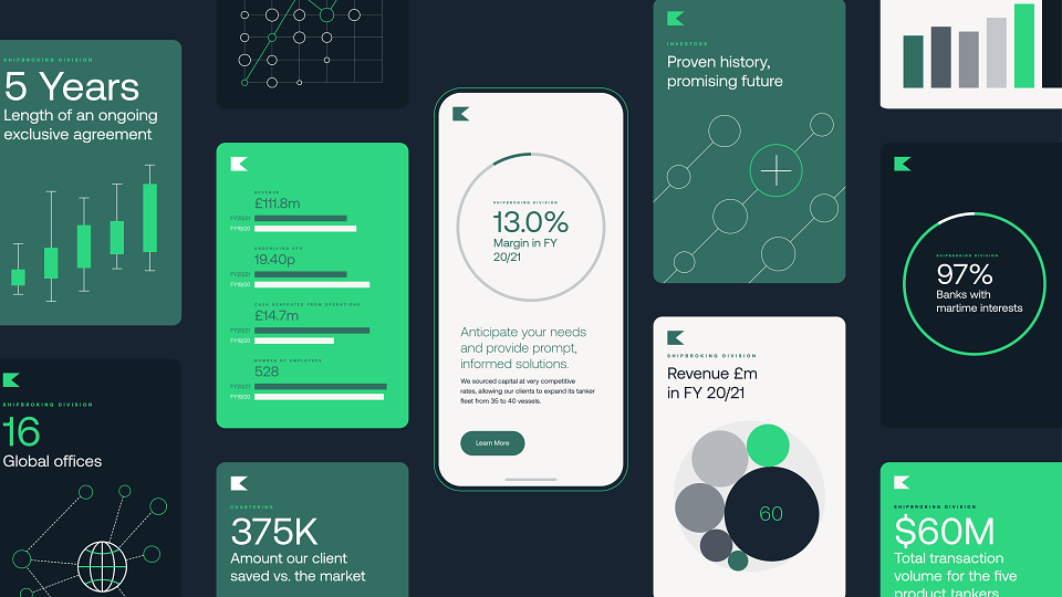
The result is an identity that carries a bold expression through its iconic brandmark and logo, typography, and vivid colour palette; as well as the use of graphic data visualisation that can be updated in line with the rapidly changing world. By combining both bold and iconic assets (the brandmark, logo and vivid colour palette) with more dynamic and flexible graphic elements (graphic data visualisation and immersive photography), every touchpoint of the new Braemar brand has been developed to play a specific role and to reflect our intention to elevate both Braemar’s expertise and attitude.