Shine Creative
Hartley Wintney
ABOUT
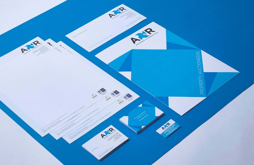
Having made the decision to rebrand, the management team wanted a new identity that demonstrated A&R’s strength and expertise, but with a more contemporary feel and a bold presence, to make them stand out from the competition. Their previous brand spelt the company name, Andrews & Robertson, in full – so it was decided to create a shorter, more impactful logo which reflected the company’s web address.
Thought processes focused on a clean design, to help A&R to be perceived as an authority in the industry. Logo ideas we explored centred on spaces, houses, structures and traditional auction elements. The final design was bold and striking, and we interpreted the icon in the logo to be a form of paper construction that could be folded and unfolded – demonstrating space and relating back to A&R’s industry.
Using the new brand, we then developed a range of materials including stationery, property boards, an exhibition stand, press advertising templates, email templates, a website design and of course a redesign of the auction catalogue – which has been extremely well received by clients. We also refined A&R’s messaging and created a new strapline focusing on their authority, expertise and core ethos, creating an even greater opportunity for the business to reignite itself into the marketplace with force.