Senso Creative
Belgrade
ABOUT
Concept
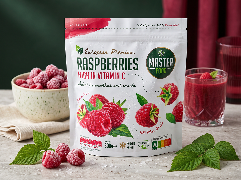
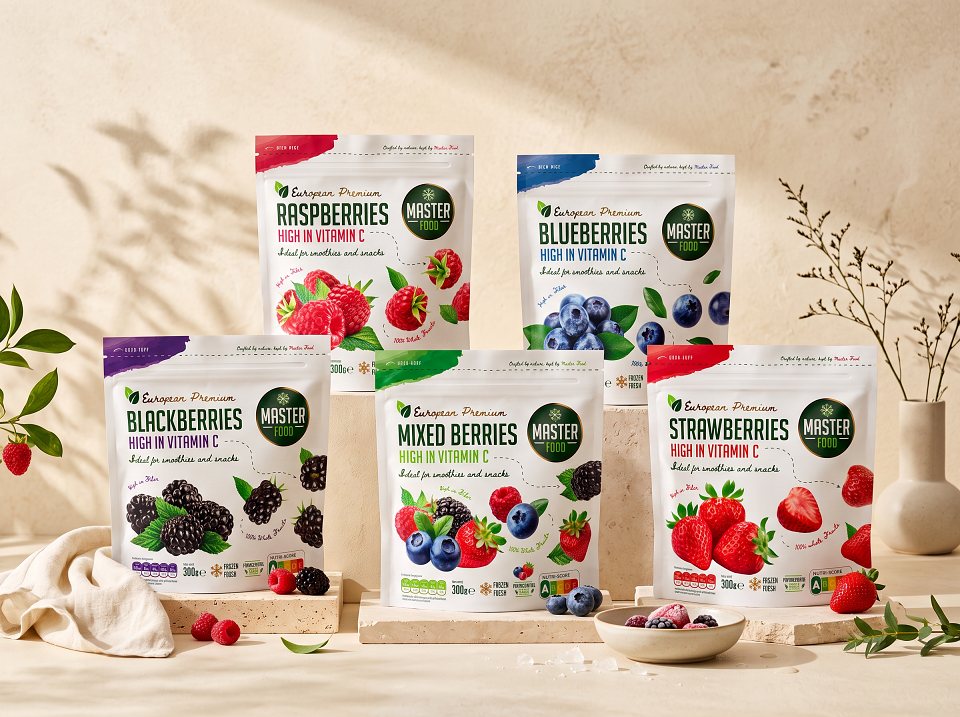
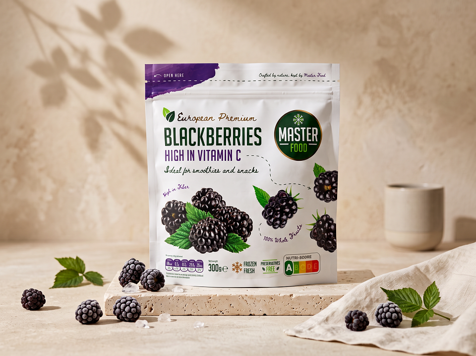
Master Food came to Senso Creative for a packaging redesign across their European Premium frozen fruit range — raspberries, blueberries, blackberries, strawberries, and a mixed berry blend. The brief was to create a cohesive shelf presence across five SKUs that still let each fruit read instantly at a glance, while communicating the range's key claims: 100% whole fruit, high in vitamin C, high in fiber, preservative-free, and frozen fresh.
Execution
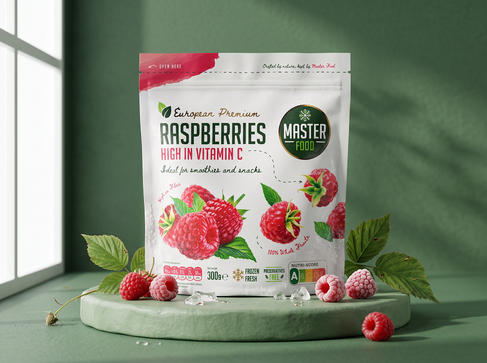
We built a flexible packaging system rather than five separate designs. A consistent white base and layout carries across every bag, with a bold diagonal color swash in the top corner — unique to each fruit — acting as the fastest visual identifier on shelf. Painterly, hand-rendered fruit illustrations pair with a hand-drawn dotted-line motif connecting the whole fruit to the "100% Whole Fruits" callout, reinforcing the natural, unprocessed positioning. Nutritional information, Nutri-Score, and certification icons are placed consistently across all packs for regulatory clarity and easy comparison at point of sale.
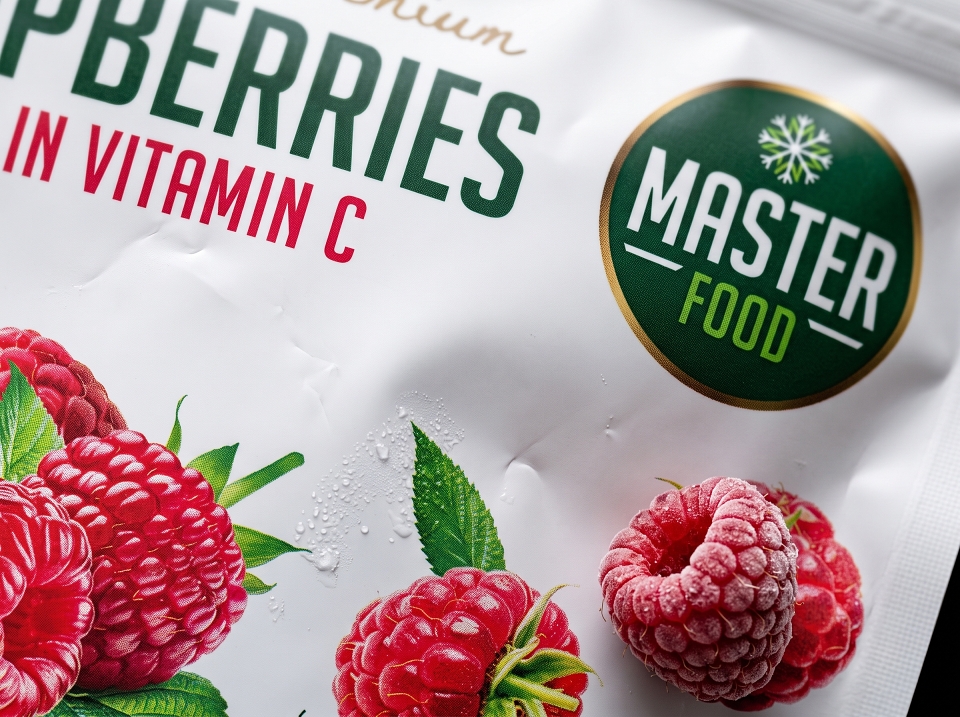
Production was an 8-color flexography print job on doypack pouches, with selective matte varnish applied over the glossy base to separate the fruit imagery and logo from the background — giving the pack a tactile, premium finish on shelf rather than a flat, uniform sheen. The "Master Food" seal and "Crafted by nature, kept by Master Food" line anchor brand trust across the whole range.
Results
The system gives Master Food a packaging family that scales cleanly across current and future SKUs — new fruits or blends can be added without breaking the visual language. On shelf, the color-coded corners plus the matte/gloss contrast from the varnish create strong stand-out and shoppability, while the consistent structure keeps the whole range reading as one premium, trustworthy brand rather than five disconnected packs.