Sara Cabello
Graphic Designer
ABOUT
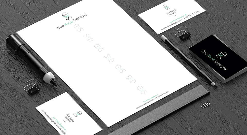
The client wanted to used a modern and elegant font, so my first option was a thin and stylised typeface. Playing around with her initials I thought a small detail like rotating them will make a huge difference, keeping it simple and clean as the client requested but less boring.
I also decided to use a touch of colour as it will make her identity more unique and attractive. When she saw the logo she said “Now, I can’t think on a better colour than mint”.
MADEIT CREDITS
-

Sara CabelloGraphic Designer