Salad
Poole
ABOUT
Based in the Lake District, Silver & Green specialise in the delicacies of the Mediterranean, including olives, olive oil, sun-dried tomatoes and pestos.
The brief
Having developed a new brand identity and authentic, playful packaging for their first range of products, Silver & Green approached us for the design of their next key offering – a beautiful, handpicked and cold-pressed olive oil. With the price point and product position squarely aimed at the mid-range to premium end of the market, the packaging needed to present premium quality whilst conveying everyday use.
The solution
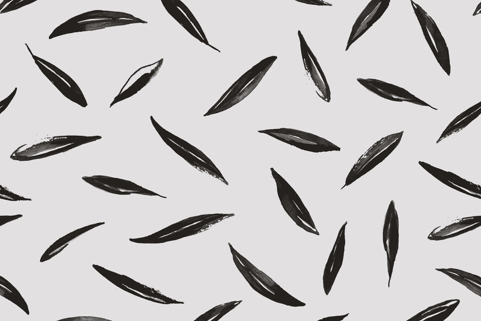
Although the brand had a number of existing assets, the bottle format differed significantly to the olive jars and pouches. We knew the bottles needed to ooze quality and craftsmanship, so we chose to differentiate them by introducing further assets that would deepen the brand. Drawing inspiration from the existing handcrafted typography we developed an original, hand painted olive leaf pattern. The concept included a full wrap of print across the bottle, creating a distinctive, textural effect particularly when viewed through the oil. We also explored ideas for a signature neck label to add theatre and stand-out to the oil’s shelf presence.
The result
Silver & Green are delighted with the beautiful packaging for their new olive oil, which has successfully enabled the brand to compete within the premium oil marketplace. Numerous independent retailers across the UK now stock the artisanal bottles, providing customers with authentic, beautifully packaged Mediterranean products from a trusted supplier. In addition to the unique bottle packaging, the hand painted olive leaf pattern can now be used throughout the brand on a number of assets, broadening the existing suite.