Sakina Salem
Data & Information Design
ABOUT
The C4ADS Wildlife Seizure Database collects data about illegal wildlife trade. The challenge was to create a narrative with a mix of bespoke chart and illustrations to highlight and provide more in-depth analysis from the information about seizures from Africa.
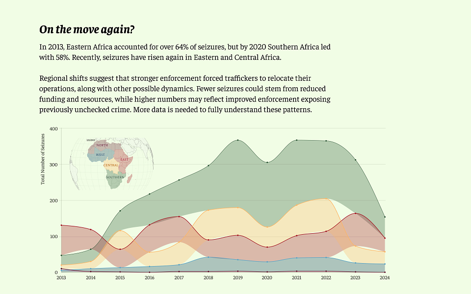
Shifts over time
An Area Bump Chart is a visual that shows how rankings or proportions change over time — like a race chart, but smoother and more organic. It’s great for comparing shifts in position while still showing the overall magnitude of each category.
Crime and enforcement
This is not a standard choropleth. I made a bespoke map that combines seizure numbers and enforcement rates. It reveals where wildlife trade hotspots intersect with how effectively they’re being stopped. The hardest part was getting the colours to align with the rest of the longform.
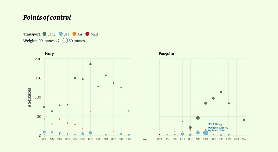
Controlling the ports
Line charts are a usual go-to when showing change over time — but here, I used a bubble chart to compare the total weight and frequency of seizures by transport mode since 2013. This chart incorporated multiple variables, showing complex relationships while also raising important questions.
MADEIT CREDITS
-

Sakina SalemData & Information Design