Sakina Salem
Data & Information Design
ABOUT
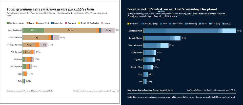
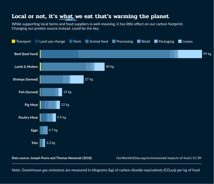
This bar chart shows how much carbon emissions are produced by the different processes involved in supplying meat products. It was included in an article busting the myth that it is the source of the food that increases emissions. The revamped bar chart clearly shows that transport plays a very small part in creating emissions across all the meat products. There are other factors that raise emission levels and instead of focusing on where the meat was sourced, we ought to focus on what meat product we consume.
By highlighting transport in a contrasting colour to the rest of the processes, we directly visualise the article's main point that transport is not the cause of higher emissions.
---
This project is part of a series that focuses on revamping existing charts to make them clearer and more engaging. The goal was to demonstrate how design decisions can improve comprehension and storytelling. The improved charts better represent and highlight the key insights in reports or presentations.
MADEIT CREDITS
-

Sakina SalemData & Information Design