Russell McGorman
Wayfinding Design Consultant & Typeface Designer
ABOUT
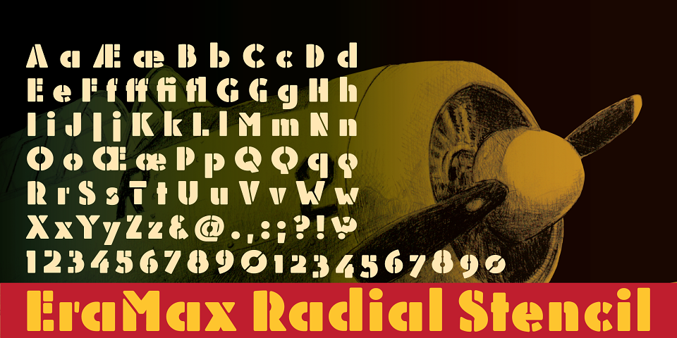
EraMax Radial is a geometric sans serif typeface, meant to be set BIG, for big statements. It's the perfect face for signage, packaging posters, branding and so on and on, where a strong voice is needed. It has a modern look that will work in a retro setting. Or, should that be a vintage look that will work in a modern setting.
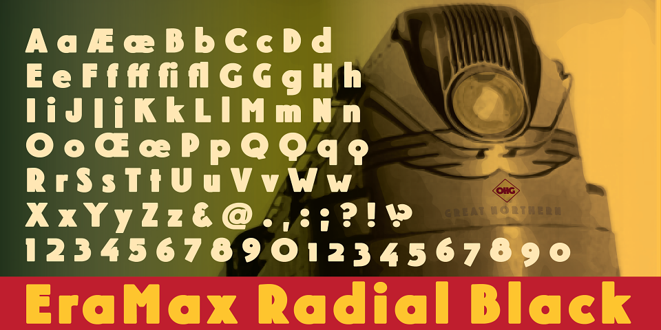
This is the first release of what is to be a series of typefaces inspired by the original hand painted signage found in the T.H. &B. train station in Hamilton Ontario. This classic Art Deco—Or, more precisely, Art Moderne building was designed by the New York firm of Fellheimer and Wagner and completed in 1933.
The original lettering included about 75% of the uppercase letters only, so the balance of the uppercase and the lowercase plus all the other glyphs were extrapolated from the look and feel of the existing uppercase letters. Figures are based on the numerals on the station clock, with adjustments made to harmonise with the letters.
MADEIT CREDITS
-

Russell McGormanWayfinding Design Consultant & Typeface Designer