Russell Hollingbery
Senior Designer
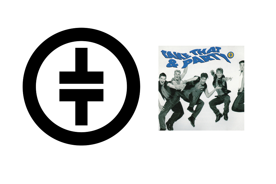
ABOUT
The brief was an identity was needed for a new boy band pop music group which is easily recognised. It is to be used on the album sleeve and singles plus merchandising. Must appeal to a young audience. My concept of the 2 mirrored Ts in a circle was based on the simplicity of the male/female symbols and the ease of reproducing for young fans.