Russell Mountford
Junior Designer
ABOUT
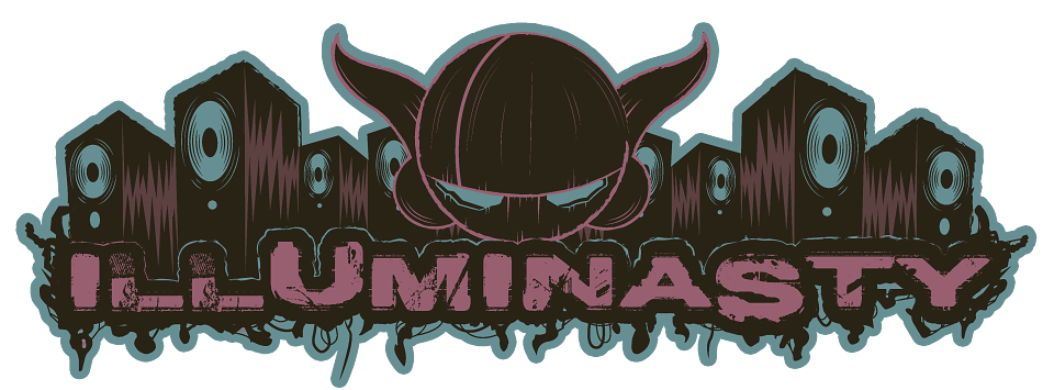
The event production company I was interning at was putting on a night to test the waters for a possible sister company idea called IllumiNasty which would focus more around a robotic, grungy, techno, sci-fi kind of night. Different to the drum and bass rave nights they currently hosted.
I was asked by the owner of the company to produce a possible logo for the event because he liked some of my mechanical robot designs I had in my portfolio. He wanted the logo to reflect the new theme of the night, include the new name but still link back to the company.
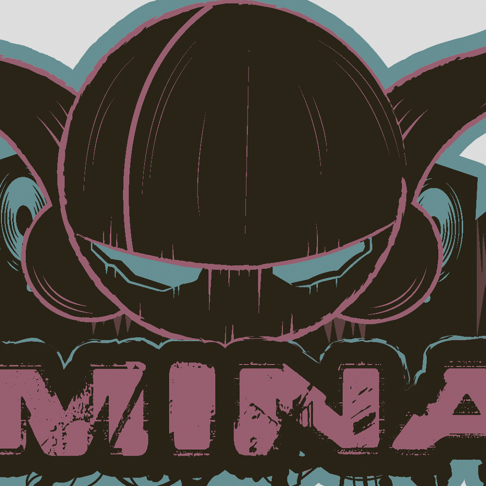
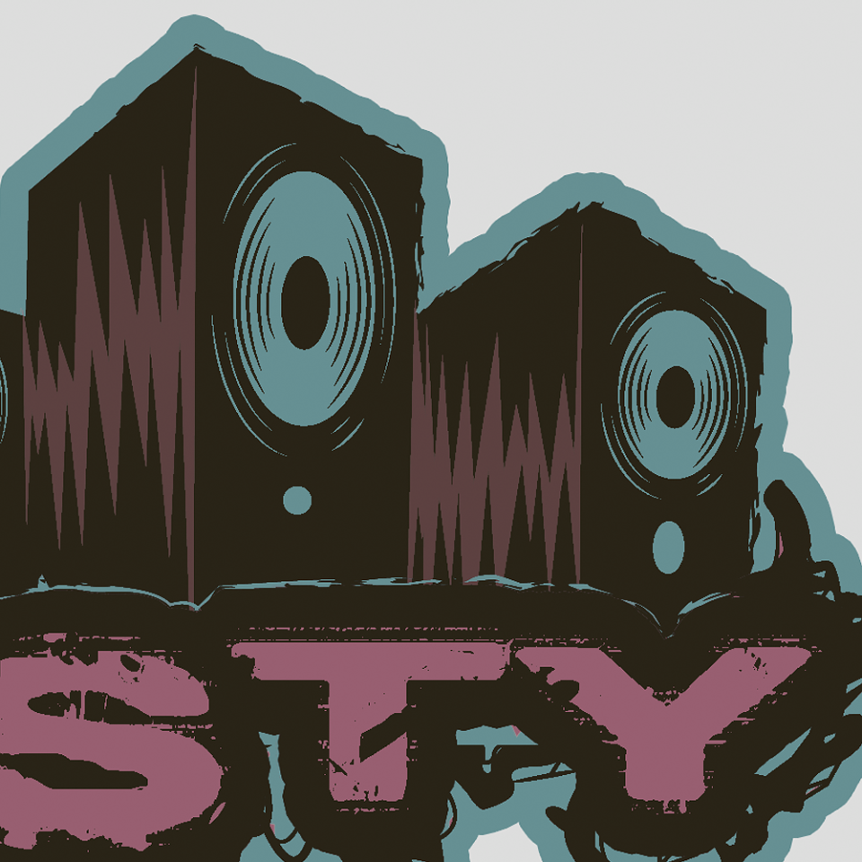
I started the project by thinking how I could link the two together. The company used a Goblin throughout its designs so that was clearly the obvious choice so I drew up a robotic looking version of the Goblin, holding back on the detail however because it was a logo after all. The owner wanted the font to be grungy in appearance so I used a very distorted but readable font for that and added silhouetted scraps of wire hanging off it to complete the look. To fill up the rest of logo I added various speakers (To reflect the music side of the event) and mechanical gears (To add to the robotic feel of the event). However, the owner didn't like the gears because he felt it made the logo to complex but he liked the speakers I had drawn and wanted me to focus on them.
The logo was useable in monotone but the owner wanted a splash of colour added just incase. I rendered it in 12 different colour variations. Using colours inspired by the rave/ grungy image we were going for. I presented them all and the owner chose the final design which used a striking pink backed with a blue.