Ruby Rose Ellis
Creative Director
ABOUT
Concept
Jordan lost his mother to frontotemporal dementia (FTD) when he was young. Years later, he and his brother unfortunately received the same diagnosis. From that grief, and that shared reality, The FTD Brothers was born.
The brief called for an identity that could hold loss and forward momentum in equal measure, honouring Geraldine without reducing her to a diagnosis. The brand needed to feel human before it felt charitable. So we built something around presence, personality and lived experience, a foundation that looks forward even while carrying the weight of what came before.
Execution
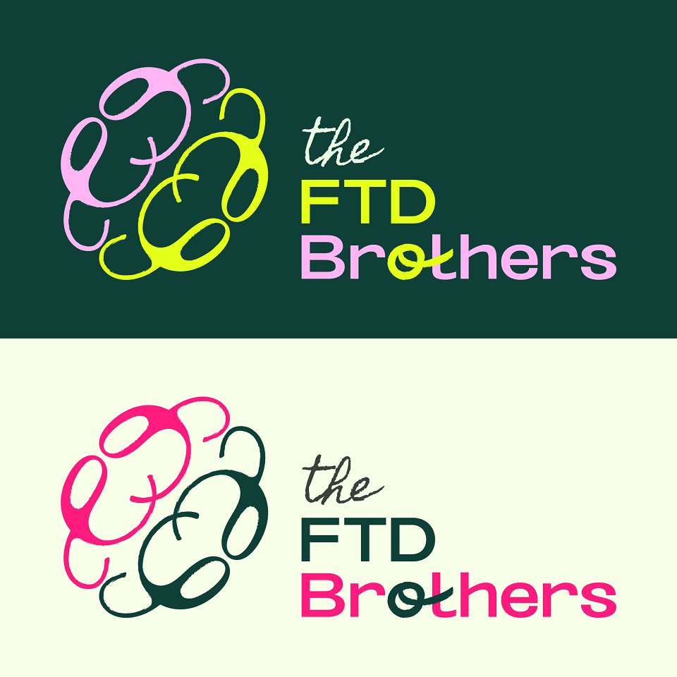
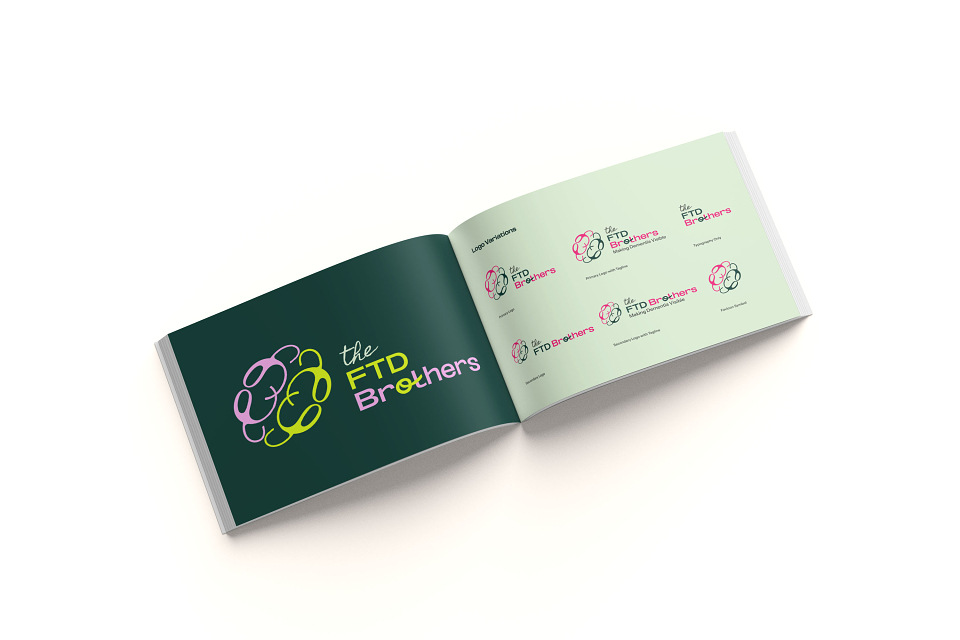
The logomark is a looping, brain-derived emblem built from continuous, overlapping forms. Within the movement, abstract letterforms emerge organically, a curved stroke suggesting a "g," a flowing line hinting at a "j," a rounded form echoing a "c." The meaning reveals itself slowly, much like memory itself.
Breaks within the loops reference neurological deterioration without illustrating it literally. The brain reads as whole at first glance, but not seamless. The mark carries a deliberate distress, soft texture within the strokes that gives it warmth and honesty rather than polish. It feels lived-in rather than engineered. The bilateral symmetry is present but imperfect, referencing brotherhood and shared diagnosis while acknowledging that two people can share a journey and experience it entirely differently.
A subtle tilt in the form creates forward rotation, suggesting momentum and action. Within the wordmark, the "o" in Brothers carries a handwritten, slightly tangled quality, a quiet reference to tau protein build-up. The disruption lives inside the name itself, present but not dramatised, connecting into the "t" to reinforce that it doesn't break the bond.
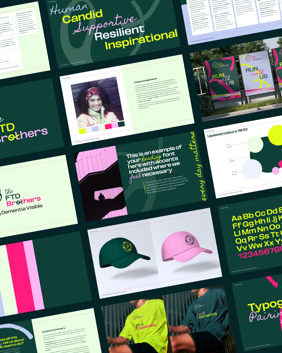
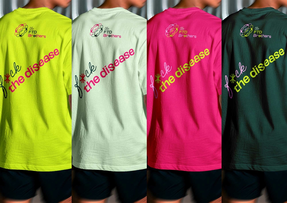
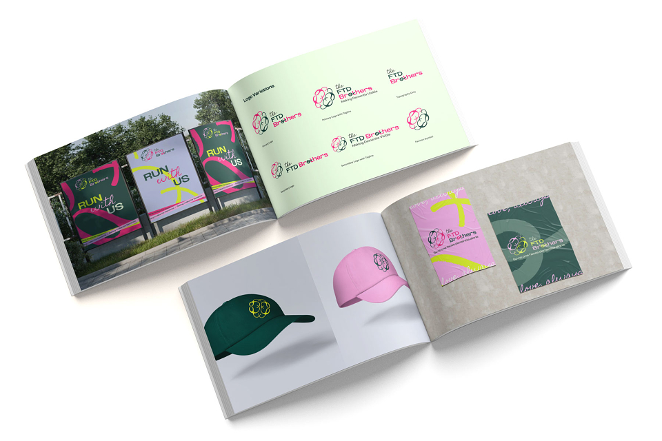
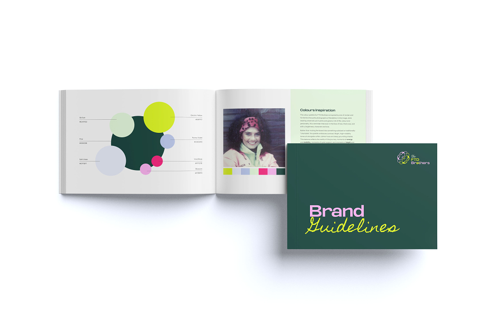
The colour palette was drawn directly from a photograph of Geraldine in a bold ski suit, pinks and greens, full of life. Rather than defaulting to something muted or conventionally charitable, the palette pairs high-visibility tones with calmer hues and deep grounding shades. Brightness sits alongside quiet. Both feel earned.
Typography spans three voices: Oddlini Bold Extra Expanded for impact and energy, Homemade Apple used sparingly as a handwritten accent, and Instrument Sans for body copy, keeping content accessible for families and carers who may already feel overwhelmed.
Results
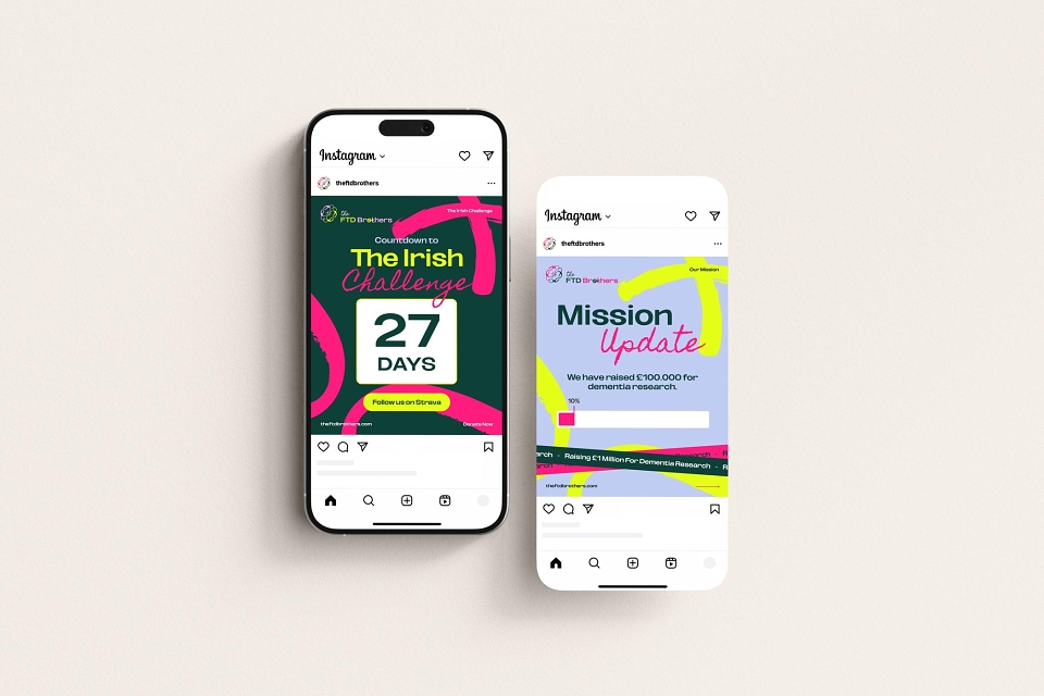
Since launch, FTD Brothers has raised over £1.7 million for their foundation, driven by Jordan's challenge of running 33 marathons in 33 days. The campaign has captured widespread attention, with Jordan featured on BBC Breakfast, Ireland AM and in Hello magazine. The funds are going directly to dementia research, including the Alzheimer Society of Ireland.