Rory Geraghty
Freelance designer
ABOUT
Student Brief
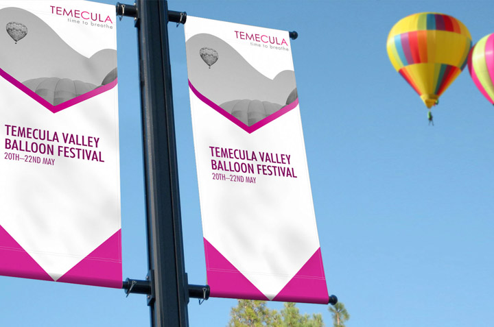
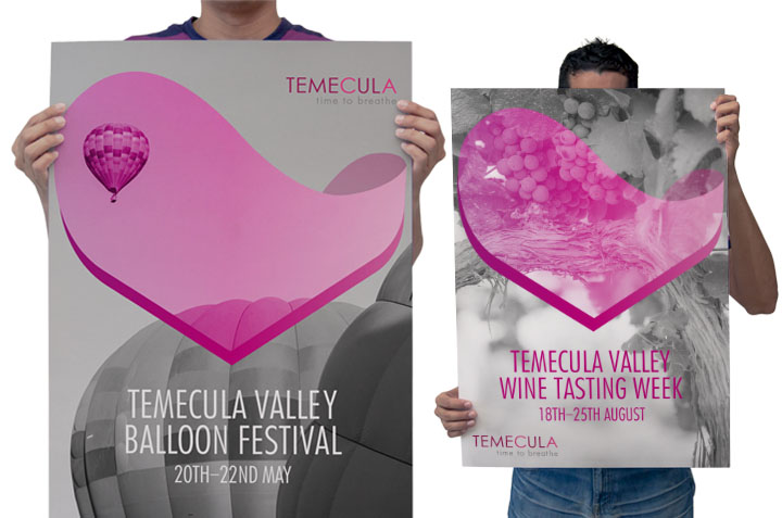
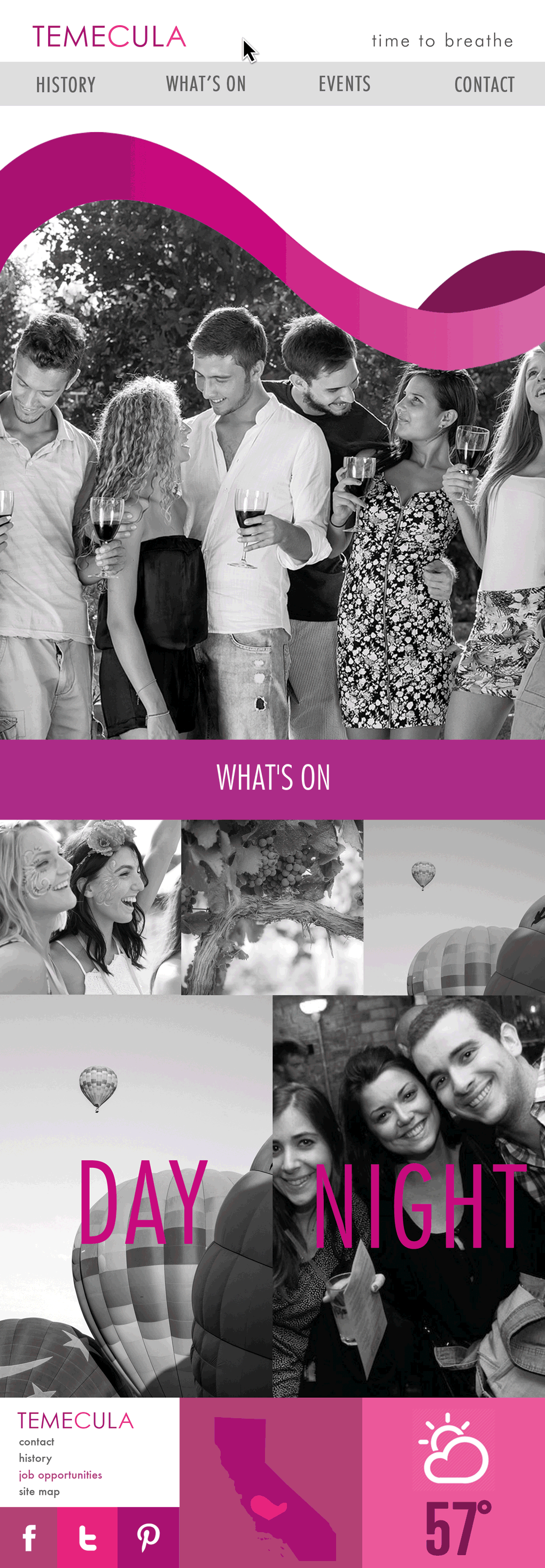
Temecula is a city located in the wine valleys of Southern California, conveniently nestled between the cities of Los Angeles and San Diego and one of the only locations in the state of California to vote to keep it’s original native American name.
The native translation of the name means the place where ‘Father Sky’ meets ‘Mother Earth’ therefore the logo concept derived via combing alchemy symbols for earth and air into a fluid motion that not only hints at its valley location but also its significance within the Californian wine industry.
The element also has a third dimension to create the appearance of a vessel such is the valley as a place to breathe away from the heavy boisterous neighbouring cities of Los Angeles and San Diego.
MADEIT CREDITS
-

Rory GeraghtyGraphic Designer