Ron Woloshun
Creative Director/Advisor
ABOUT
Branding, Naming, Design, Packaging
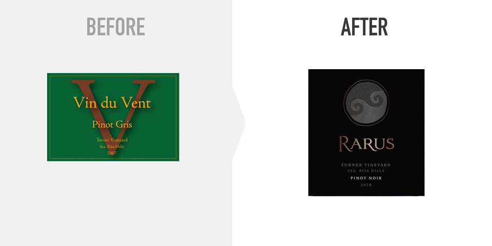
Rarus, a line of ultra-premium wines from prime land in the Santa Rita Hills, began life as “Vin du Vent.” And its label was green — green for the whites, and blue for the reds.
After a wide-ranging exploration of themes and imagery including Tibetan Buddhist prayer wheels, Torii gates, the number 3, and the legend of the phoenix, Vin du Vent became Rarus.
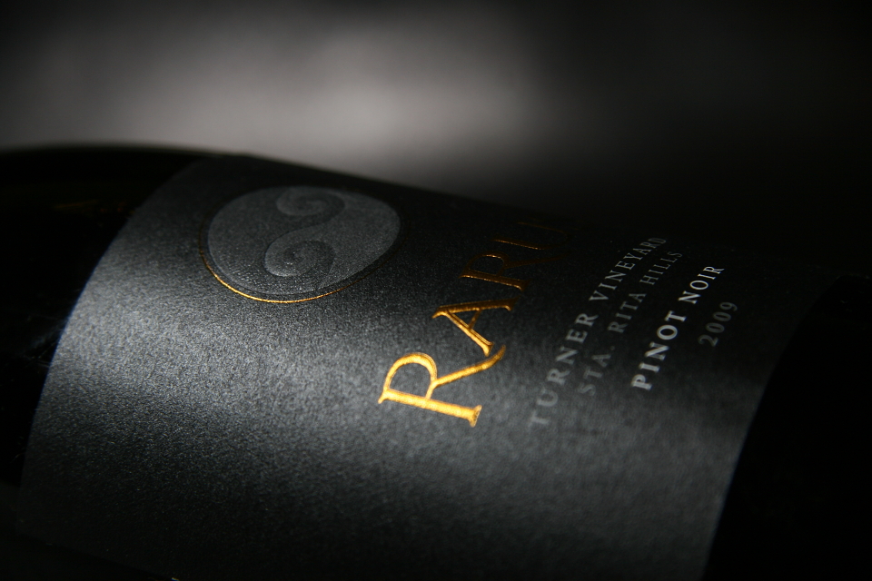
I’m not usually a huge proponent of foil stamping, and especially gold, on a wine label — in fact more than once I’ve dismissed it as a thoughtless cliché that actually brings down the perceived value of the wine. I had originally specced a rather gorgeous pale gunmetal foil, and I kept pestering my very patient pre-press team with questions about how to dull its shine and keep things tasteful.
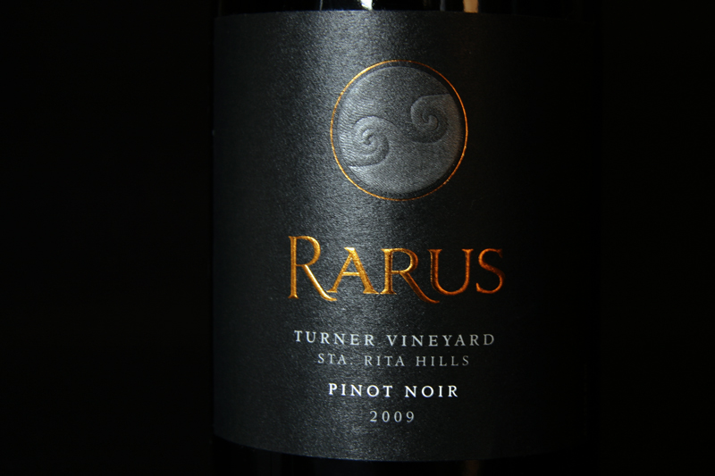
But with its field of rich black, intricately embossed motif from a Tibetan prayer flag, and expressive but stately logotype, this label simply cried out for a bit of opulence. So I changed it on press to a gold that, on nearly any other label, would be completely over the top.
Behold Rarus — proof that rules are made to be broken.