Robert
Director
ABOUT
Background
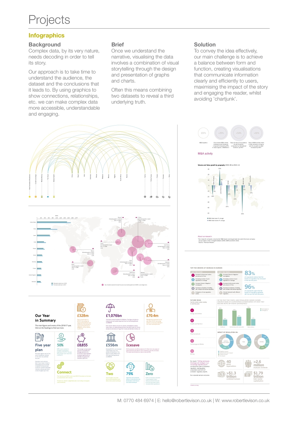
Complex data, by its very nature, needs decoding in order to tell its story. My approach is to take time to understand the audience, the dataset and the conclusions that it leads to. By using graphics to show connections, relationships, etc. we can make complex data more accessible, understandable and engaging.
Brief
Once we understand the narrative, visualising the data involves a combination of visual storytelling through the design and presentation of graphs and charts. Often this means combining two datasets to reveal a third underlying truth.
Solution
To convey the idea effectively, our main challenge is to achieve a balance between form and function, creating visualisations that communicate information clearly and efficiently to users, maximising the impact of the story and engaging the reader, whilst avoiding ’chartjunk’.