Rob Skelly
Associate Creative Director
ABOUT
CONCEPT
The founder of Veganuary and a talented chef had a clear ambition: to change the way the world eats. The meeting of two great minds. Matthew has committed years of his life to investing in the power of plants. And Adam, owner of an incredibly popular restaurant served cutting-edge vegan food. Together they decided to embark on a journey to start a global food business and reduce the number of chickens being eaten each year.
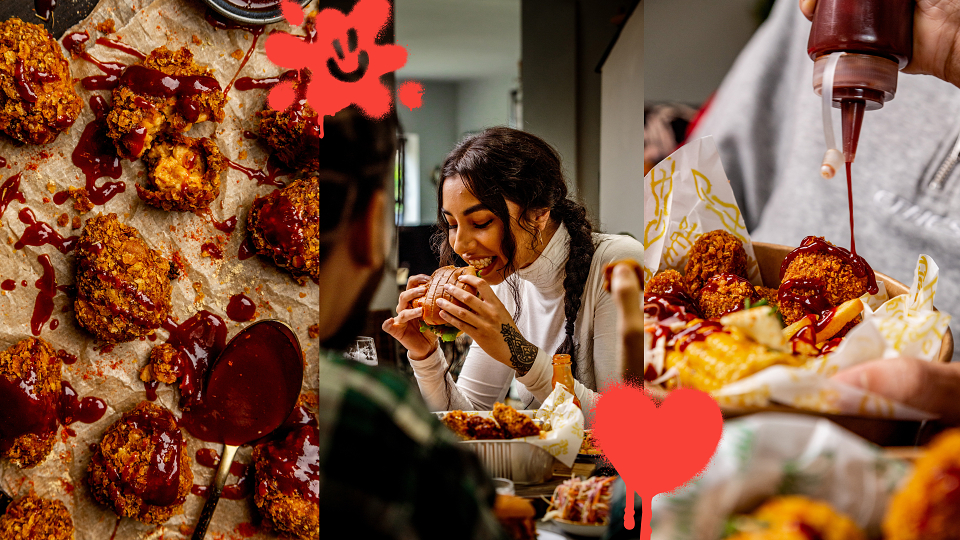
Our challenge was to create a brand that appeals to a growing flexitarian market, by positioning VFC as a plant-based alternative to typical junk food. We needed to deliver all the ‘feel good’ of indulgent eating, while adding to that satisfaction by removing the guilt of eating animals. With plant-based meat alternatives on the rise we built our thinking on the insight that people try to strike a balance between ethics and enjoyment and sometimes we just love eating junk. It tastes great, it’s indulgent and easy. But when it comes to living a little the ethical options are often safe and lacking excitement. Our vision was to create a leading loved mainstream brand that makes a positive change to the world and the lives of the people and animals living in it.
EXECUTION
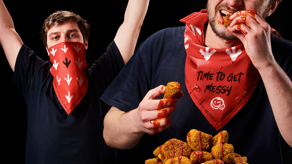
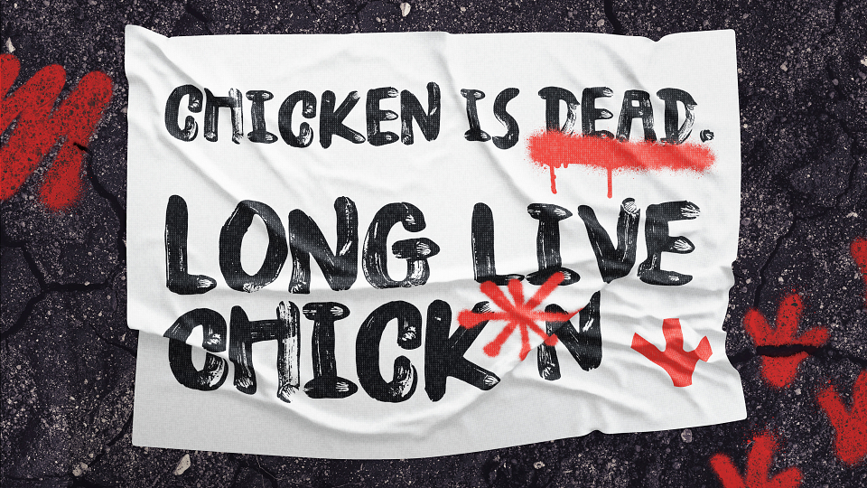
With a clear ambition to shake it up, the solution sticks it to the man by rejecting the status quo of the food industry and challenging the system. We created a positive food rebellion positioning VFC as a no-compromise foodie brand with all the greatness of junk, and none of the guilt. Unburdened by the self-righteous tropes of the category, VFC expresses its brand values by celebrating messy, dirty junk food.
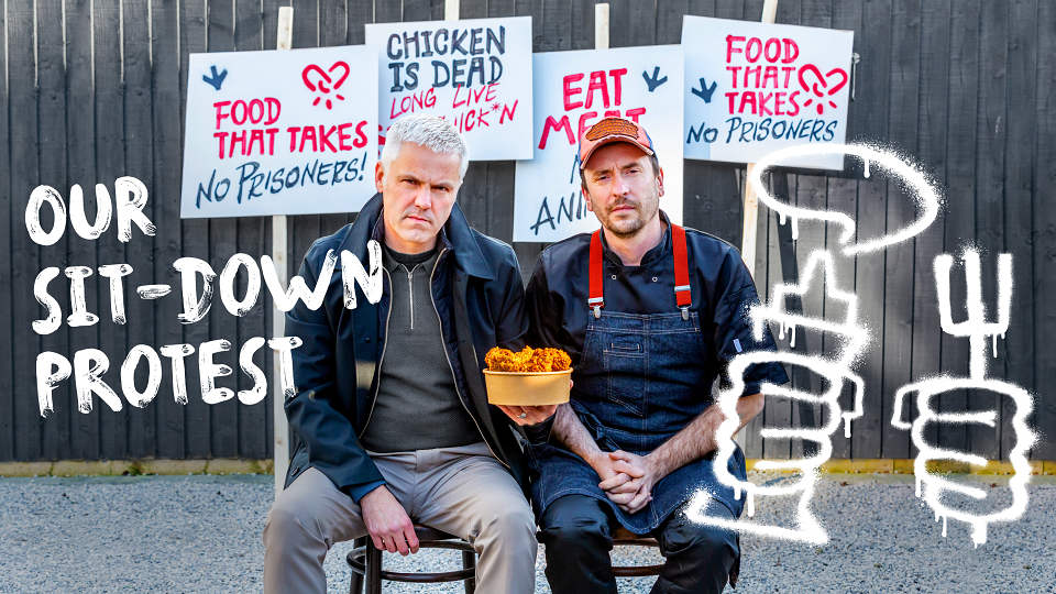
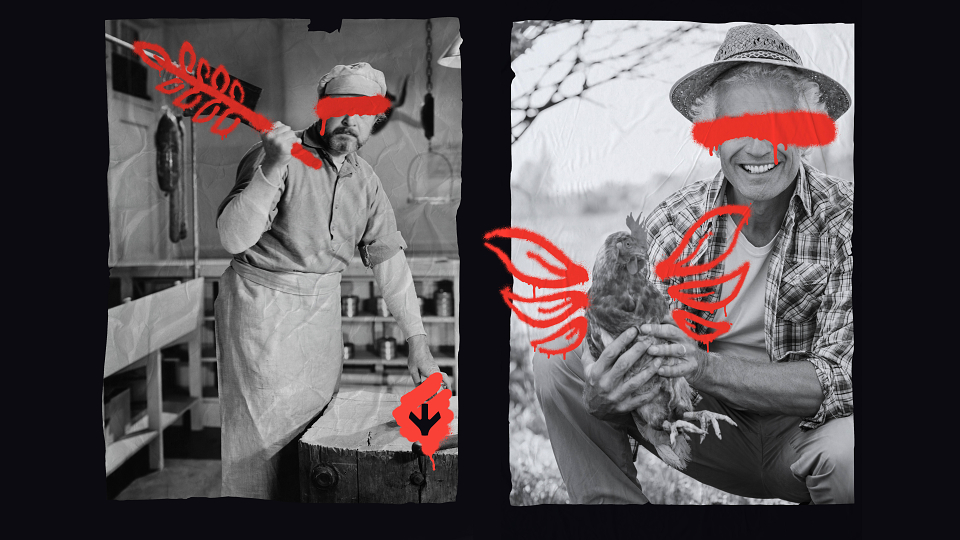
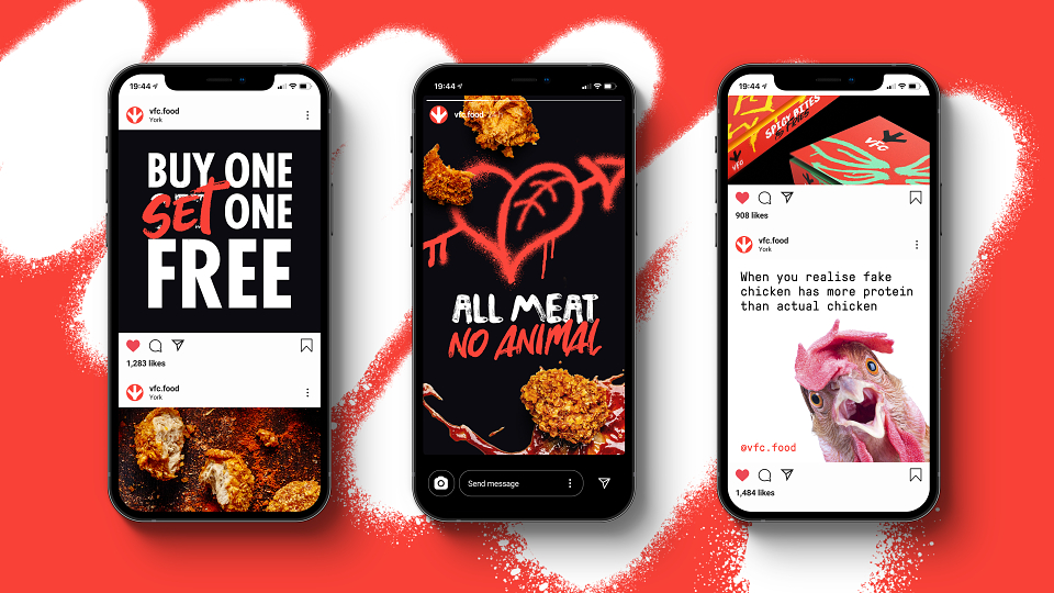
Embracing the spirit of rebellion, VFC twists the visual language of rebellion into something positive. Using graffiti to reframe the status quo, making people think, smile and hungry for change. The sassy brand messages work together to deliver big on both attitude and flavour. Encouraging consumers to literally take matters into their own hands, dialing up guilt-free indulgence and fighting injustice from home, with a delicious sit-down protest.
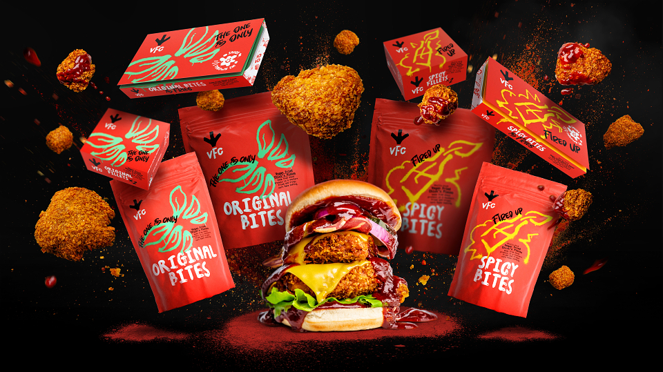
The bold, disruptive yet uplifting icon is a symbol of life, freedom and transformation. Inspired by saucy feel-good indulgence, the VFC typography was created using real mess-covered fingers. The hand painted spray graffiti assets and bespoke typeface allows VFC to cluck the system and shake things up.
RESULTS
This client should have counted their chick*ns before they hatched the brand – they were running out of supply due to overwhelming demand within weeks of their December 2020 launch.
Their direct to consumer offering has proven the concept works, and international retail opportunities are presenting themselves daily. They sold 25,000 portions of food within the first eights weeks, gaining 15,000 followers on Instagram.
MADEIT CREDITS
-

VFCClient
-
Daisy CrowderClient Director -
Lucas SmithPhotographer -
Sarah GoldthorpeSenior Designer -
Timothy LeonardStrategy & Provocation Partner -

Born Ugly -

Daisy CrowderClient Director -

Joe CookeDesigner -

Rob SkellyAssociate Creative Director -

Sabrina AhmedSenior Partner