Rish
Community Manager
ABOUT
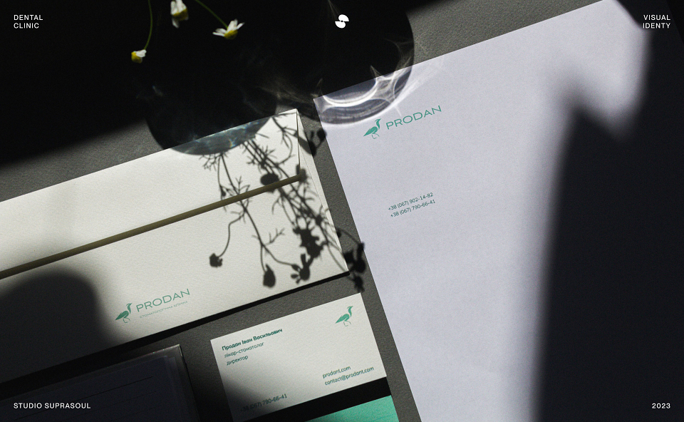
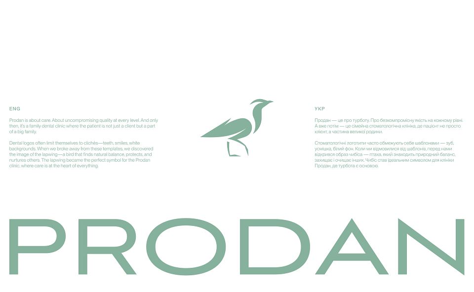
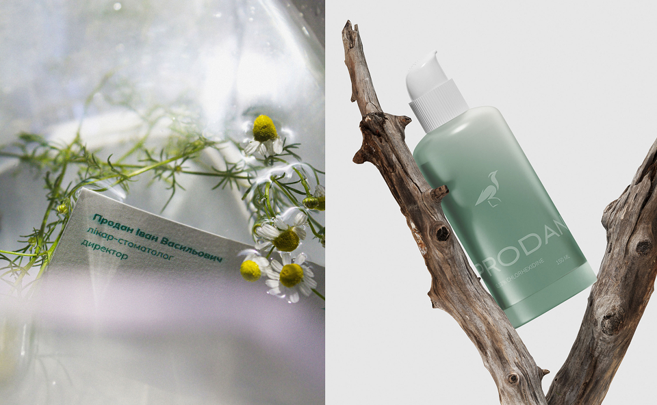
Prodan is about care. About uncompromising quality at every level. And only then, it’s a family dental clinic where a patient is not just a client but a part of a big family.
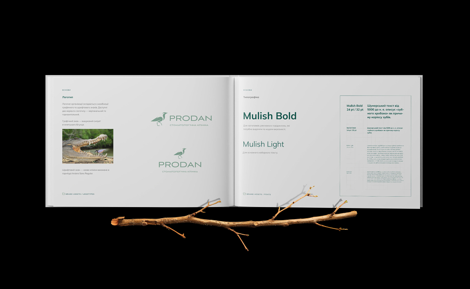
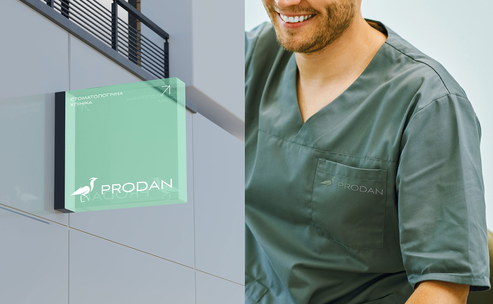
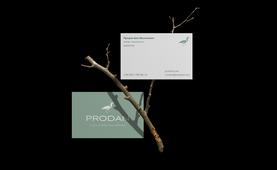
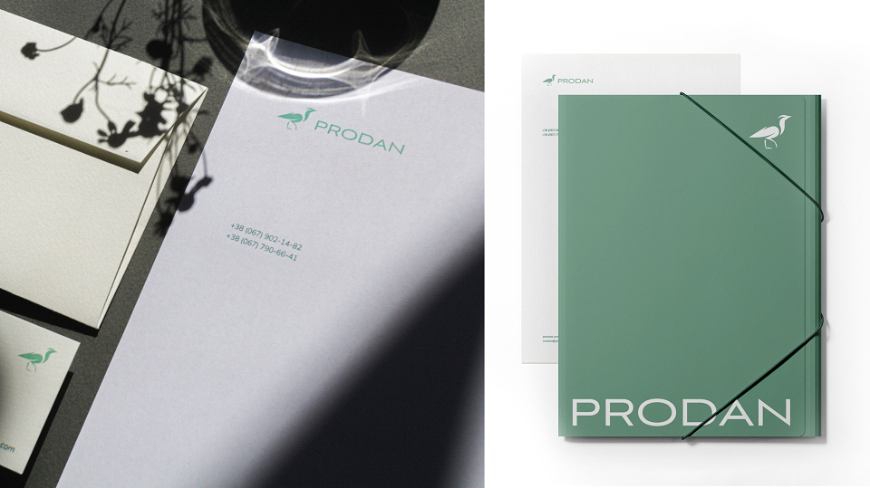
Dental logos often confine themselves to clichés—teeth, smiles, white backgrounds. When we moved away from these templates, we discovered the image of the lapwing—a bird that finds natural balance, protects, and nurtures others. The lapwing became the perfect symbol for the Prodan clinic, where care is at the core.
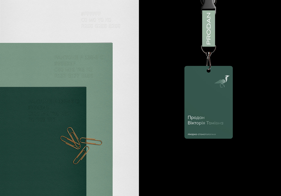
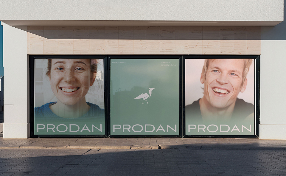
Can a brand evoke a sense of calm and trust? Prodan proves that it can. We abandoned sterile white colors, as they don’t convey warmth, care, or genuine connection. Instead, we chose a soft, serene palette with natural tones. These colors envelop and create a sense of safety and trust, helping patients feel at home—where they are truly cared for.
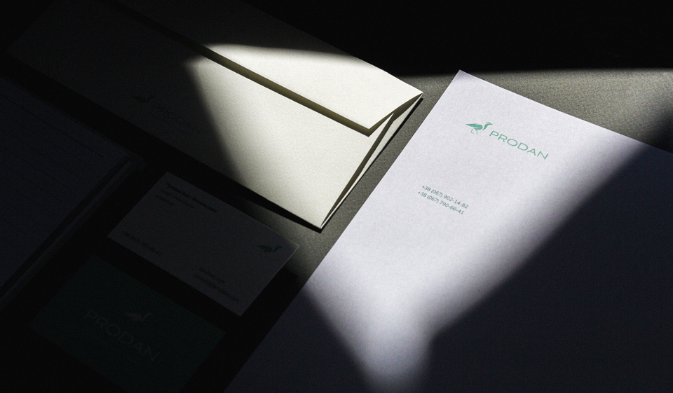
The Prodan clinic’s identity is defined by clear graphics, the lapwing symbol, and a cohesive color palette. All of this speaks to the thoughtful attention
MADEIT CREDITS
-

RishCommunity Manager